The sharing size for photos on the internet
5 Comments
In what is shaping up as a series of posts about image internet sharing practices, I’ve explained why and how to watermark. In this piece, I will explain why I have chosen to share images at a modest resolution.
There are a number of factors to be considered when choosing an image size for displaying and sharing on the internet. The gamut of image sizes varies from large thumbnails to full-resolution files. Smaller images load faster, are more easily displayed and shared. Larger images offer more detail to see and can be used in a variety of ways, such as filling up entire large screens or producing printed materials. The downside of that versatility is an increased number of people using your image for free, possibly in an un-authorized way, instead of licensing the image or buying a print from you.
A popular school of thought advances that one should not worry about that risk, and go all the way to sharing full-resolution files, because the increased exposure that is brought by sharing those larger images will more than make up for the inevitable loss of revenue from people not acquiring those from you.
I personally think that the benefits of sharing at large sizes are largely exaggerated.
When it comes to “sharing”, what do people mostly do with images available on the internet ? They view them on web browser, occasionally upload them to other websites – which results in the same- or email them to others, in which case the image is viewed in a mail reader.
Although there is a larger variety of big screens on the market than ever before, in 2011 desktops accounted for only 27% (source) of US computer sales. Notebook screens are not large. This is confirmed by Google Analytics records of terragalleria.com visits in the past 30 days as seen below:
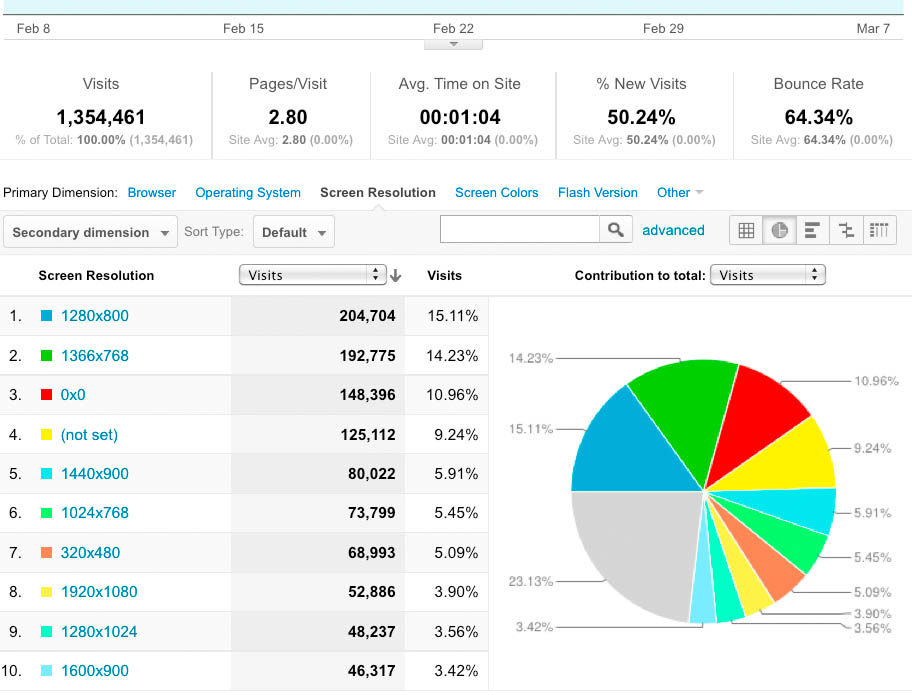
Not only most computer users use a notebook rather than a desktop, but also many people rely on a mobile device rather than a computer as their primary means to access the internet. Those come with screens that are even smaller than notebooks – although the “New iPad” and its breathen will change that. It will be interesting to see what kind of design is required for a photography site to look the best on the high-res tablets. As far as I can guess, most people who use a desktop 2000+x1600 screen do not open their browser windows full-screen, yet full-screen appears to be the only mode of operation of the iPad. Do you have an idea of how this will work out ?
The dimensions above are for screen sizes, but the browser window – the portion of screen real estate actually available to display your images – is quite a bit smaller, because of the operating system and browser’s tasks bars. To visualize browser window sizes aggregated over all Google visits (not just terragalleria.com visits), use Google Browser Size, an extremely valuable tool recently released by Google. For example, the “90%” contour means that 90% of people visiting Google have their browser window open to at least this size or larger. That’s surprisingly few vertical pixels.
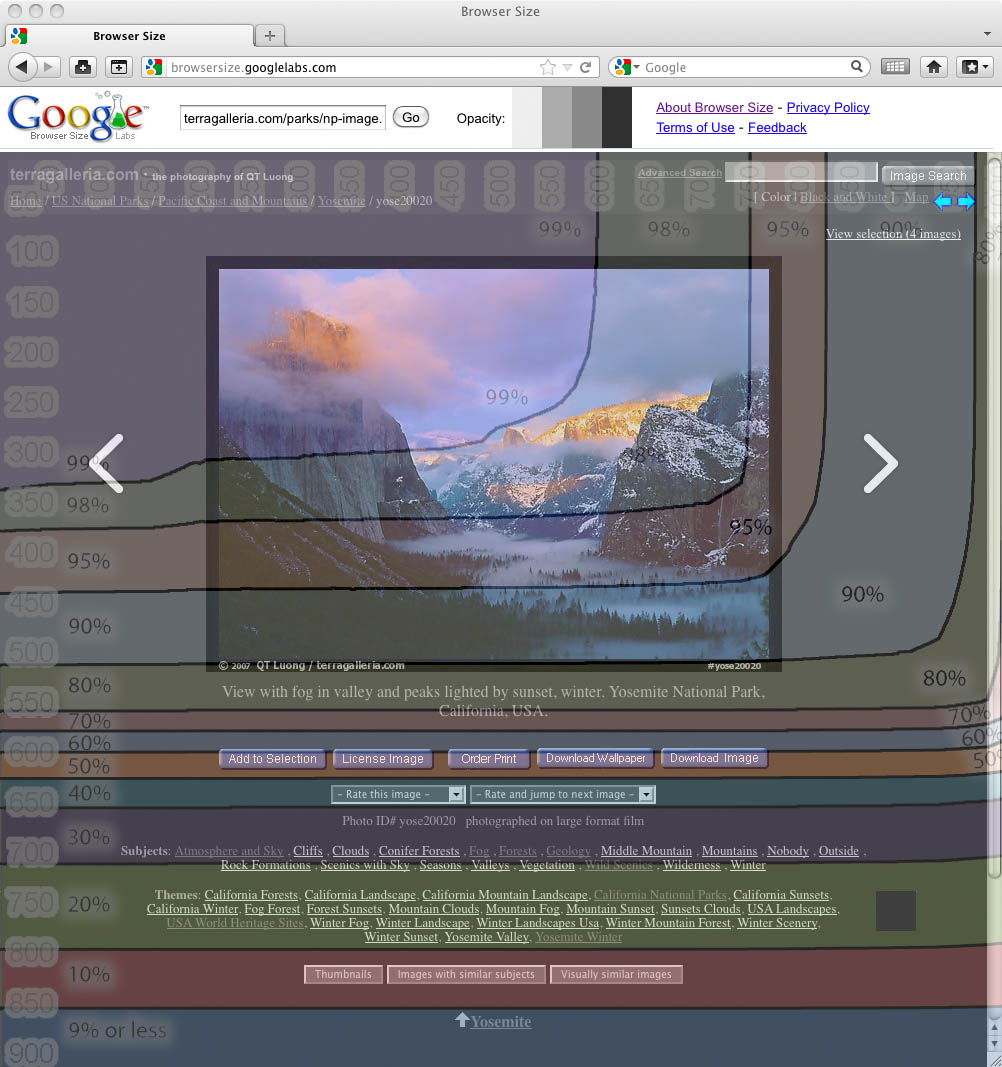
On this screen capture, you can see that in spite of my modest image size (576×416 including the border and watermark) and very economical header, only 70% of users can see the image and caption without scrolling, and only 50% of users can see the “action buttons”.
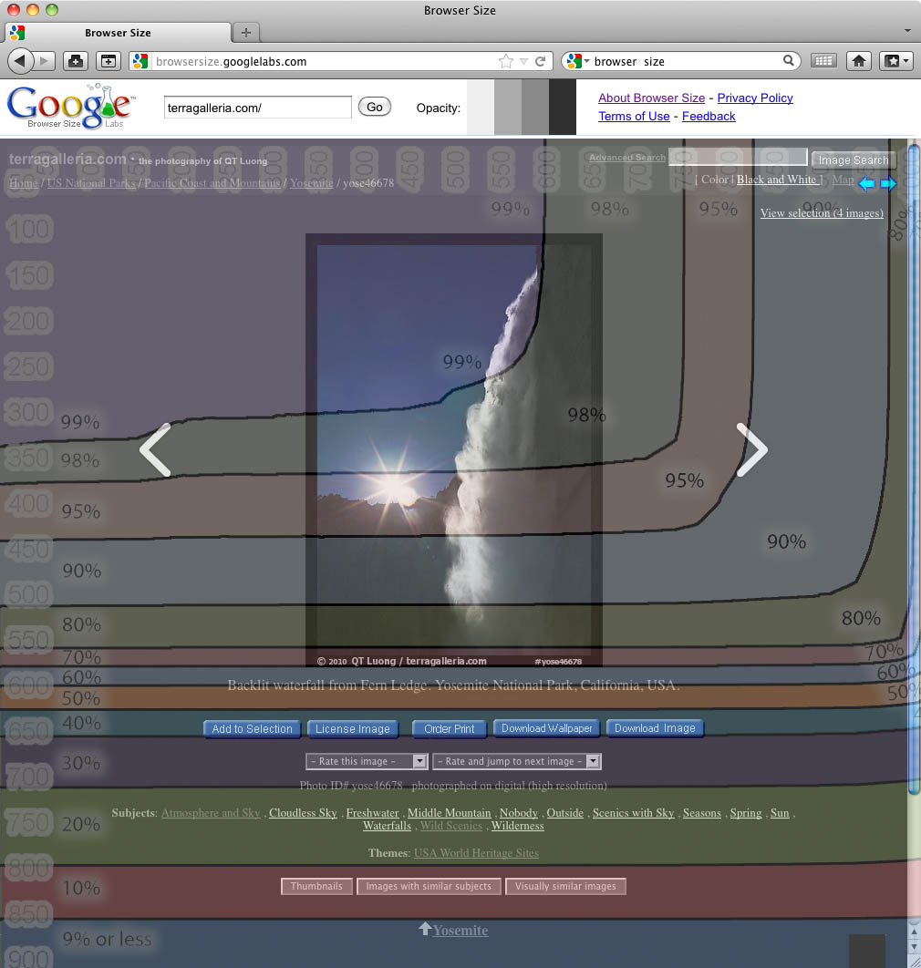
For vertical images, this gets more tight – even though the height of my vertical images is less than the width of my horizontal images. Now only 70% of users can even see the entire image without scrolling, and only 50% of them can see the image and caption. Try it with your website !
The conclusion of this is that modest image sizes would seem to work better for most viewers. In the past ten years that terragalleria.com has been online, I have received numerous emails of appreciation, some even mentioning an eye-opening or life-changing experience – a few have also written in the guestbook how deeply they were moved. Apparently, the fact that my standard web image size is only 4%-10% of the original didn’t get that much in the way of their experience.
Despite them being a minority, I have large screen users covered as well, with a full screen slideshow which uses images designed to fill a 1680×1050 screen with a bit of navigation space. They will available in a non-slideshow display when I update my 10-year old website design. But that is larger than necessary. The Boston Globe has gained a wide acclaim and following for their Big Picture feature (so much that the Atlantic has poached its creator Alan Taylor to run In Focus). Both sites use 1000 pixel wide images. That’s big on the internet for you. The highly praised Google Plus lightbox (and its Facebook promptly deployed copy) displays images smaller than that.
The only reasons users would want bigger would not be for sharing, but rather personal use. The two primary uses I can see are making prints and displaying on a big screen (computer monitor or TV). In spite of some trying to dance around the subject, my opinion is that if you offer limited edition prints, out of respect for your collectors – not to mention laws – you cannot allow everyone to make their own prints. Some photographers may think that there is no market for computer wallpapers, and instead chose to give them freely, but there are quite a few companies that are in the business of selling screensavers. By just selling wallpaper image downloads, Ryan Bliss has been able to support his family for more than a decade.
I respect photographers who choose to grant free personal use of their high-resolution files, but I have the feeling that most of them do not support themselves primarily through the sale and licensing of their photographs. Despite the “free for all” culture, I think most people understand that it is reasonable for someone who does so to charge for higher-resolution files. Hence it is unnecessarily – and counterproductive if you are trying to make a living at it- to give them away.
What do you think ? What is your standard image size for sharing on the internet ?


It’s sound like you’re talking about Trey Ratcliffe. Yeah he opened up quite the little firestorm with that one. But a lot of his income is derived from e-books and the magic voodoo he sells. Big images is his thing, and that’s ok if it works for him. Unfortunately some of have viewed his opinions as gospel, and that’s where the arguments start.
Some ‘togs just haven’t realized that’s it’s “ok” to do what fits your own needs or business model. For instance, there are still some wedding photographers that keep the lock down on high res digital files of the wedding gig. What the heck for? In most cases I have run into, wedding clients will not sign a release for stock, so what the heck are you going to do with the images? Hope Aunt Tillie comes along and buys a 4×6 print on Smugmug? At what point does the value of your time spent custom cropping and sizing outweigh the value of the sometimes small revenue you may gain from family prints? When I did weddings I priced large files into the package. In one case, I shot a wedding for another photog and even included the Raw files he wanted. There comes a time to realize that certain models are changing, and some wedding clients just don’t give a hoot about prints or albums. The difference for wedding photographers comes in service and the ability to capture the day.
QT,
I’ve been around this bush a lot, both in the design side of a website and attempting to create a functional user interface that meets many different user-end demands. For me it depends on what platform, and to whom one is sharing. The image overly screenshots that represent collective % of screen size by users do not break those users down into types. So, for example, stock photo buyers, photo researchers and designers tend to have larger monitors. They are often the paying portion and not just the casual browser/viewer.
I ended up with a conservative photo size for my website previews, and then had a custom “comp” link for users to access a 1200px file if they were logged in and given privileges. As for the social network world of photo sharing, I’ve yet to see it really materialize in an economic platform, and seems heavily weighted to casual viewing and sharing. And I doubt much photo commerce happens on mobile devices, although I don’t have statistics on that. I guess it comes down to who is your primary audience and market. It is so tough to design for everyone, although it is getting a lot easier these days. Thanks for a great write up on this subject, your posts are always thoughtful and comprehensive.
There are a few other very popular folks who post full size as well.
Patrick, you are probably right that many professional photo buyers use larger screens. I think that’s the primary reason why “portfolio sites” are often done using Flash, because this allows for screen-filling viewing. Of course I don’t care for Flash for reasons mentioned in http://terragalleria.com/blog/2011/12/20/seo-thoughts-from-a-top-ranked-photographer/ – much the same way as a commercial photographer shouldn’t probably care about SEO. These days, business comes from a much larger base than professional photo buyers. For my new design, I am leaning towards giving everybody access to an alternative 1000px file (still thinking about the best way to do it), because I am afraid that many wouldn’t care to register.
If you go to a stock website like Getty, the images are actually similarly sized (the one I looked at was 515×333). This is also true for most other stock sites as well (at least the ones I have seen). I imagine for customers that sign in / register they will provide a higher-res version without the watermark for use in comps.
Stephen, maybe this has changed, but last time I checked, a few years ago, registered users got just the same size, but without watermarks. Speaking of Getty, it’s interesting that they changed their watermarking system just recently, bringing it in line with my long-time practice of providing URL, image ID, and author.