William Neill’s Yosemite – App and ebook review
4 Comments

William Neill‘s exquisite portfolio of Yosemite photographs, “Yosemite: The Promise of Wildness” became my favorite Yosemite picture book upon publication in 1994, one year after my arrival in California. It has remained so until today (even though I have my own) to the point that the spine has begun to separate.
There are many scenes of detail where the well-known sensitivity to texture, form, and color of William Neill shines, but also grander views captured with the exceptional light that only a local resident can witness – William Neill has lived continuously in the Yosemite area since 1977. If you don’t own a copy of this work, and you have any interest in nature landscape photography, you should consider acquiring one. But under which form ?
I am a photobook collector and love the physical object. However, when I read that Richard Benson recently said “Forget about [print]. Everything that is happening now in the digital realm is better.”, I had to pay attention. You see, Richard Benson is possibly the most knowledgeable authority about photographic printing (see my review of The Printed Picture).
Since the Yosemite work of William Neill’s has been so inspirational to me, I was particularly happy to be given the opportunity to look at its new digital incarnations, in the form of a new iPad App and a relatively recent PDF e-book. Their prices are much lower than the book, making them an excellent value.
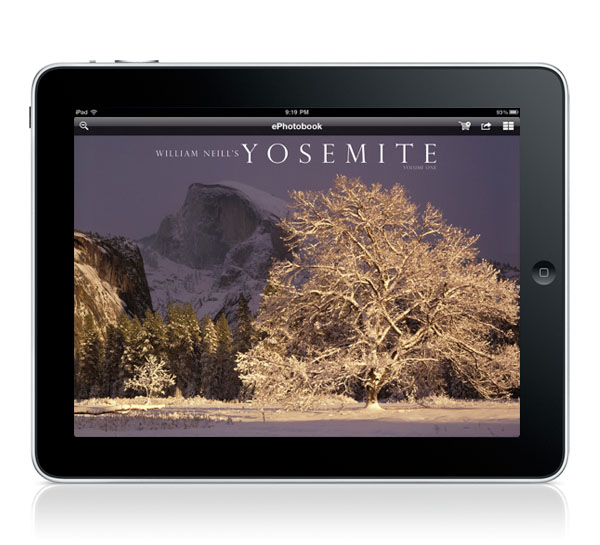
Both electronic versions feature the same contents. There are now just 52 images, some of which were not in the book. This includes very evocative images that I was glad to discover, since I had not seen them before. Since the book had 70 images, a new volume is be expected (this one is called Yosemite Volume 1 !). Each image comes with an insightful comment, which has been expended and now includes a location note precise enough for someone to find the picture spot in many cases – with a bit of work.
The App design, done by Jim Goldstein– who besides being a talented and versatile photographer is also a mobile app consultant – is simple and functional. The images fill the screen, with the aid of a rotation for verticals. You swipe horizontally to move from one image to another, vertically to read the comments, tap to hide them. This is clearly easier than going to the final pages of the book to look for comments. You have the possibility to view images without the distraction of text (like in some art books which don’t even include a single word), while retaining easy access to information. In addition, the images are provided at a higher resolution (HD: 1920 pix) than the screen size, so that you can zoom to view details with the usual pinch. The larger images cause a tiny delay when moving from one image to another, but this is hardly noticeable. What is more noticeable to my eye is a possible color management problem, as I have noticed that the colors are less vivid on the App than both in the book and PDF – it looks like there is not enough red. This is subtle, someone who is not a printmaker may not notice it, and it wouldn’t detract from the images for those who have not seen them before.
I was surprised to see the PDF work that well for switching between full-size images and comments. There is one section for each of them. When you click on the full-size image, you jump sections and go to the corresponding comment page, and vice-versa. When used with a good PDF reader on the iPad (I like Goodreader), the operation is as intuitive as with the App. This is so far one of the PDF with the best navigation I have seen (better than previous ones by William Neill too).
The main difference between the App and the PDF is that the PDF is designed like a book, while the App works like a native photo album. We are comparing here a mixed presentation, simulating a printed page on digital media, versus a purely digital presentation. Like on the printed page, there is a roomy white border around the images with the PDF, and even a page number. An advantage of the PDF is that it can be seen on many different devices. While the layout works very well on a large computer screen – which takes advantage of the high-resolution of the images (1500 px), the images appear a bit small on the iPad. Maybe because the iPad itself looks like a black frame and mat, I felt that the white space in the PDF did not help the images unless used in the dark.
With the digital versions, and in particular the iPad, I miss the high resolution of the printed page – most of William Neill’s early Yosemite work was done with a 4×5 camera. However, this is made up for by the contrast of the images. It is a simple matter of physics that an image on a transmissive medium (screen) always offer more contrast range than an image on on a reflective medium (paper), presenting therefore a wider range of tones. Then, there is the portability of the digital medium. I can leave “William Neill’s Yosemite” permanently on the iPad, together with the other PDFs of William Neill (equally fascinating) and enjoy the images in a wide range of conditions, whenever I need a bit of the regenerative power of nature. I hope that this new nice presentation of enduring and outstanding images together with interesting words, updated for the digital age, will bring a new generation of viewers to William Neill’s great photography.


Great review, QT. I too own Bill’s Yosemite book and it is one of my favorites. As nice as the digital medium is, I still don’t see myself not purchasing photo books. Photo books are great. The experience cannot be compared.
QT Thanks for the thoughtful review. I appreciate the perspective in comparing the PDF and iPad version of the eBook.
Just reviewing this myself and from a long comparison I think that it’s the iPad that might be correct, not the PDF or William’s website. Particularly images such as the lilies which shown green casts in the clouds and also the Aspens where the PDF and website show mucky greens and cyanic birch. Love the book though and a great review you’ve made.
Richard Benson’s position in the photographic heirarchy not withstanding I still love the smell of ink, the texture of paper and the presentation of the print….not to overlook the tactile joy of turning the pages while relaxing by the fireplace.
And while I have an iPad and enjoy some photographic “books” on the device I worry about those people brought up soley in the digital era who actually shun books and laugh nervously when confronted with …err, dare I say it aloud…”pay-puh”.
And already paper and even digital-media such as DVD’s are becoming unavailable: for example one of my favorites was “Lenswork” magazine and the extended versions on DVD. Now to save money but allegedly to “answer the needs of our audience” they will only offer their goods as a downloads. And LumiLandscape also only offers downloads “in order to save the planet resources”. So for a few pennies extra profit the Customer simply sees the image until it rots away into digital oblivion.
But that is OK….I have over 10,000 books and that should see me safely out of this tunnel.
Cheers All,
Bob