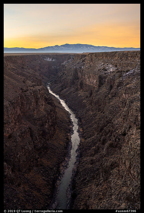
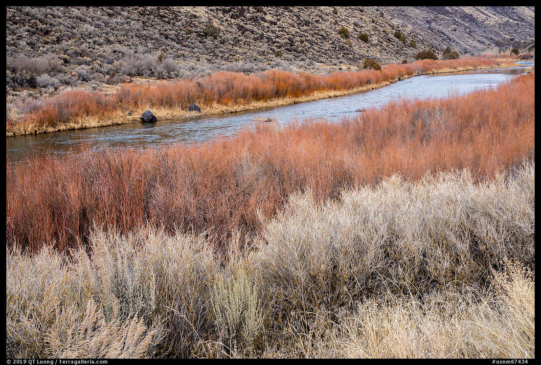
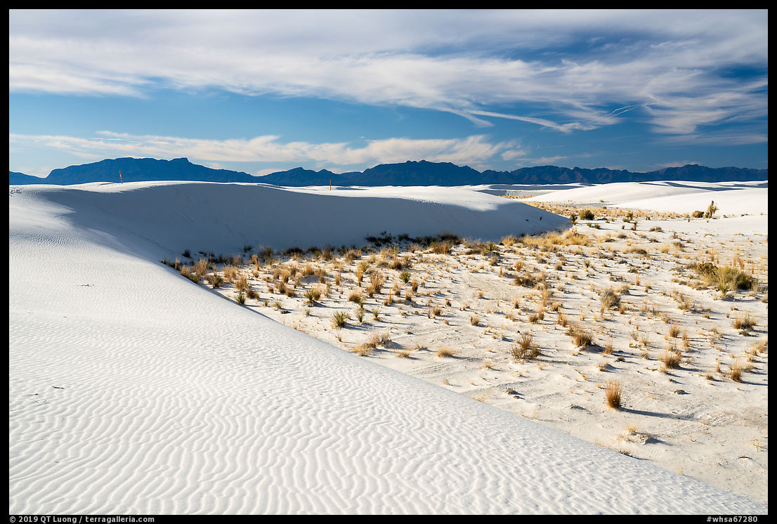
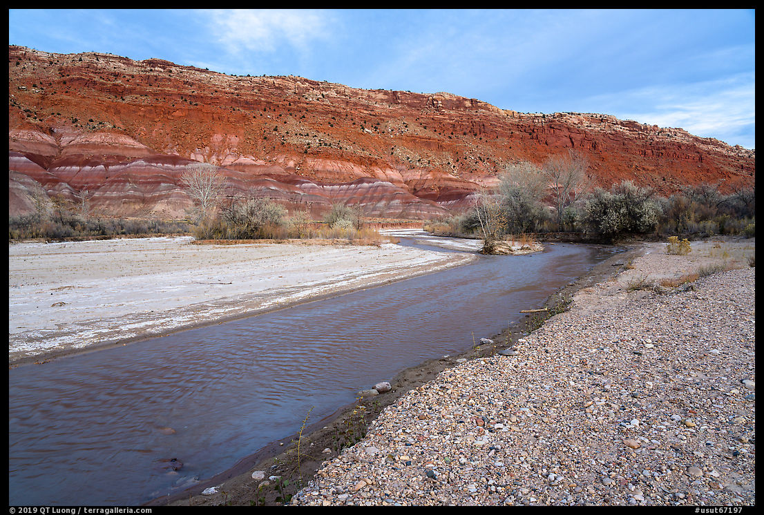
My car
wrecked last September was a Impreza, the most fuel-efficient Subaru. I replaced it with a Toyota Prius Prime. Read about the reasoning behind my choice, and how it worked for an adventurous road trip in the West during which I camped in the car, spent much time driving backcountry unpaved roads and had to deal with a flat tire.
Environmental impacts
I had been driving Subarus for over twenty years. Since I appreciated
their AWD handling combined with decent fuel economy, my first instinct was to buy another one.
Compared to 4WD trucks such as the Toyota 4Runner (mpg city/hwy 16/19) they
have a significantly better fuel economy (typically 26/33), yet get you to most places.
However, just a few weeks before the crash,
a post by photographer Stephen Bay made a strong impression on me.
He pointed out to an eye-opening number: burning a gallon of gas results in 25 lbs of CO2
2 – a primary climate-change agent.
To put that fully in perspective, it means that if you drive a car with a fuel economy of 25 mpg,
each mile results in a volume of 8.5 cubic feet (64 gallons) CO2
2. Given Galen Rowell’s environmental
advocacy, his choice of a Chevy Suburban had always vaguely perplexed me, but the numbers seem to make the concern more concrete.
Stephen’s prescription was to travel less. Indeed, after a lifetime of
photographing around the globe, Paul Strand decided to concentrate on
the beauty of his own garden, creating a body of work that was eventually curated
by Joel Meyerowitz into the book The Garden at Orgeval. It
opens with the quote
The artist’s world is limitless. I can be found
anywhere, far from where he lives or a few feet away. It is always on
his doorstep.
It is possible that I will end up following Strand’s
footsteps, but frankly, I am not at that stage yet. The diversity of the natural world is
what inspired me to embark on a journey that resulted in a full-time career in photography.
I still have a few destination-based projects that I hope can make a positive contribution.
Thinking only of impact, nobody would have children. Each of us deserves to seek our happiness, including going places, but we have to do our reasonable best considering our circumstances to limit our impact. Given the
high impact of SUVs, I wondered if I even needed a Subaru or if I could make a few more compromises in convenience.
Prius Prime as the cleanest vehicle
My quest for the most fuel-efficient vehicle in the U.S. (*) led me to the Toyota
Prius Prime, which is the plug-in version of the venerable Prius.
The Prius first went on sale in 1997, and I find it surprising that two
decades later, it still has not been surpassed in terms of fuel
economy and emissions. Wait a minute, emissions? Don’t modern EVs produce zero emissions, unlike the Prius in long-range use?
The catch is that in the U.S., only about 15% of electricity is
generated from zero-emission sources (including nuclear), while 85% is generated by burning fossil fuels, so when driving an
EV you end up using indirectly fossil fuels. And a lot of it, because burning
fossil fuels to generate electricity has only an average efficiency of about 35%, the rest is lost as heat due to various thermal, mechanical, and electric limitations. Then there is an additional loss of 10% in transmission lines. This means that for each kWh of electricity
delivered to the customer, you have to burn (1/.35) * (1/.90) * 0.85 = 2.7 kWh worth of fossil fuels.
Tesla is the EV leader. Their smallest car is the Model 3, which is the most efficient of all EVs. It consumes 26 KWh for 100 miles. Therefore,
it indirectly burns 0.26 * 2.7 = 0.702 kWh per mile in fossil fuels. The Prius Prime gets (at least)
54 miles per gallon in hybrid mode. If we assume that the energy content of gasoline is 36 kWh/gallon,
then the fossil fuel energy burned by the Prius Prime is 36 / 54 = 0.666 kWh per mile, actually less than the Tesla.
This seat of the pants calculation doesn’t attempt to evaluate the
carbon footprint of driving either vehicle – a herculean task, but it does
suggests that in terms of fossil fuels burned, a more efficient gas car can be better than a slightly less efficient EV.
Of course, for practical purposes, there are still not that many charging stations outside of the country’s urban areas. Unlike a pure EV, the Prius Prime can run on gas for a range of 600+ miles just like the Prius.
The Prius Prime adds to the Prius the ability to charge the battery from an electric plug, with an autonomy of 27 miles, which is enough for most of our daily uses in town. In EV mode, the Prime consumes 21 kWh for 100 miles, and
therefore burns 0.21* 2.7 = 0.567 kWh of gas per mile. Running it in EV mode is (0.666 – 0.567) / 0.666 = 15% cleaner than in hybrid mode. This makes the Prius Prime the cleanest mid-size vehicle. The International Energy Agency did a more sophisticated analysis and concluded that of all car categories, including Battery based EV, ICE (Internal Combustion Engine, that is gasoline), Hybrid EV, Plug-in Hybrid EV, and Fuel Cell EV, Plug-in Hybrid EV has the lowest carbon footprint when accounting for all factors. Just as in the last paragraph, they find that a small ICE car beats a larger EV car. The big batteries in an EV car with a reasonable range are quite heavy, to the point that their weight surprisingly surpasses the combination of an ICE engine and smaller batteries in a plug-in hybrid! When you drive the Plug-in hybrid around town on a daily basis, it acts as a EV without having to lug the additional battery weight that would be needed only for longer trips. In addition, the larger the battery, the larger the environmental impact of manufacturing it.
What about the cost to the driver? If we use as a baseline a very high PGE residential electricity rate of $0.20/kWh (twice the national average – our actual rate isn’t easy to evaluate because of the complicated solar contract), the cost for a full charge is 0.2 * 6.7kwh = $1.34. Since a charge gets the same mileage as half a gallon, EV driving is cheaper than hybrid if gas costs more than $2.68/gallon. Those are not huge differences, but it adds up. I was also intrigued by EV driving, and I indeed found out the car to be smoother, quieter and more responsive in EV mode.
(*) The circumstances are vastly different in other countries. Electricity generation produces 40% fewer carbon emissions in the EU than in the US. Examples of factors that account for that difference are that
France gets 90% of their electric power from nuclear and renewable sources. Also, diesel is less expensive than gasoline and available in small cars.
Sleeping in the Prius Prime
One of the first things that I do when considering a new car is to
check if it offers enough room for sleeping. It is a great time saver not to have to find a suitable camping spot and not to have to pitch a tent, also an uncomfortable proposition in windy or rainy weather now that I am in my mid-fifties.
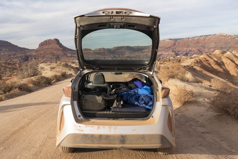
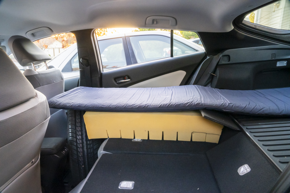
To the amusement of the salesman, I promptly folded the second row of seats and climbed inside the car. After
pushing forward the passenger seat, there was enough space to lay flat
(I am 6 feet), but there were two issues. First, the space behind the
passenger seat had to be filled up to create a long enough surface. As explained in the last paragraph, a spare wheel did
the job. Second, the Prime has a larger battery that adds about 5
inches of height to the cargo floor. When you fold the second row
of seats, they are about 5 inches lower than the cargo space at the rear. My simple
solution is to cut a piece of foam to make up for the difference. After laying a
camping mattress on top, I got a cushy and almost perfectly flat surface.
However, on my first night in the field, I found out that in such a sedan-like low profile vehicle, those 5 inches of lost space are quite significant.
It did not leave much headroom, and it took me a few days to get used to the contortions necessary
to get into bed.
In retrospect, for road trips, I would have preferred the newly
released Prius AWD that has also a bit more cargo space since it doesn’t have the large plug-in battery. However, even if the gains in economy and environmental
impact of aren’t that significant, the Prius Prime is the better vehicle at home, where I nowadays spend most of my time, and the compromises in comfort are still acceptable.
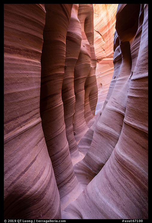
Off pavement driving
In most national parks, you can see all the major sights by driving on
paved roads or dirt roads that are well-graded enough for a regular
vehicle. I have found most roads marked as “high-clearance
recommended” easily driven with a regular car, while most of those
marked as “high clearance required” can be driven with such a car
with care in good conditions.
In his excellent guidebooks,
Laurent Martres rates road difficulty on a scale of 0 to 5, the later reserved for dangerous technical roads. In the past, I had driven several roads rated 3 with a Subaru Legacy, for example, the backcountry roads of Capitol Reef National Park. While AWD provided better handling, it was not necessary. My 1995 Legacy came before Subaru started to steadily increase the ground clearance
of their vehicles. Despite its low 4.7 inches ground clearance, I never got stuck, so
I figured out that the Prius, with 4.9 inches clearance, would serve most of my needs. I could always fly and rent
a more rugged vehicle when needed. Flying in economical ways burns about the equivalent of a 50 mpg car, so contrarily
to some assertions, flying often results in fewer emissions per person than driving.
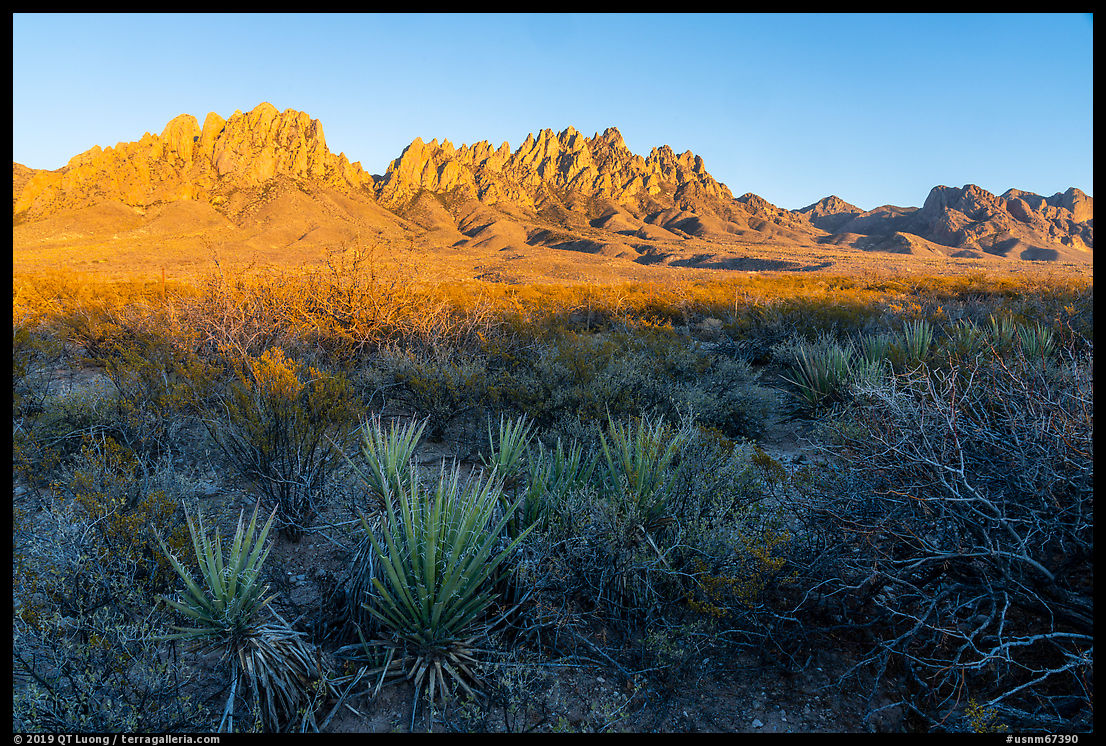
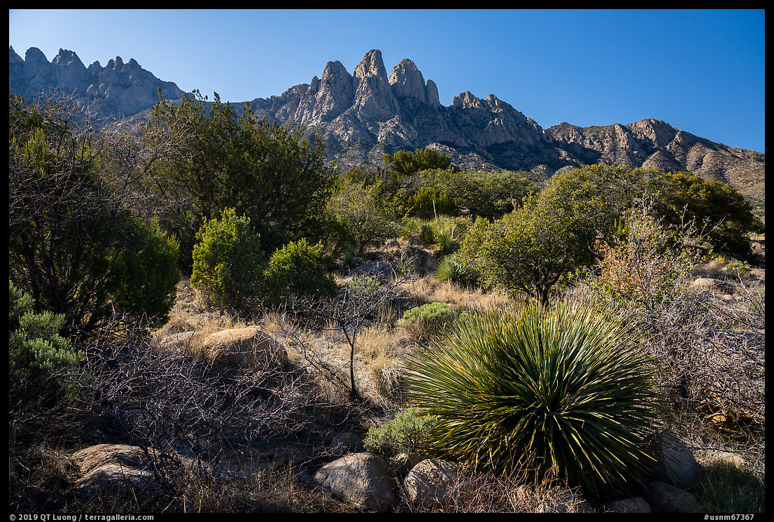
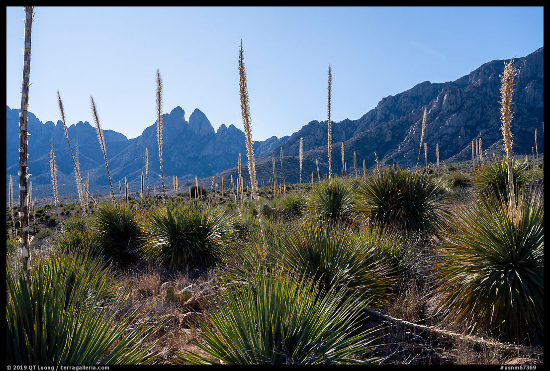
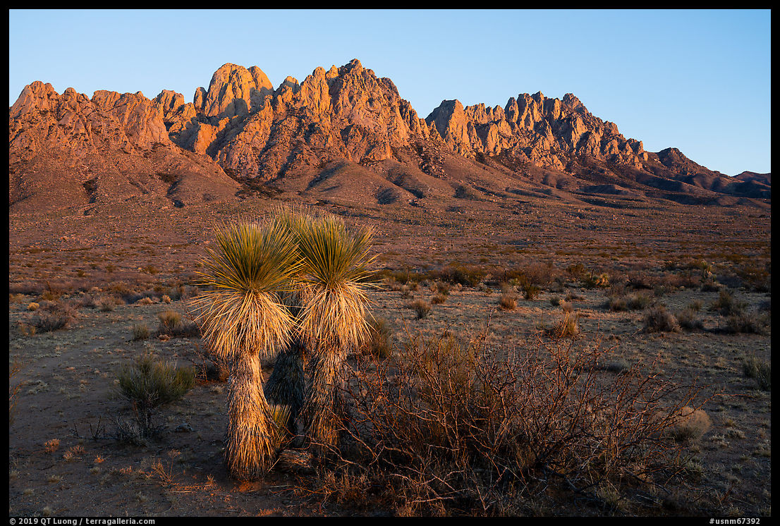
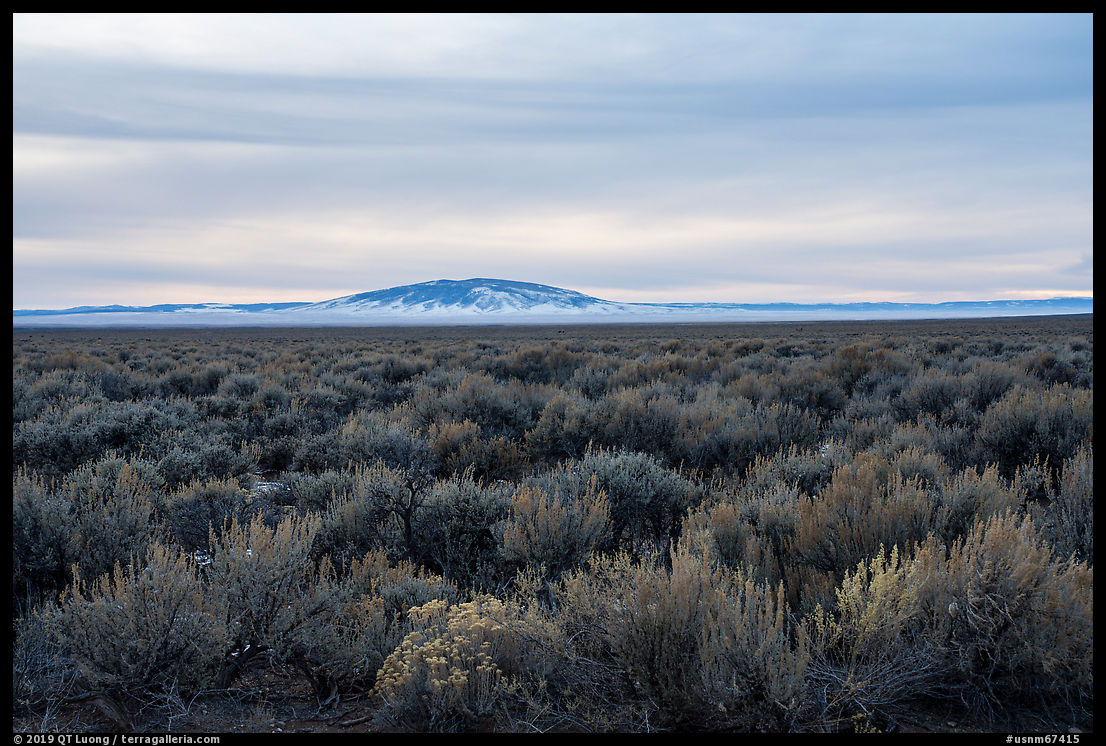
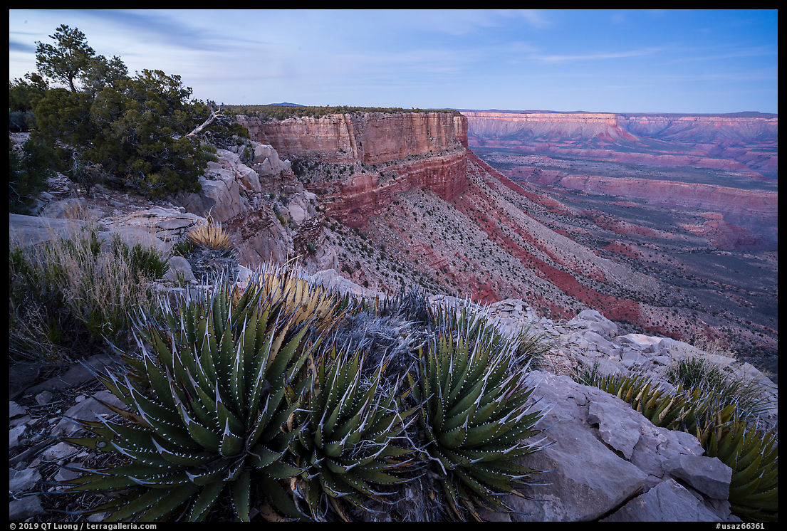
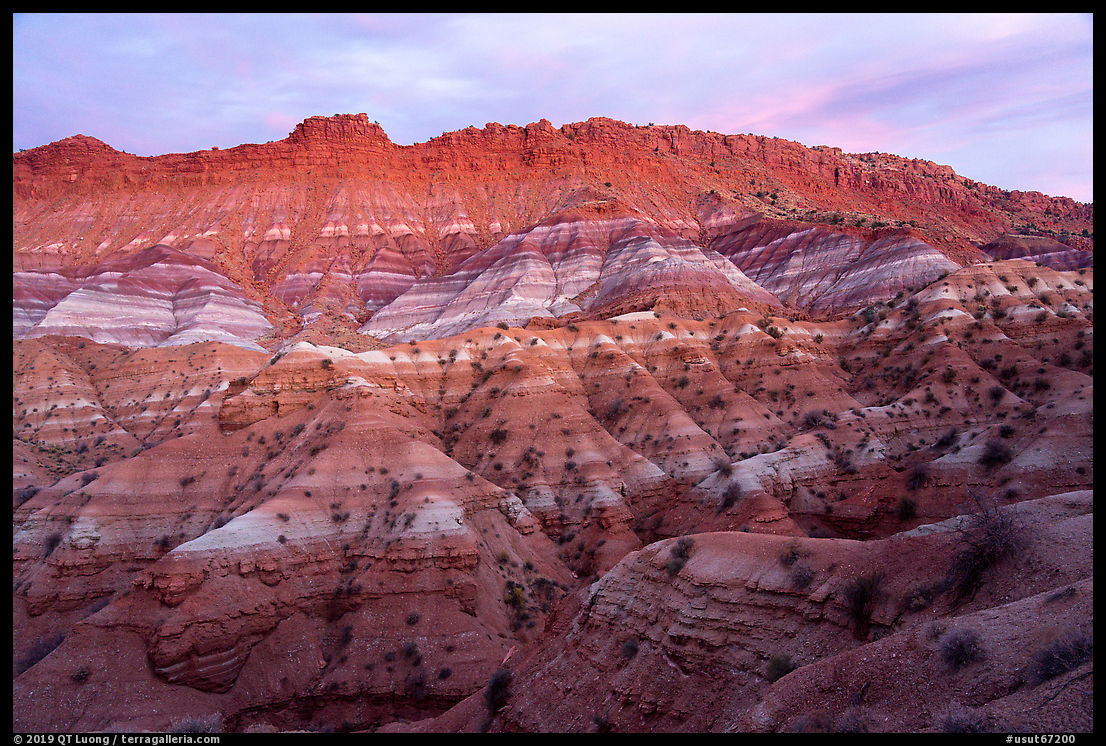
On that maiden road trip, I spent much of my time in little developed national monuments with mostly
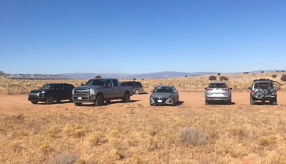
unpaved roads. The least capable vehicles I encountered were Subarus, and nobody drove sedans, let alone Priuses or Teslas common in my neighborhood in San Jose.
I wondered how practical it would be to charge an EV in that area. Since during that trip, I almost always ate while driving to save time, I was glad not to have to deal with detouring and waiting for charges.
In Gold Butte National Monument, everybody else drove a full 4WD, the majority of them Jeeps. The previous spring, when I got to the Glyphs area there with a rented Jeep, the road at first appeared iffy enough that I engaged 4WD.
It turned out that the Prius made it to the trailhead (rated 3).
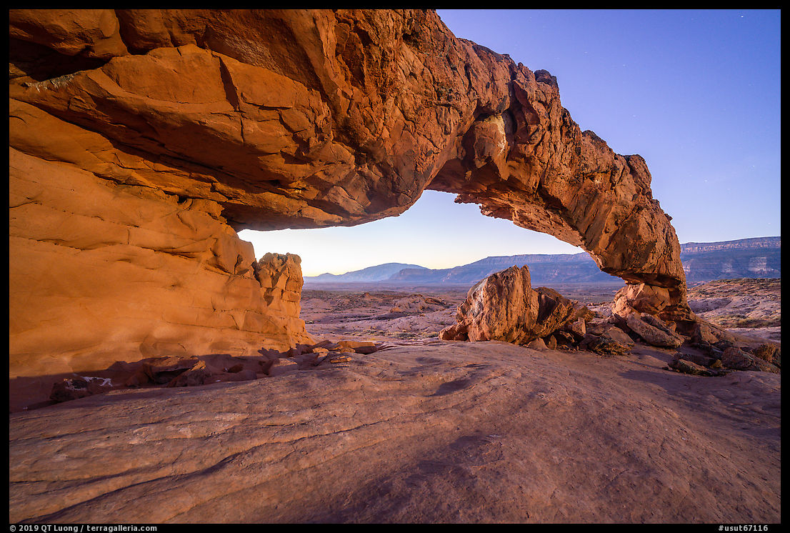
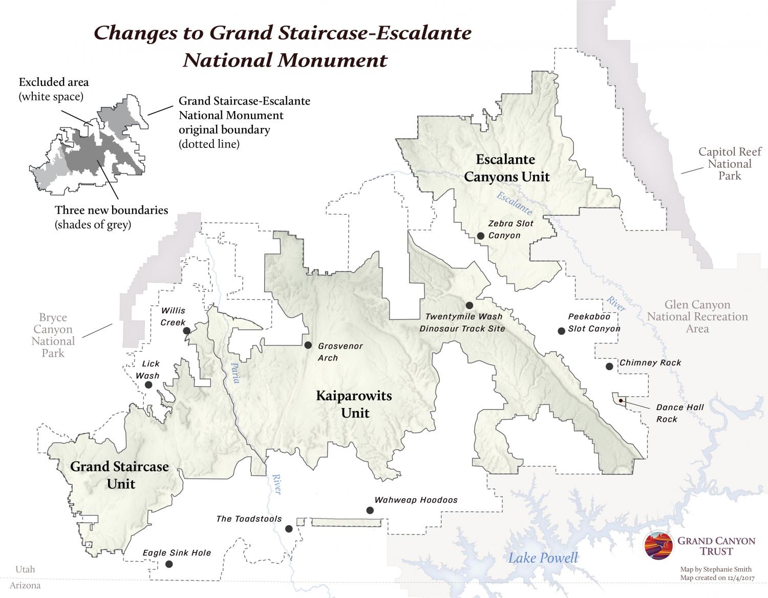
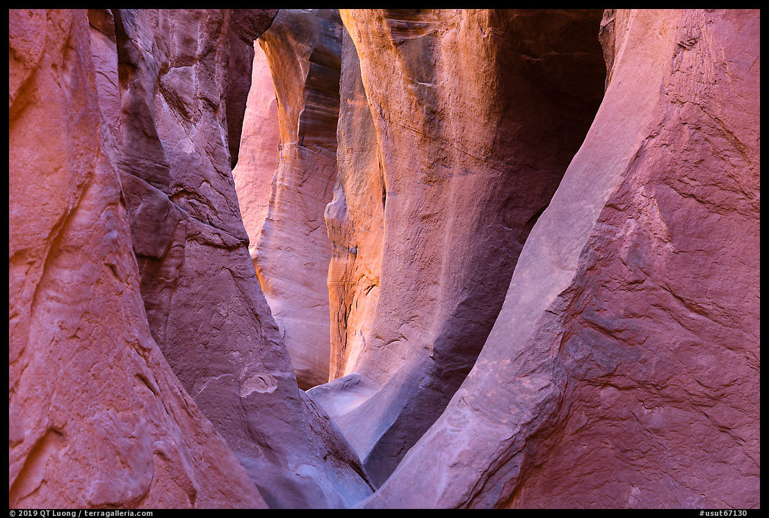
I was more worried on portions of the Hole-in-the-Rock
and branching roads in Grand Staircase-Escalante National Monument (also rated 3). A nerve-wracking moment happened when as I was trying to keep momentum negotiating a sandy curve, an 18 wheeler semi barreled in the opposite direction, seemingly out of nowhere. In the end, although my margin of error was smaller than if I had driven a Subaru, I got to several trailheads where nobody else came, and I did not get stuck. However, it could be that I got too confident and drove a bit too fast to beat the vibrations from the washboard on the way back on Hole-in-the-Rock road.
The spare wheel
A not so recent trend has been to replace the full-size tire with a “donut” spare tire of reduced dimensions.
They provide savings to car manufacturers, and also to drivers in terms of space
and weight. As an illustration of those savings, unlike the 2018 Prius Two, the 2018 Prius Two Eco
did not include a spare tire nor rear windshield wiper. The weight and aerodynamic savings alone resulted
in fuel savings of 3 miles per gallon.
The downside is that a donut tire is designed only to
get you to a repair facility. In remote areas,
that it would do the job is not a given. Most of these tires are good
only for about 70 miles, and their smaller size could be
problematic off the pavement. The time when I came
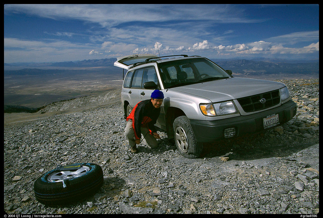
closest to getting suck with a Subaru came on Mount Washington, on the top of a
mountain in a remote corner of Nevada’s Great Basin National Park
where I did not see a single other person for three days. Back in 2003,
the unpaved road to the summit was not even marked on the official national
park map. When I went back to the car after a hike to the
bristlecone pine groves, I found one of the tires was flat. Fortunately, the
2000 Subaru Forester had a full-size spare, and after exchanging the
wheel, I was able to come back to civilization. I doubt a donut would have been enough.
In many cars, the donut is even eliminated altogether and replaced by a “tire repair kit”
consisting essentially of a can of tire goop – its use will ruin the tire sensor and require an expensive repair. On the Prius Prime, and most other plug-in hybrid
cars, this is necessary to make space for a sizeable battery.
The owners I talked to did not have any concern about that.
However, a few days after buying the car, I shopped for a spare wheel, finding a new one on eBay for a third of the price asked by dealerships. It is heavy (45 lbs) and takes quite a bit of room, but fit perfectly and gets out of the way in the space at the back of the passenger seat, a solution that works as long as you do not need the entire
second row of seats.
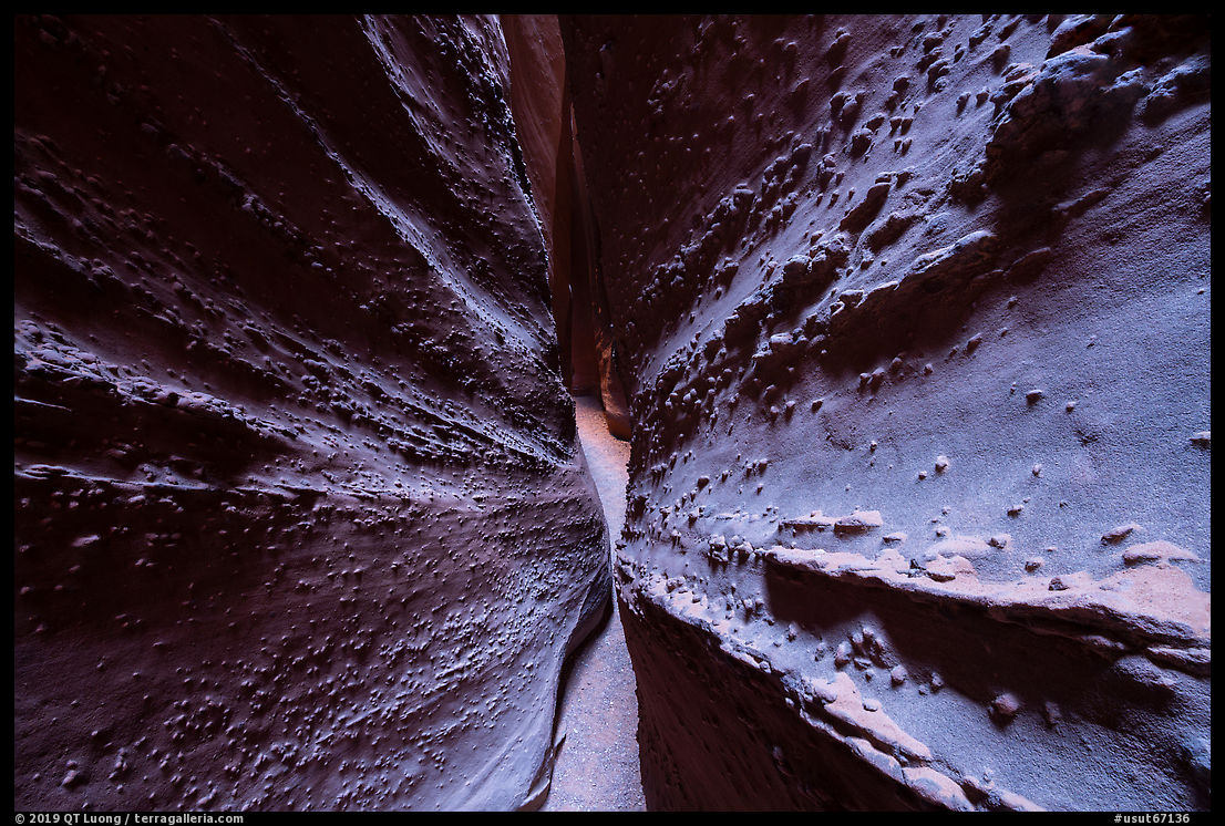
I drove mostly unpaved roads for a week without incidents.
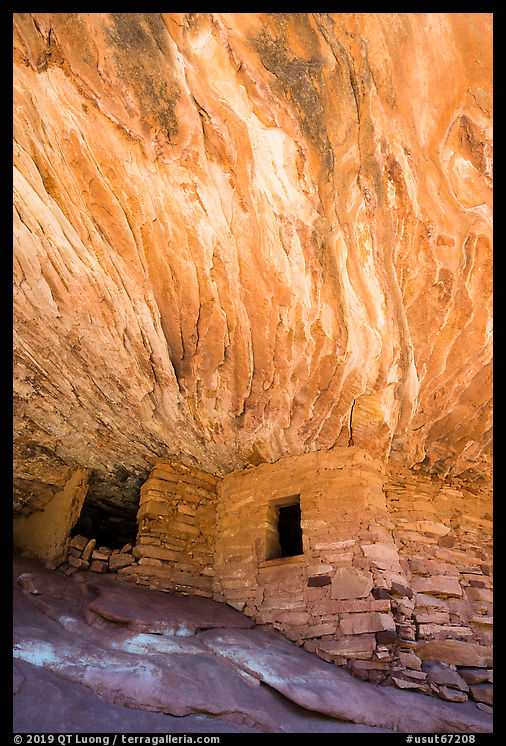
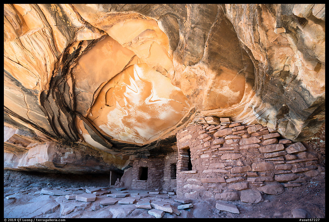
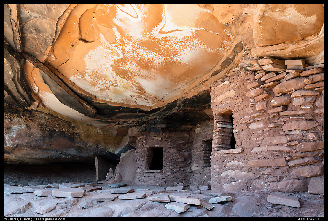
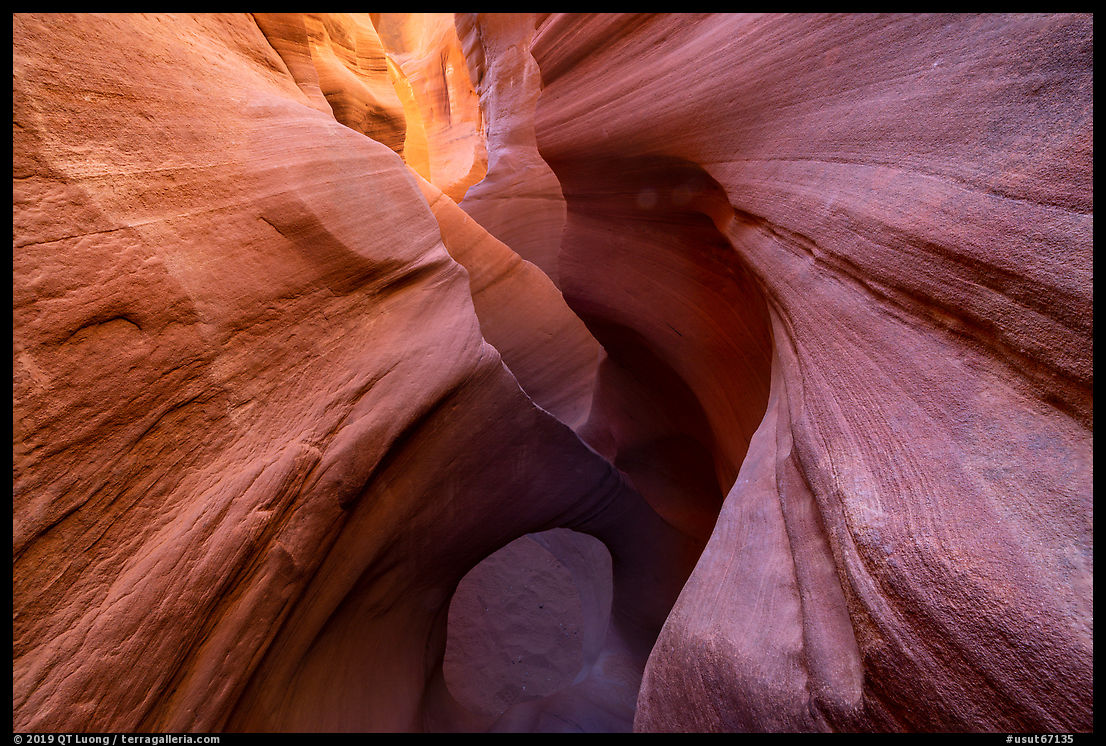
Half an hour after getting back to the pavement from the Hole-in-the-Rock road, I parked at the Escalante River Trailhead. I went looking for the Hundred Handprints at dusk, and photographed them at night.
On the road again on Utah Hwy 12, after less than a half-mile of driving, I recognized the disheartening sound of a flat tire. Since I was not familiar with the car, it took me almost an hour to locate the tools and change the wheel.
I then drove to the Capitol Reef National Park campground. During the entire two hours and half since the tire flat, I didn’t see a single car on the road, nor at any point did I get cellular service. The next morning, when I asked the rangers at the visitor center for the best place to get my tire fixed and possibly replaced, they directed me to Moab, a two hours and half drive. All out of range for a donut tire. The irony is that I was better off with my Prius than I likely would have been with a current Subaru, as they now come with a donut tire in the U.S. – a questionable choice for vehicles marketed as rugged, but one that I might have contented myself with.
Even though the Colorado Plateau is a popular destination, one needs to come prepared, and proper preparation overcomes equipment limitations.
January 2022 update. The Prius Prime has served very well as a family vehicle, as its electric range is enough to cover most of our needs in town, and we are able to use it predominantly as a EV – while having the convenience of gas on longer trips. Over the first 20,000 miles (that included a few road trips), we got 153 mpg. For a vehicle solely oriented towards photo trips, I’d consider something more rugged like the new RAV4 Prime, released 2021, so not available when I bought the Prius Prime. The RAV4 Prime gets 94 MPGe versus 133 MPGe for the Prius Prime, but it has 8.2 inch clearance. I ended up renting a SUV twice and a Jeep once when the Prius wasn’t enough – not a bad solution. If getting a Prius for that use, I would definitively buy the AWD version instead.
Prius Offroad offers a 1.5 inch lift kit for the Prius. 6.4 inch clearance is a significant improvement over 4.9 inch.
March 2024 update. The American Council for an Energy Efficient Economy (ACEEE) finds that the “greenest” 2024 car is the Prius Prime SE in this
study of more than 1,200 vehicle models with Tesla quite far behind.