Physical Book Details
4 Comments
As I prepare for the fifth printing of Treasured Lands, besides revising and adding contents such as White Sands National Park, I am also looking at possible physical changes. One of the things that I love about books is their materiality. In a world where so much has become virtual and mediated by the screen, it is satisfying to hold in your hands a well-made object. “Well made” is in the details, and this article goes through a few of them.
The most important component of a book is the paper it is printed on. Even for books that are made only of words, the way various papers feel on the fingertips makes a difference in reading pleasure. For photography books, the choice of paper is critical. Everything else being equal, a thicker paper will support better printing. If you lay out a lot of ink on a thin paper, it will show through the back of the page. That is generally undesirable unless you have a particular conceptual goal in mind – a recent example that comes to mind is Andres Gonzales’s American Origami where the designer sought a certain level of transparency with the paper. In comparison with two other large illustrated books about the national parks, you will notice that Treasured Lands is quite a bit thicker than the page count would suggest.
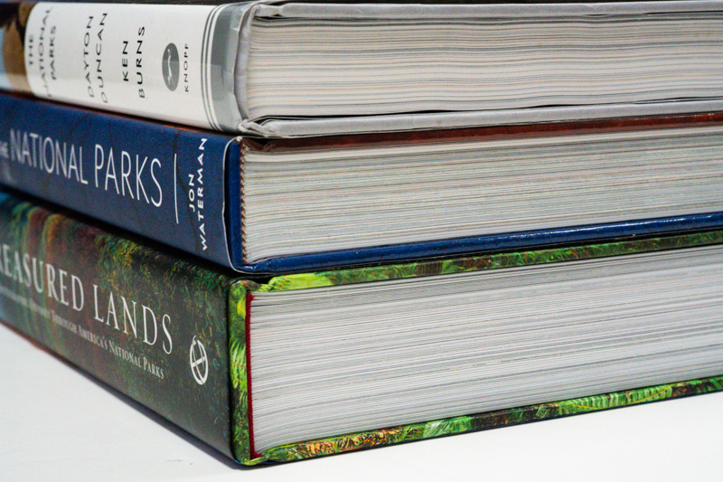
The National Parks: America’s Best Idea , National Geographic Atlas of the National Parks (both 432 pages), Treasured Lands 2nd Ed (480 pages)
A coated paper, although less environment-friendly, will result in darker blacks, which are key to providing depth in images. Paul Caponigro’s images look very different printed in The Wise Silence with a soft matte paper versus Masterworks from 40 years which uses glossy stock. The later is definitively closer to the original prints, but if one considers a book is an interpretation and its own medium, the choice of the former to convey the quiet nature of the work makes sense. However, if the viewer is to see the landscape through the photographs, coated papers are the preferred choice. A glossy finish isn’t the best choice for text nor for borders, so in Treasured Lands, the choice has been to use a heavy matte art paper with gloss varnish applied on the images. This way, images are glossy and the rest in matte. Besides the extra cost, this requires extra work from the publisher, since they need to provide an additional layer to indicate to the printer where to apply gloss varnish. On the other hand, it opens up interesting possibilities. If you have the second edition of Treasured Lands, notice how the pins on the maps jump out.
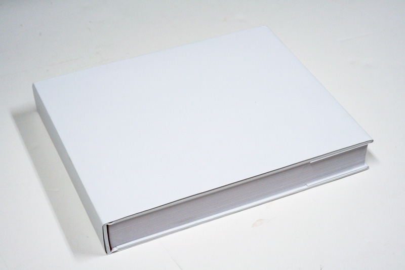
Once materials are picked up, the printer sends the publisher one or several of what is called a “dummy”, which is a blank book made of the selected materials, meant to evaluate the “feel” of the book. Besides the ink, all the physical components of the book are there.
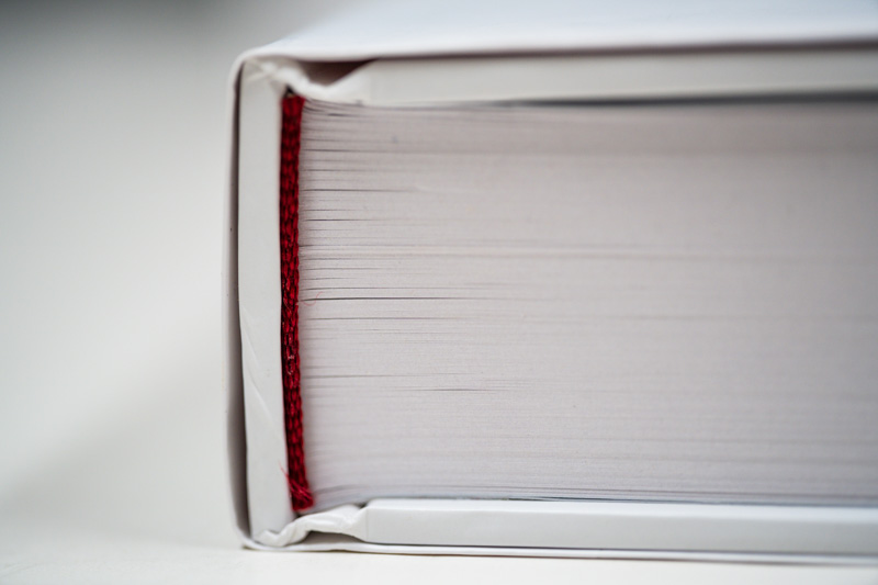
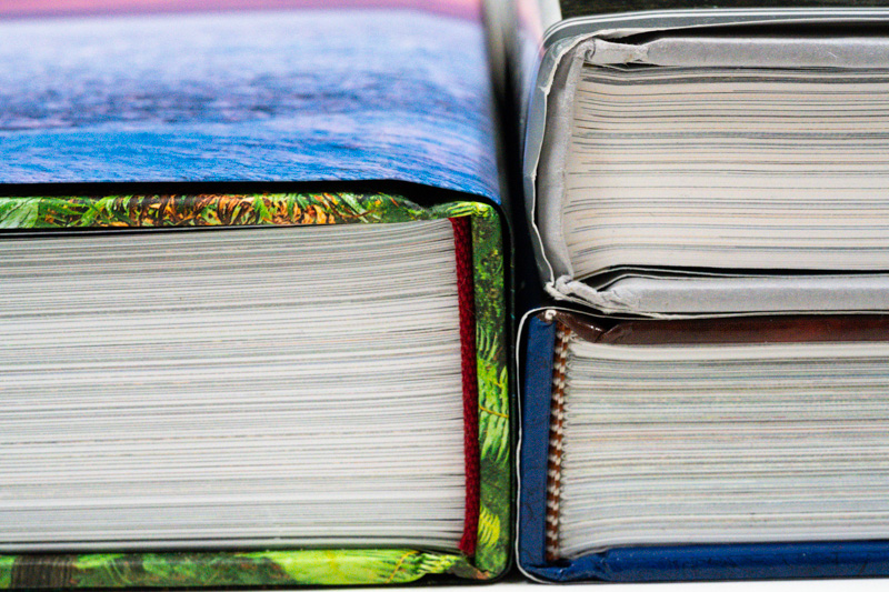
I am reasonably confident that you don’t know what “head and tail bands” are. Before getting into this funny industry of publishing, I had not heard of the term. Although I had amassed close to a thousand photography books, I had not noticed that many of those with hardcovers had one. Head and tail bands are the small strips of cloth at the top and bottom of a hardcover book set against the spine and paper. In a distant past, they were there to hide the imperfect cut of pages. Since nowadays pages are machine-cut rather than hand-cut, they are not really needed anymore. Many trade hardcovers don’t have them. For instance, they are absent from The National Parks: America’s Best Idea. They are there in many photography books because of their decorative role, and the statement they make about the art of the book is important to boutique publishers. The colors of the head and tail bands in Treasured Lands were chosen to match the folds of the jacket, which is normally not apparent. That jacket is larger than the book trim to allow for a “French fold jacket”, where the top and bottom edges are folded underneath for greater strength. By contrast, the two other books use a regular dust jacket.
Despite the 4 stars, one of my favorite of the 200 reviews of Treasured Lands on Amazon is this one:

It underscores that the book, which will exceed 8lbs in its fifth printing due to the choice of improved materials, is of unusual weight. For most people, it will be the biggest book they own, so a strong binding is required. I have avoided to cut images by the gutter, except for the nine panoramic spreads, however having the book open flat still matters since many images are full page. The more pages a book has, the more difficult this is to achieve, and Treasured Lands has close to 500 pages. My printer is offering me two choices:
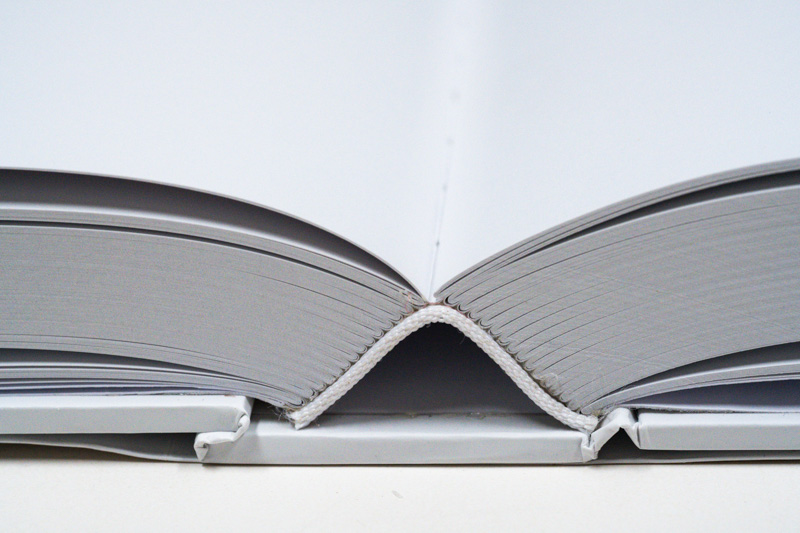
Open spine: results in a book which opens flatter
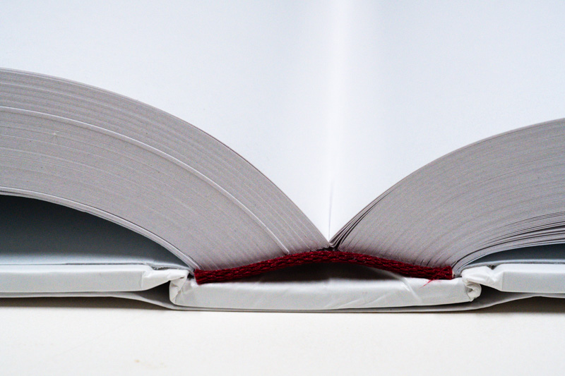
Closed spine: results in a book with a stronger binding
Which would be your preference? If you don’t see the box below, please click here.
I voted for Open Spine because I found when I made 4 books of my own national park photos via Adoramapix, BayPhoto, Mixbook, and Shutterfly, that the “Hinged Paper Pages” offered by BayPhoto (scroll down at https://www.bayphoto.com/books/baybooks/) provide a “lay flat” view of my photos that I believe is very similar to your “Open Spine” photo, and the “Hinged Paper Pages” photo book that I made provides a complete view of each page without having to tilt the book to see the part of the photo (or text) that is closest to the spine. Being able to see the entire photo without manually tilting the book, makes the experience much more enjoyable when flipping thru the book and/or pausing to study an image or read text near the spine. Many photo books like yours are heavy and large (10+ inches in height and/or width). I don’t want to do weight-lifting exercises when tilting your book in order to view your photos and text. I work out at the gym 3 days a week, so lifting your books is not a problem for me, but tilting 1 of your books to see all of each photo (and accompanying text) is not the most conducive way to enjoy your art. Reading the copies of Treasured Lands that I have bought so far (and will buy as you release them) is like touring a high-end art gallery or museum where I want to see and absorb all of each piece of art. My wife and I love Treasured Lands. So far, we’ve visited 35 of the 62 US National Parks and many state parks and BLM areas, and check the details in your book before every trip.
Thank you for your support. I have deemed the next version a new printing rather than a new edition because the additions are limited to White Sands, and I do not think worth “upgrading” if you have already a second edition.
It depends on how many times the book is read. For a few times through, I presume open spine allows one to see the images better. IF one were to leaf through the book many many times, the closed spine might hold lup better. I opt for the value on the first uses. And careful reading if one wants to preserve the book for posterity, whoever that is.
I voted for the closed spine but I want to change it to open spine because seeing the pictures better outweighs the durability. Tough choice but I think open is slightly better. Please change my vote. And yes, your book is the best photobook I have ever owned. Thanks so much for your attention to detail.