Tracing the History of National Park Service Emblems through Visitor Guides
No Comments
https://www.terragalleria.com/blog/tracing-the-history-of-national-park-service-emblems-through-visitor-guides
On the 108th anniversary of the National Park Service (NPS) this article continues my examination of the official NPS visitor guides over the years, focussing this time on one particular element: the NPS emblem. If you haven’t done so, reading the previous installments of this series will provide context.
Part 4 of an on-going series: 1 | 2 | 3 | 4 | 5 | to be continued
Although nowadays the NPS Arrowhead is one of the most recognized and beloved emblems in the U.S., it wasn’t until this century that its use became entirely consistent. It is difficult to trace its appearances on signage and uniforms because little of the outdated versions remain. However, it is still possible to find copies of NPS visitor guides dating from more than a century ago. A close look at them makes it possible to chronicle the history and evolution of the emblems used by the NPS.
1917-1951: DOI emblems
The U.S. Department of the Interior (DOI) was created in 1849. Starting with Yellowstone National Park in 1872, all the national parks have been under the responsibility of the DOI. The National Park Service (NPS) was created in August 25, 2016 as a federal agency within the DOI with the sole mission to manage the national parks. In the years prior to 1916, the visitor guides issued by the DOI for some of those parks did not feature an emblem anywhere. Since there was yet no agency within the DOI responsible for the national parks, they were credited to the “Office of the Secretary”.
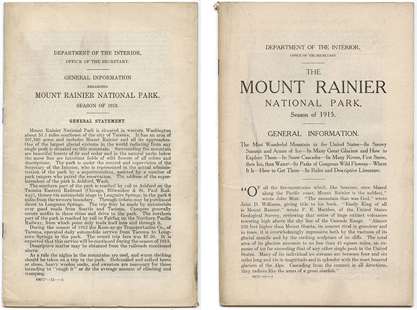
1913 and 1915 visitor guide booklets for Mt Rainier National Park
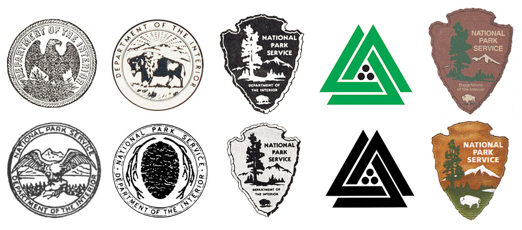
The year of its creation, in 1916, the NPS received its first emblem, a routine eagle perched on a rock with its winds spread wide. As reported in the National Park Portfolio examination, that emblem seems to have appeared in print only in the year 1916, and not on park visitor guides. In 1919, a new NPS emblem consisting of a sequoia cone emerged, as chronicled in Harper’s Ferry Center’s (HFC) article Planting a Seed. Some thought that it didn’t fully represent the scope of the NPS mission. Although it was used on signage and uniforms, its appearance in print was limited to internal NPS newsletters – explicitly marked “Not For Publication”. For the sake of completness, I have shown the two little-used emblems in the bottom left of the opening picture. For its first thirty-six years, the NPS used in its publications the emblem of its parent agency, the U.S. Department of the Interior, rather than its own emblem.
1917 visitor guide booklets with DOI eagle.
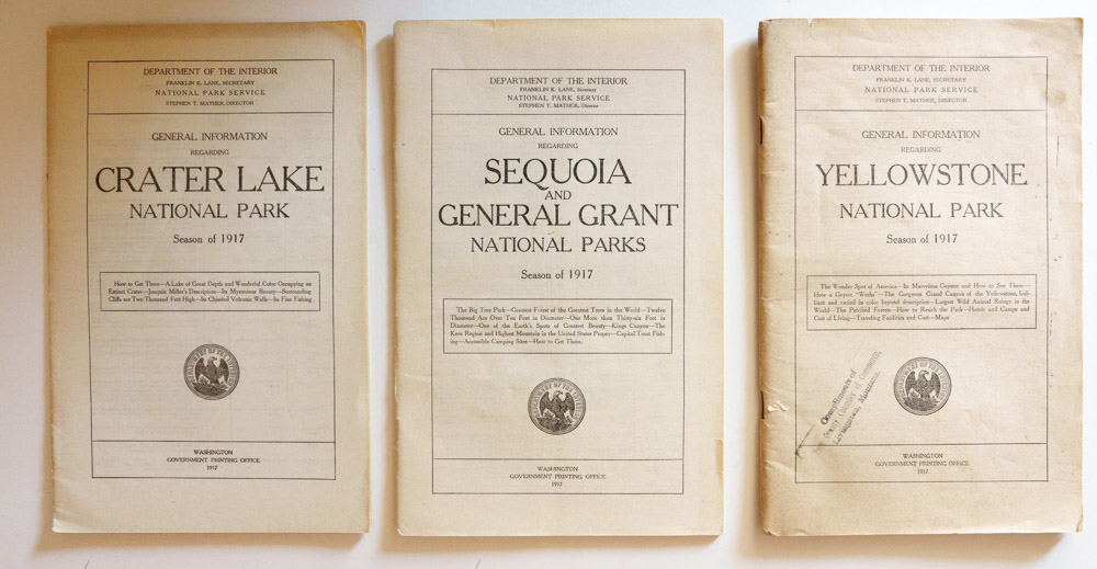
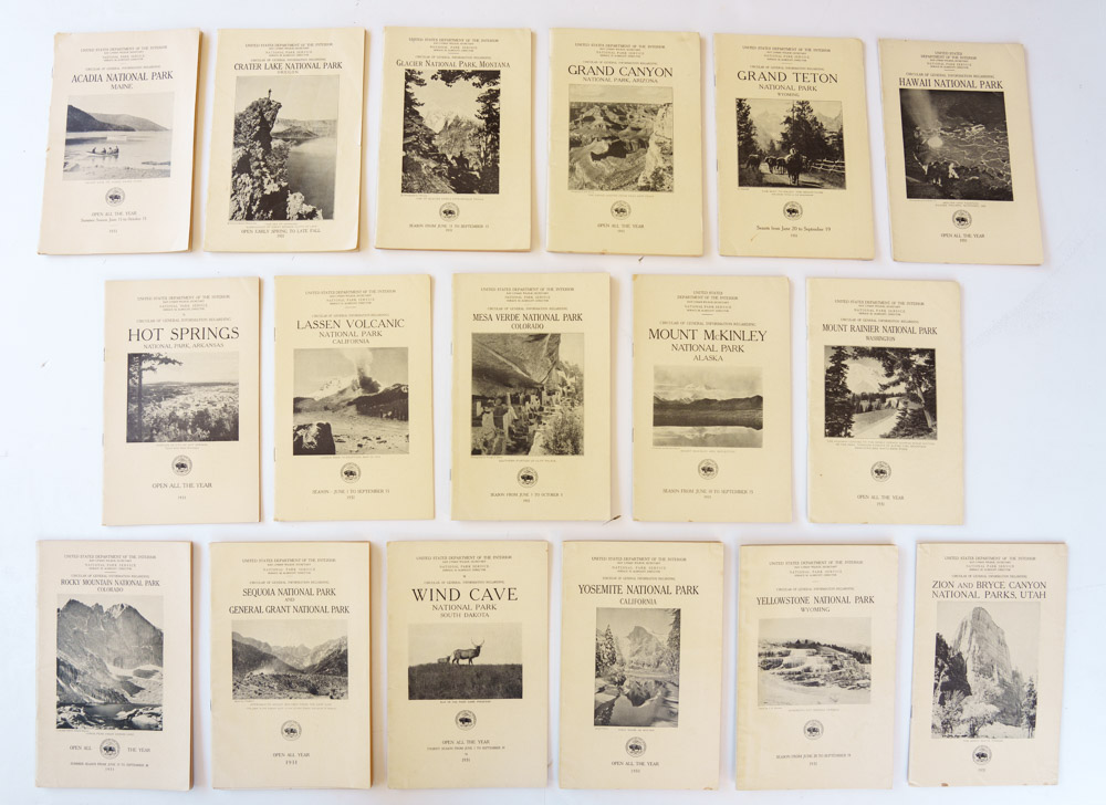
The DOI received its first official seal, an eagle clutching arrows perching on a sheaf of wheat during its first year in 1849. Sometimes in 1917, that trite federal eagle was replaced with a distinctive bison which better symbolized the Department’s western focus. However, the first national park visitor guides issued by the NPS were printed ahead of the season 1917, before the change to the bison. Unlike those that came before, they credited to “Department of the Interior – National Park Service”. There was a booklet each for Yellowstone, Yosemite, Sequoia and General Grant, Mount Rainier, Crater Lake, Wind Cave, Mesa Verde, Glacier, Rocky Mountain National Parks plus the Hot Springs Reservation. The old emblem of the DOI adorned their cover.

1918 and 1920 visitor guide booklets with DOI bison.
The bison appeared on the covers for the 1918 booklets. It disappeared in 1919 to make room for a picture. The exceptions were Wind Cave National Park and Hot Springs Reservation, which were not illustrated with a picture in 1919 and 1920, unlike the others of those year. From the years 1921 to 1929, no emblem appeared on the visitor guides, so we cannot see there that between 1923 and 1929, another eagle had replaced the bison, which was restored in 1930 (source). That year, below the picture, the new emblem of the DOI with the bison adorned a few covers – the others were probably printed in 1929. In 1931, it was reproduced on all the covers except Crater Lake National Park. In 1932, it was removed from the covers of the Glacier and Zion National Parks booklets but stayed on the others. Novelty seems to have been a factor in its prominent placement.
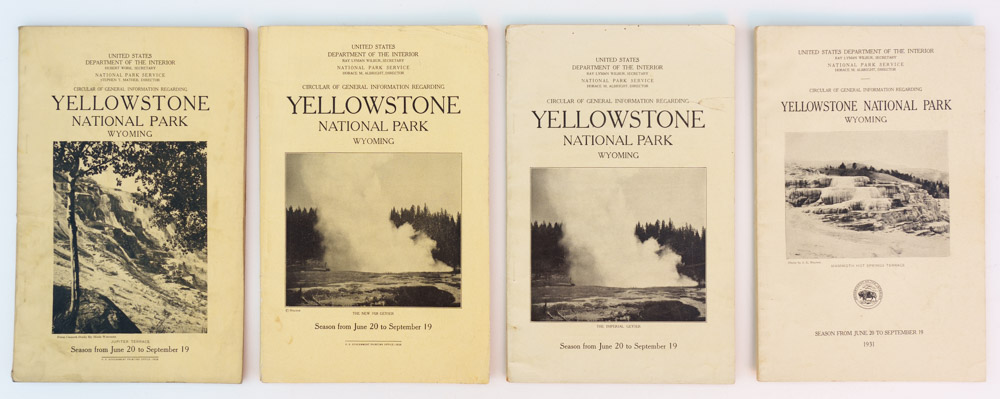
Visitor guide booklets “Circular of General Information regarding Yellowstone National Park” from 1928 to 1931. Notice the caption “The New 2028 Geyser” in 1929 and “The Imperial Geyser” in 1920.
Complete set of visitor guide booklets for 1931.
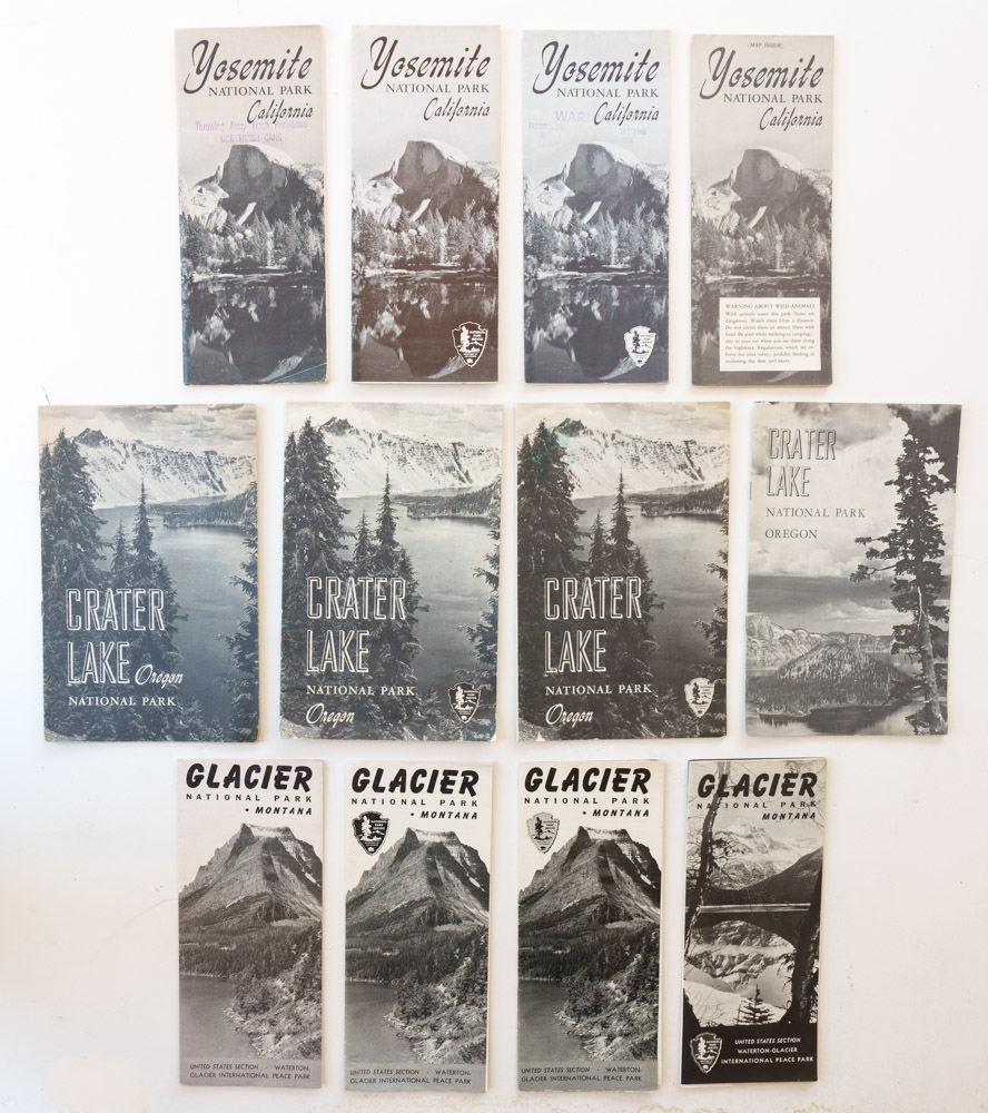
In the standardized booklet designs from 1933 to 1942, the DOI emblem was removed from all the covers (shown here) but was dutifully featured on the first inside page of each visitor guide. In the previous installment, I noted that in the 1940s, some parks replaced the standard booklet format with a folding brochure format. This started with the newly established Great Smoky Mountains National Park in 1940. In 1941, Yellowstone National Park and the newly established Mammoth Cave followed. In 1942, four more national parks (Sequoia & Kings Canyon, Glacier, Rocky Mountain, and Lassen Volcanic National Parks) made the change. In 1945, a year when very few new visitor guides were issued, Isle Royale National Park joined them. In this new standardized format, the DOI emblem reappeared on the cover.
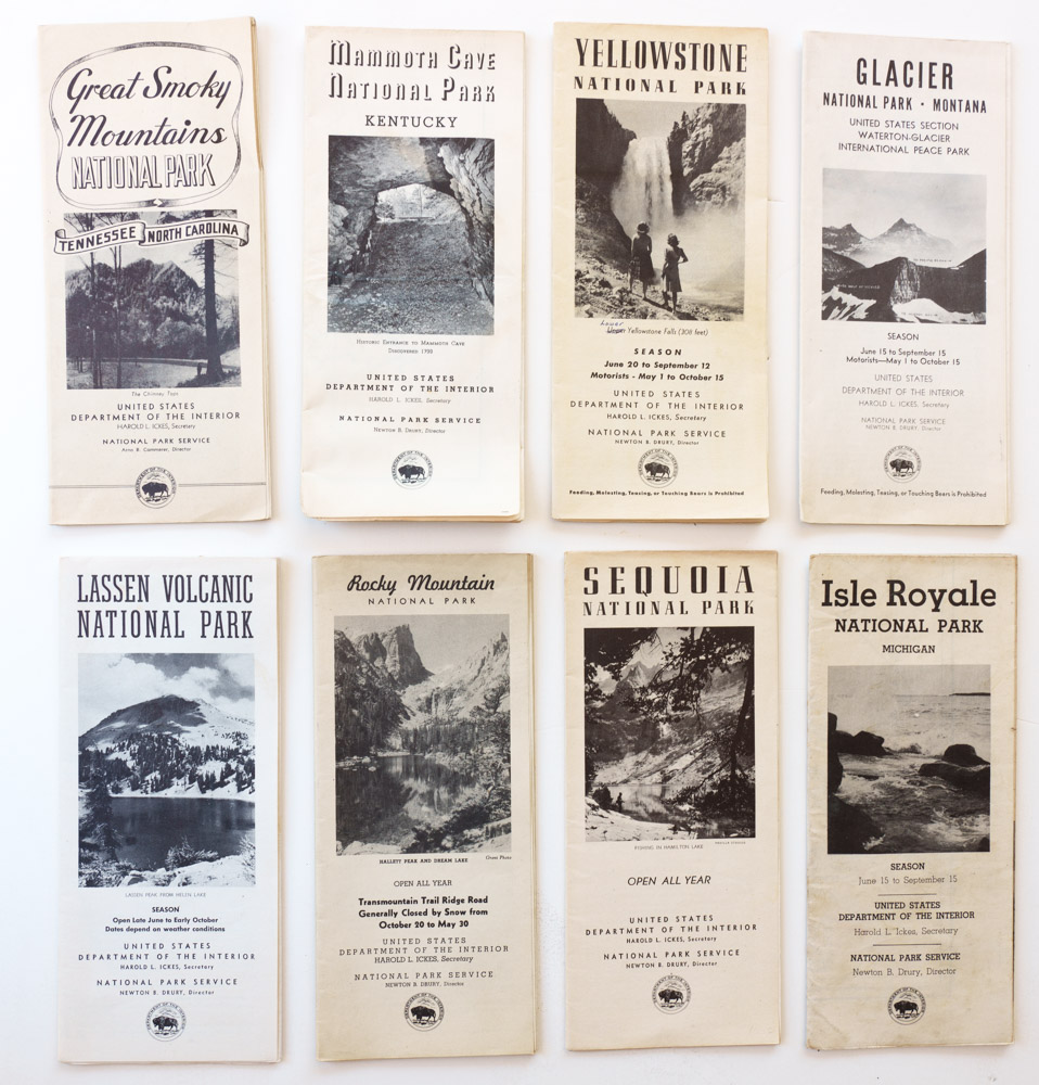
Visitor guide folding brochures from the early 1940s.
Past World War II, when no uniform design standards were in use, visitor guides no longer featured the DOI emblem on their covers, except Sequoia & Kings Canyon, Shenandoah, Great Smoky Mountains, and Everglades National Parks where it lingered until 1956. Compared to the previous years, the latest emblem which appeared in 1950 added letters with the founding date of the department, March 3, 1849. There were also differences in the way the bison was drawn. However, by the late 1940s, the NPS had been seeking its own emblem, holding a contest in 1949 that resulted in a winner but no adoption.
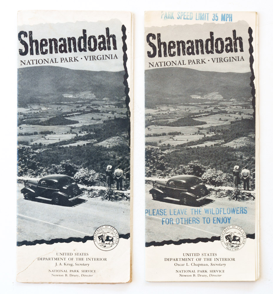
Shenandoah National Park folding brochures, 1949 and 1950.
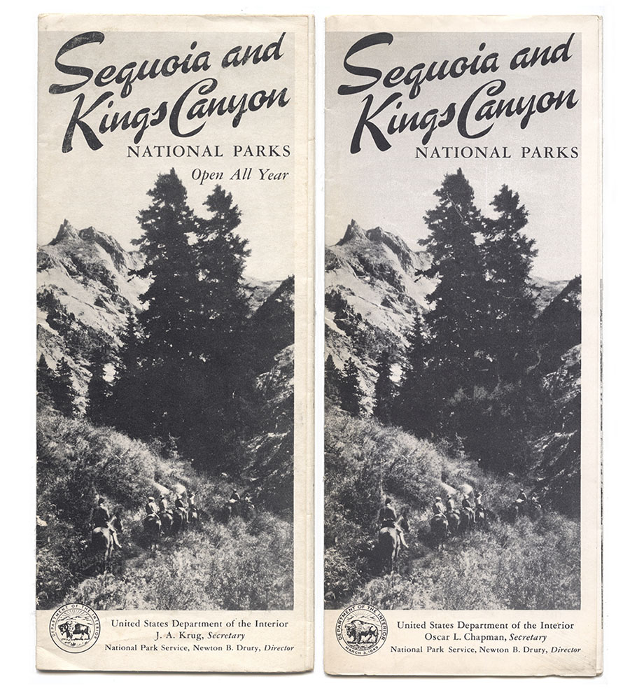
Sequoia and Kings Canyon National Parks folding brochures, 1947 and 1951.
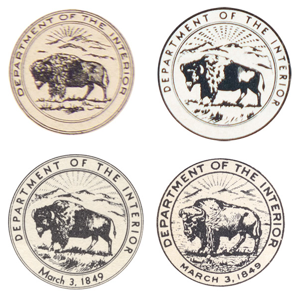
DOI emblems from visitor guides: 1931 (Yellowstone National Park), 1949 and 1950 (Shenandoah National Park), 1951 (Sequoia and Kings Canyon National Parks).
1952-1968: Monochromatic Arrowhead
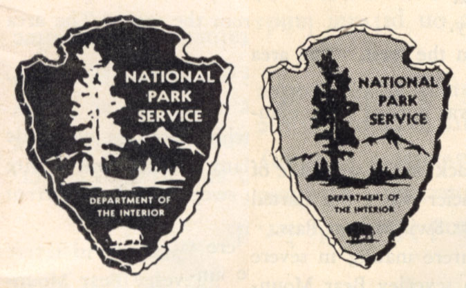
It wasn’t until 1962 that the DOI officially approved a new official symbol for the NPS, the first iteration of the beloved arrowhead. An article in the internal NPS newsletter National Park Courier (June 7, 1962) officially spelled out its meaning:The arrowhead “trademark” symbolizes the scenic beauty and historical heritage of our Nation. The history and prehistory of the United States is recognized in the arrowhead shape of the shield. A tall tree in the foreground implied vast forested lands and growing life of the wilderness. The small lake on the shield is a reminder of the role of water in scenic and recreational resources. Behind the tree and lake towers a snow-capped mountain typifying open space and the majesty of nature. Near the point of the arrowhead is an American bison as the symbol of the conservation of wildlife.
Arrowheads from Glacier National Park visitor guides: 1952, 1953
That symbol had been extensively used for a decade after being approved on July 20, 1951. The history of the arrowhead design has been imprecise, with much of the confusion originating from the NPS and repeated in many places. For instance, the page History of the Arrowhead (which is quoted by Google in response to the search “first NPS arrowhead”) names Aubrey Neasham, Herbert Maier, and NPS director Conrad Wirth as the people responsible for the arrowhead design. It mentions the 1952 Oregon Caves National Monument visitor guide as the first appearance of the arrowhead in print – with the standard (for the B&W era) black elements on a light background. If you want to read all the historical details, the HFC’s article A Germ of an Idea sets the record straight: Walter Rivers was the designer of the NPS arrowhead emblem, and the initial design had grey elements over a black background, as can be seen in the following brochure covers.
First column: Yosemite, Crater Lake, Glacier National Parks visitor guides from 1951, 1952, and 1953. Fourth column: 1954 (Yosemite), 1958 (Crater Lake), 1956 (Glacier).
The following year, 1953 saw a wider adoption of the new standard arrowhead with black elements on a light background, often on the brochure cover and almost always on its first or last interior page. However, this adoption was not universal. Glacier National Park was a curious exception in using the initial Arrowhead with a black background from 1956 to 1959. By 1960, with the exception of Lassen Volcanic National Park, all park visitor guides had removed the Arrowhead from the cover, printing it instead on the last page. Again, novelty seems to have been a factor in its prominent placement.
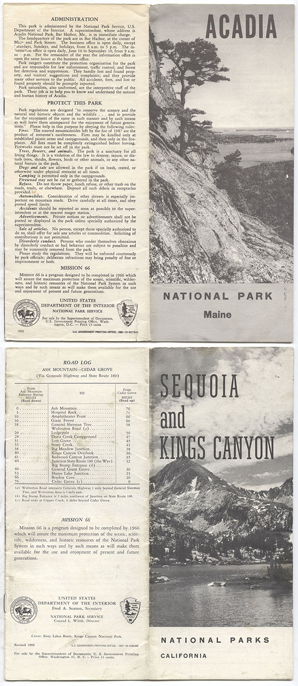
Front and back covers of Acadia National Park (1962) and Sequoia & Kings Canyon National Park (1959) stapled brochures.
1968-1969: Parkscape U.S.A.
In 1966, as the NPS celebrated its 50th anniversary, the park infrastructure was in its best shape thanks to aptly named Mission 66, a decade-long construction program initiated by Director Conrad Wirth in 1956 – notice the paragraph about Mission 66 on the brochures above. However, during that decade park visitation had also more than doubled because of the growing urbanized population with more leisure time. George Hartzog, the new NPS director, conceived of a new program to meet this challenge and get the National Park System ready for the centennial of Yellowstone National Park’s establishment in 1972. The name “Parkscape U.S.A.” was coined to “articulate the growing concern around the world for the protection of natural and historical environments.”Thomas Geismar of the New York design firm Chermayeff and Geismar Associates created the symbol for Parkscape U.S.A., a bold and modern abstraction representing the interconnectivity needed to protect people and the environment. In the words of Hartzog:
the symbol represents the three categories of parks—natural, historical, and recreational—that make up the work of the National Park Service. The fact that the design implies, as has been suggested, mountains, or fortifications, or tents, comes as a bonus to our original hopes for a new symbol to identify our new program.The symbol for Parkscape U.S.A. launched in 1966 and was featured on a US Postal Service anniversary stamp printed 117 million copies. More details about the Parkscape U.S.A. program and symbol can be found in HFC’s article Design for the Times.
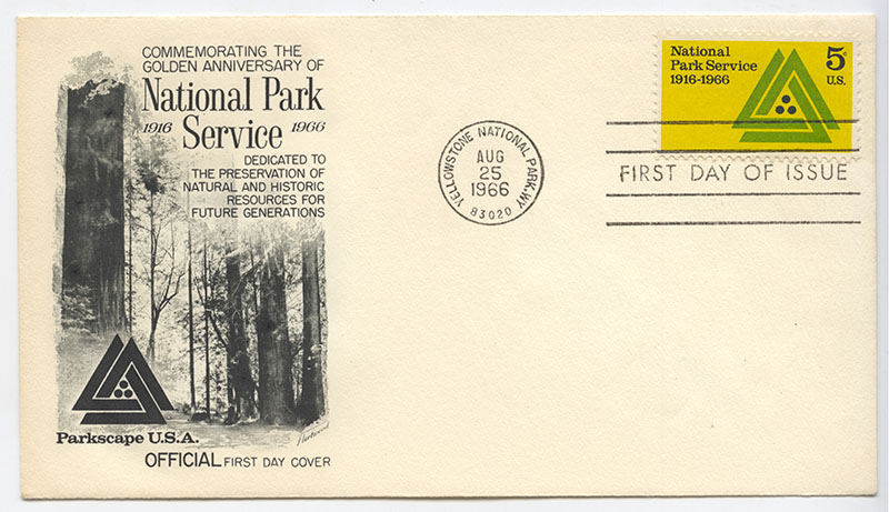
Parkscape U.S.A. First Day Cover
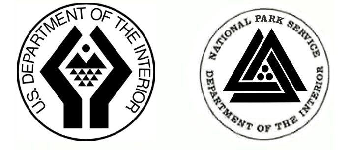
DOI seal and NPS badge, 1968-1969
Initially, the Parkscape symbol was intended to appear only in places relevant to the Parkscape U.S.A. program and not to replace the Arrowhead. However, as part of a drive by President Nixon to modernize the government, the DOI adopted a new abstract and angular emblem without the bison, also designed by Geismar to represent the department’s diverse responsibilities. Can you recognize a stylized pair of hands framing symbols of the sun, mountains, and water? Feeling that the Arrowhead with the bison was rendered anachronistic by the new DOI emblem, Hartzog initiated the change of the NPS official emblem to the Parkscape symbol, which became effective on Oct 10, 1968. This coincided with the NPS adopting the new “pocket guide” design standard for its visitor guides, which was as radical a departure from tradition as any before – for a presentation of the “pocket guides”, please refer to the three previous installments of this series. It was fitting that the Parkscape symbol appeared mostly on the “pocket guides” (although not on all) as the new design-oriented folders shared with the Parkscape U.S.A. symbol a modern minimalist approach.

Back of “pocket guides” from 1967-1969 with the Parkscape symbol.
Even for the minority of parks that did not follow the “pocket guide” design standards, some visitor guides now featured the Parkscape symbol since it had become the official NPS symbol.
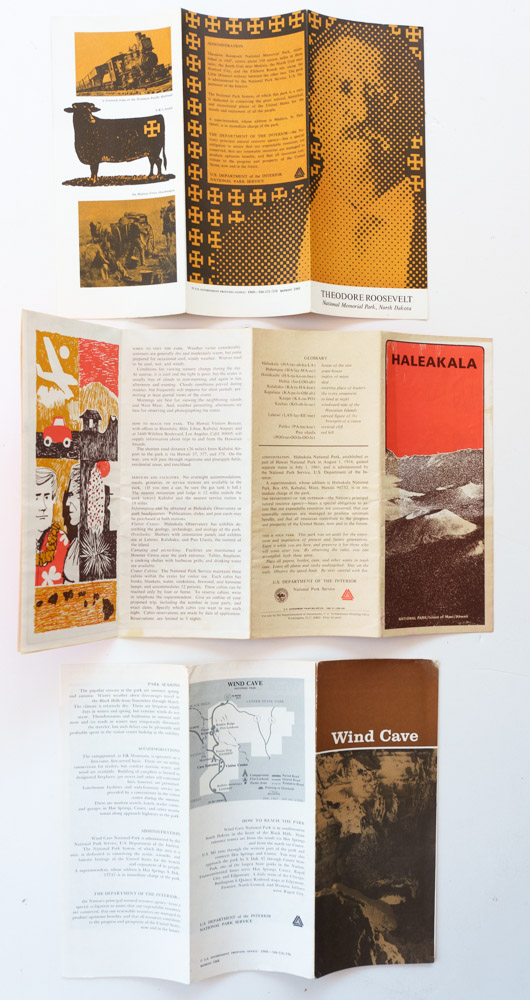
Theodore Roosevelt National Memorial Park (1969), Haleakala National Park (1967), Wind Cave National Park (1968) folding brochures with the Parkscape symbol. The Haleakala brochure marks the last time the NPS used the DOI emblem.
Although the design community widely praised the Parkscape symbol, NPS employees felt its novelty assaulted traditions and sentiments. Faced with resistance to change and nostalgia for the Arrowhead among the rank, Hartzog appointed a committee. After it issued a recommendation to reinstate the Arrowhead as the official emblem, he approved the suggestion on May 15, 1969. The Parkscape U.S.A. symbol reign as NPS emblem had lasted less than a year. The new DOI emblem occurred a similar fate.
As a result of this short period, most of the “pocket guides” do not feature the Parkscape symbol. They also did not feature the Arrowhead, maybe because its design was inconsistent with their modern design, or because after the turmoil, the NPS thought it better not to print any emblem on the visitor guides. Unlike from 1930 to 1968, from 1970 to 1998 none of the park brochures included the NPS Arrowhead or the DOI seal inside.
1999-present: Color Arrowhead
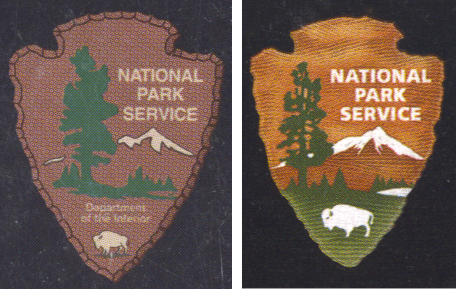
When it was used in visitor guides in the years 1952-1968, the Arrowhead was printed monochromatically, because that’s how the visitor guides were printed until the mid-1970s. However, when it was used as a badge for park ranger uniforms, since the 1950s, the Arrowhead featured colors.In 1999, an Arrowhead measuring 3/4 inch (2.4 cm) was added to the black band of some Unigrid brochures – Everglades, Kenai Fjords, Saguaro, Zion National Parks. 15 other national parks followed suit in 2000, and 13 more in 2001. Since Unigrids are printed full-color, it was natural that the Arrowhead would appear in color. Like the uniform badges, it featured a dark green for the trees and a brown background. The mountain snowfield, bison, and letters, including “Department of the Interior”, were white. Earlier Unigrid brochures, distinguished by larger fonts for the park name and subsequently the subtitle “Official Map and Guide” did not feature the Arrowhead. Note also the change in fonts from Helvetica to Frutiger.
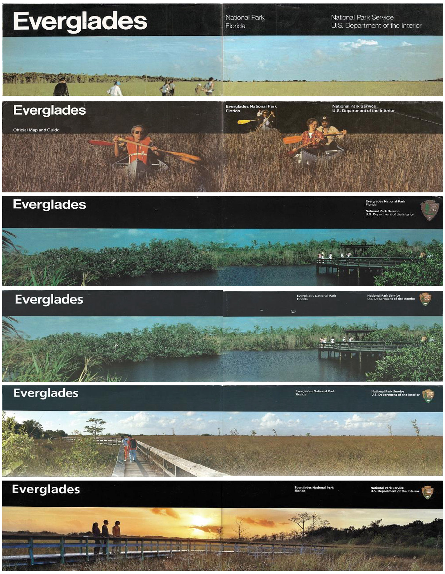
Everglades National Park Unigrid brochures: 1979-1990 (large name font), 1992-1998 (Official Map and Guide), 1999-2000 (large Arrowhead), 2003, 2004-2014, 2015-present.
In 2001, Director Order #52A: Communicating the National Park Service Mission, established a clear communications strategy for the NPS. As part of it, Harpers Ferry Center was put in charge of NPS graphic design standards, and the last iteration of the Arrowhead took place. The Dennis Konetzka Design Group refined it to appear consistently and legibly on all NPS communication materials with modern printing. The colors were standardized to Pantone colors Dark Rust PMS 1615C for the mountain, Medium Rust PMS 1605C for the sky which previously was the same color as the mountain, and Dark Green PMS 553C for trees and grass – the bison is now standing in a large field of grass rather than a tiny patch. White is used for the bison, lake, snowfield, and type, which now excludes the letters “Department of the Interior”. The color graphic design is made available by the HFC in two versions, as flat artwork with plain colors, and as shaded artwork for print applications that can reproduce fine details – such as the Unigrid brochures. On that page, the Arrowhead is watermarked with the letters NPS because patent, trademark, and federal laws strictly prohibit its reproduction without NPS permission.
Arrowheads from Glacier National Park Unigrid brochures: 2000, 2001.
Unlike visitor guides of some earlier periods, Unigrids were not redesigned every year, but rather based on demand. Glacier and Rocky Mountain National Parks are among the oldest and most visited in the system. Their Unigrid brochures, redesigned in 2001, feature the new 2001 Arrowhead, printed almost the same size as previously.
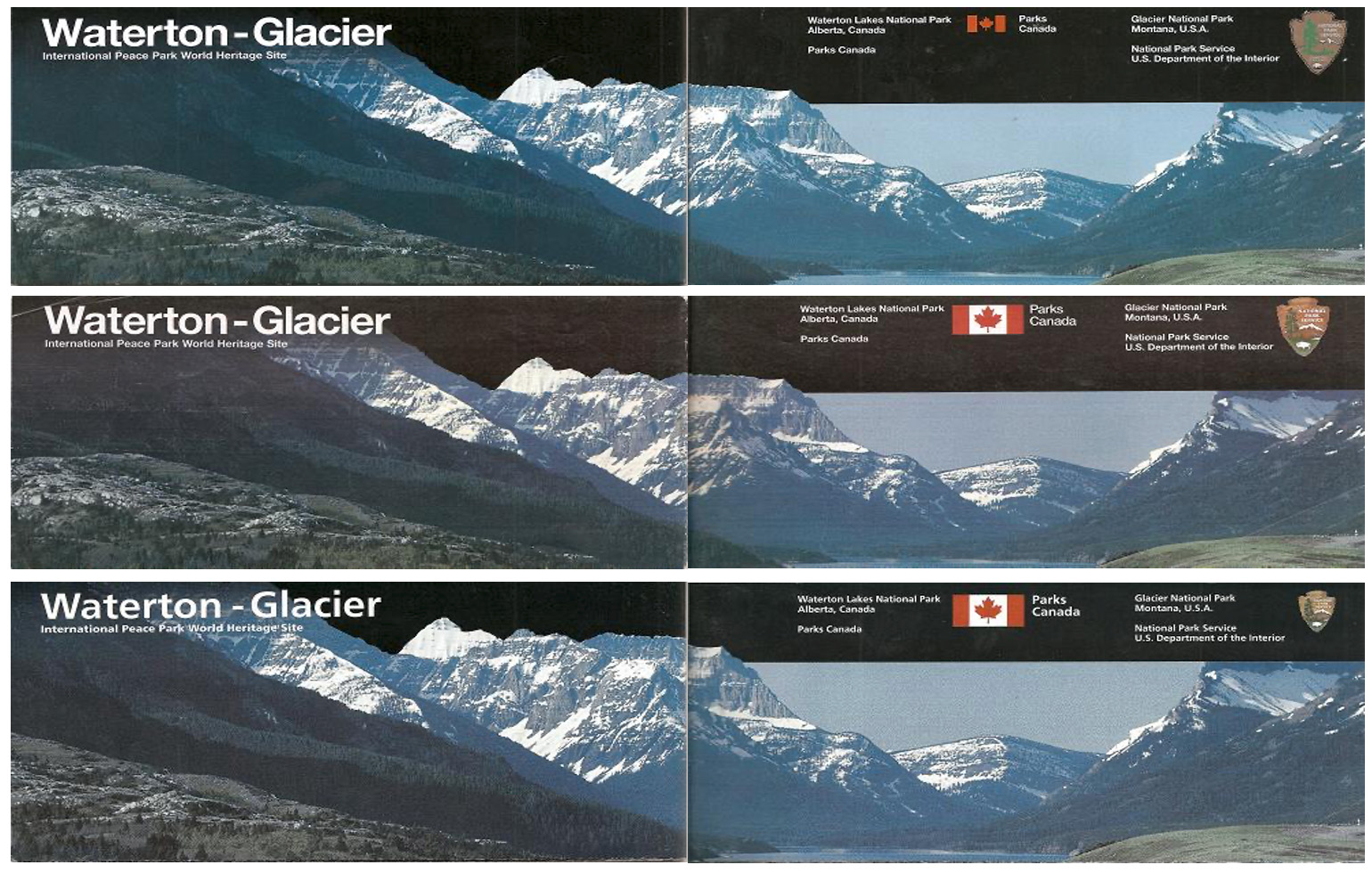
Glacier National Park Unigrid brochures: 2000, 2001-2005, 2008-2018.
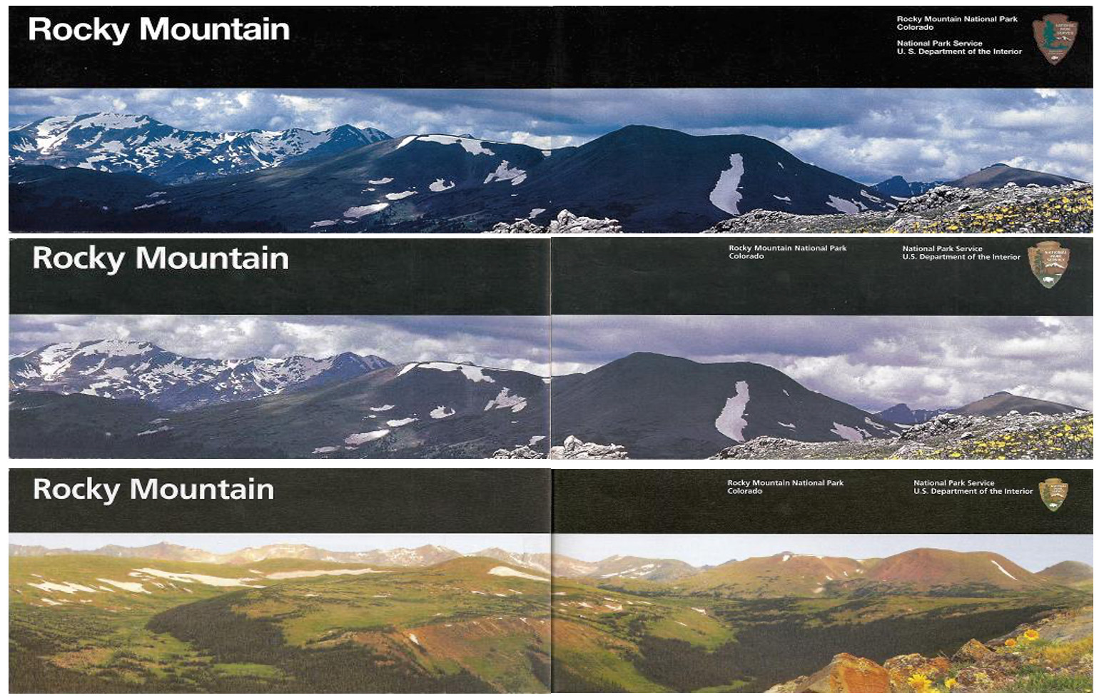
Rocky Mountain National Park Unigrid brochures: 2000-2001, 2001-2005, 2006-2012.
The use of emblems in visitor guides had been inconsistent because, before 2001, there was no requirement to include them. The 2001 Director Order #52A dictated that:
the Arrowhead Symbol will appear on all official NPS media intended for the public, consistent with the graphic design standards prescribed by Director’s Order #52B (see section III.E, below). It will be used in all new publications immediately, and will be applied to all existing publications as they are updated.By 2003, a new design standard took effect, prescribing a noticeably reduced Arrowhead size of 5/8 inch (1.5cm). For the lesser-visited parks, brochures either with the previous version of the Arrowhead or with no Arrowhead sometimes persisted for years. By 2012, when the National Park of American Samoa brochure adopted the current design standard, all the Unigrids brochures featured the same 2001 Arrowhead. This was the first time in history when all the NPS visitor guides featured a uniform design down to minute details, and since then the NPS has managed to keep it that way.
PS: I am still expanding my collection and I have numerous duplicates, so if you’d be interested in donating, trading, selling, or buying vintage brochures for any NPS units that are currently national parks, please let me know.
Part 4 of an on-going series: 1 | 2 | 3 | 4 | 5 | to be continued