Terra Galleria Photography

Landscape Photography 1988-2024

In this narrative, I draw a parallel between the development of my landscape photography work over more than three decades and my view of the historic evolution of landscape photography and environmental thought.

I

Growing up in France, I did not experience natural, raw landscapes solely shaped by primordial forces of nature until I ventured to the high peaks of the Alps. Their inhospitable and dangerous terrain was possibly the only wilderness left in the old world. Entranced by the sublimity of the experience, I forged my first connections with the wild. When I picked up the camera, I was first a reporter wanting to share the wonders I discovered in the mountains. For a while, I continued photographing in that vein on my globe-trotting adventures motivated by novelty.

Although the medium’s pioneers like William Henry Fox Talbot and Gustave Le Gray have captured natural scenes, a sustained landscape photography practice did not appear until the second half of the 19th century. In England, Francis Frith and Peter Henry Emerson helped shape that pursuit. Still, the most influential work came from half a dozen American photographers who participated in federal and state survey expeditions from 1867 to 1879, such as Carleton Watkins, Timothy H. O’Sullivan, and William Henry Jackson. When America explored its little-known West, photography proved to be a vital tool. Survey photographers were simultaneously explorers, reporters, and artists, sharing discoveries with an eager public. Frontier myths of manifest destiny framed the work, and the photographers were responsible for faithfully reproducing wild places that people had never seen before. In response, while exploring a new subject and medium, they made new kind of pictures, eminently photographic and without artifice, that formed the basis for a new approach to landscape. Yet in terms of composition or the desire to convey the immensity of nature, their images shared some visual commonalities with the Hudson River School of painting that had invented the Western landscape.

The continent was subsequently tamed, but vast open spaces remained. A newcomer to America, I was entranced by its abundance of remote lands, and in particular by the beauty and diversity of the national parks. It was all new to me, and I felt compelled to translate my wonder into photographs. The parks offered a place apart from civilization with pristine scenery mostly untrammeled by man while accessible to almost everyone. In the wilderness, people are visitors—present only in passing. Their footsteps fade, leaving the wild unchanged, untouched by a permanent presence. Although the infrastructure of the parks made a visit easy, it was not difficult to get away from people and development if one enjoyed walking away from the roads far enough as roadless wilderness areas had been preserved. I progressively embarked on outings into more and more remote settings, especially in Alaska. The more remote, the better the experience felt.

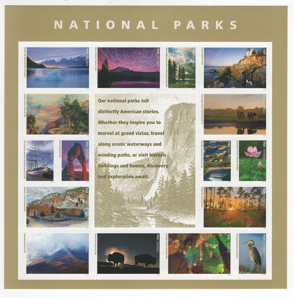
The humanist tradition dominated French photography. For a nature lover, the prints from West Coast photographers such as Ansel Adams that I saw in California museums were a revelation. The result of a distinctively American vision illustrated by painters of the Hudson River School and writers such as Henry David Thoreau and John Muir, their esthetic was rooted in the sublime. Celebrating the beauty of nature as revealed by the light, the images mostly excluded any hints of civilization. They provided a model for expressing the emotions and feelings of awe experienced in the wild by presenting landscapes romantically rather than just recording their appearance. Following the photographers whose prints I had admired, I adopted a 5×7-inch view camera for its unparalleled descriptive power. Working in color, I favored truth and clarity. The visually complex, widely encompassing yet detail-laden images allow the viewer to stand before the landscape as if they were there. Roaming the wilderness of the parks had been a transformational experience for me. I hoped to touch viewers of my photographs the same way I was. As an invitation to visit the national parks, and to celebrate the centennial of the National Park Service, I published Treasured Lands (2016) – a winner of twelve awards currently in its 8th printing.

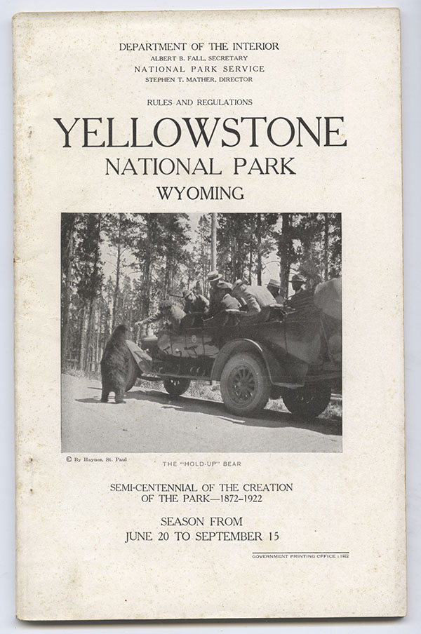
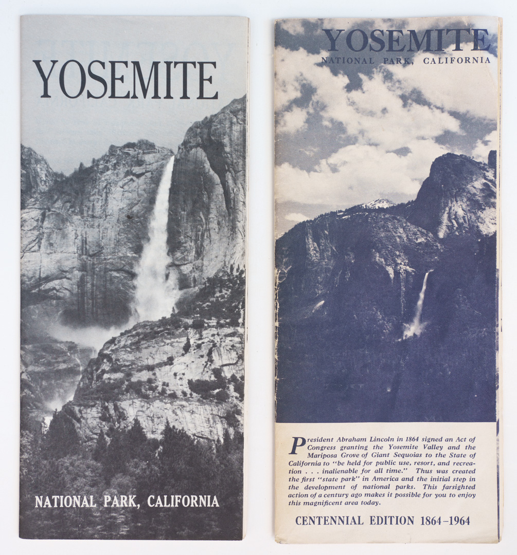
The protected status of those lands was not a given, but instead the result of hard-fought environmental battles, in which photography had played a key role. The first interest of the 19th survey photographers was descriptive, but reportage occasionally led to advocacy. Images of Watkins and Jackson were instrumental in establishing Yosemite as the first wild public land in 1864, and Yellowstone as the first national park in 1872. Images of the land could touch a public who hadn’t been there. Heightened appreciation of its beauty and fragility resulted in support for political action that led to achievements such as the National Park System and the Wilderness Act of 1964. Inspired by the idea that art could make a difference, in the mid-1990s, I set out to work with advocacy in mind, following the tradition of photographers like Eliot Porter and Philip Hyde who created images for the Sierra Club books and campaigns. After being the first to photograph all the U.S. national parks with a 5×7 view camera, I subsequently turned my attention to lesser-known public lands such as the national monuments managed by the BLM, aiming to bring more public awareness to them in collaboration with grassroots conservation organizations. A quarter-century later, I was much gratified when the Sierra Club honored me with the Ansel Adams Award for Conservation Photography, maybe a capstone for a career in nature photography. Leveraging new technologies, I have expanded my approach to nature subjects to the microscopic and cosmic levels. I also continue to make classic nature photographs, which are still necessary because they reveal the “absolute purity of wilderness, a purity we need to know” in the words of Robert Adams.

II
After roaming some of America’s most remote lands, I realized that by comparison, the high Alps bore a significant cultural imprint, as evidenced by mountain huts near mountaintops, user trails even on glaciers, and fixed anchors on climbing routes. That cultural imprint marks to an even higher degree the perception of mountains by humans – the reason college friends introduced into their wild world.

At first, it appeared that before the settlement by Europeans, America’s landscape was largely virgin. However, as called out by the new Western history movement of the 1980s, this was an unscientific and socially regressive myth ignoring the indigenous people. Far from being the last remaining refuge from civilization and a place separated from humanity, the American wilderness is to some degree a creation of a particular culture at a specific moment in history. In less than a century and a half, the romantic sublime and the ideology of the frontier as a cradle of national character have transformed the idea of wilderness from a terrifying wasteland to a sacred American icon. We think of national parks as sites of preservation, but they are also sites of dispossession and reconstruction, partly manufactured landscapes built out of our desire for pristine nature. That their establishment often came at the cost of physically removing the people, both native and settlers, who habited them reinforces their artificiality. Those places that preclude people need to activel management to maintain the appearance of an unmanaged landscape. Increasing threats resulting from the global human impact call for more and more interventions. Ansel Adams and other modernist photographers, followed by an entire nature photography industry, depict a landscape from which people and their constructions are always absent. Yet the text of the 1872 law establishing Yellowstone National Park described it as “a public park or pleasuring ground for the benefit and enjoyment of the people.”

I was well acquainted with their terrain, but my collaboration with Ken Burns and Dayton Duncan on their film “The National Parks: America’s Best Idea” (2008) awakened me to the concept of national parks. I became interested in a more complete picture of them, one that acknowledged that they are more than nature, they are a construct. Although visitors remember the scenery, for most it is the interplay between the human-made and the natural that defines their park experience. The reassuringly familiar park structures carry an educational and interpretive purpose that directs how we look at nature. In the early 2010s, departing from the iconography of the wild, I started to photograph what I saw as a material embodiment of the National Park Service’s work: designated overlooks where interpretive signs and landscape are in dialog, lodges decorated with park photographs, campground amphitheaters with educational programs, and roads engineered to create a scenic experience accessible to everyone. My images of the visitor centers, those structures quintessentially associated with the park experience, referenced the Claude Glasses found at Grand Canyon National Park’s Desert View Watchtower. Those small mirrors with a tinted surface, named after the painter Claude Lorrain, were popular with the English gentry who turned their back to the landscape to view a painterly version of it. The canon of nature photography deliberately obscured the connection between the scenic vistas and the human experience. Breaking the separation between photographer and landscape, before the popularity of the selfie, I made a statement about my presence in the landscape as a form of intervention, just like the national park itself.

III

Over the last thirty years, I have done more than four hundred national park visits. I returned multiple times to observe the changes brought by seasons and weather, develop a relationship with places, and inhabit them to some measure. Still, as the wilderness is defined by people’s absence, I was necessarily someone coming from the outside to look in. But there was a place I inhabited: the city I call home, San Jose, CA.

In the mid-1970s, the exhibition “New Topographics: Photographs of a Man-Altered Landscape” marked a turning point from the romantic and nature-centric conventions of beauty. The New Topographics photographers declined to work in parklands or wilderness and instead documented the human imprint on mundane lands. The idea became influential because it related to the landscape of everyday life, opening the door for other photographers to find subjects closer to home. Criticism by scholars such as J.B Jackson and William Cronon subsequently pointed out that the wilderness movement embodies a dualistic vision in which the human is separate from the natural. The idealization of wilderness as the pinnacle of environmentalism encourages privileging some parts of nature at the expense of others. By adopting an excessively high standard for what counts as natural, we irresponsibly devalue the environment in which we live. The esthetics extolling the wilderness sublime could suggest that less pure places were not as worthy of attention. However, parklands and wilderness represent only a sliver of nature in contemporary America. More inclusive environmentalism needs to go beyond setting aside for posterity beautiful lands, making room for humble rural, suburban, and urban landscapes, and dealing with those everyday places that can be degraded or restored. By the 1970s, even the National Park Service started to embrace a more elastic definition of parklands to bring them closer to urban centers. Extending my work from national parks to national monuments brought me to areas such as the San Gabriel Mountains or the Organ Mountains lying at the doorstep of cities.

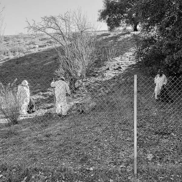
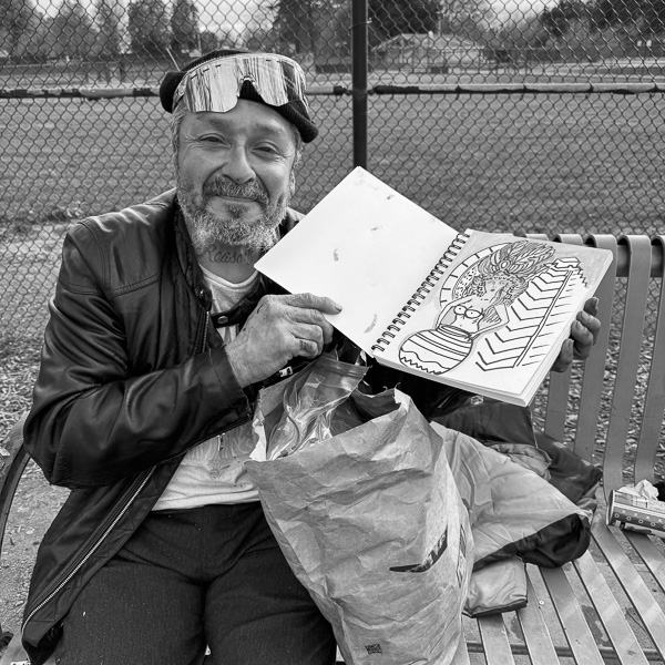
The New Topographics’s esthetic emphasized the banal rather than the sublime, favoring neutrality over emotion. My typology of national park structures spoke to the mind rather than the heart. When instead of limiting my photography to faraway parklands all over the country, I started to work closer to home, I tried to find emotional resonance in the places where I live. The power of the national parks and their pristine landscapes is that just being there is enough for us to feel wonder. But when we stand on lands that are not sublime, we can learn to experience some of that wonder. Aldo Leopold saw that “Wilderness exists in all degrees, from the little accidental wild spot at the head of a ravine in a Corn Belt wood lot to vast expanses of virgin country… [it] is a relative condition”. I am fortunate that two dozen nature parks lie within a half-an-hour drive from my San Jose home. I did not seek remarkable light but visited them midday, and briefly, like most residents. Yet I experienced some of the qualities of the wilderness in them, which images with romantic reverence could convey. Even in places where wild and human interpenetrate, I could sense the values of nature anywhere I looked with attention. The Coyote Creek Trail, the longest multi-use paved trail in San Jose, is surrounded by a narrow strip of public land. Galen Rowell had inspired me in my early mountaineering years. Rekindling his dynamic approach, I photographed the trail over ten years encompassing more than a hundred visits. I observed changes over the seasons and the years, not only in nature but also in how people live along the trail. I initially approached the trail through nature photography, and then I broadened my photography with the realization that it is a lived-in landscape. Although a small place, its dimensions embrace eternal concerns with the place of man on the land.

Imperfect Prints for Sale

https://www.terragalleria.com/blog/imperfect-prints-for-sale

Having used the same printer for twenty years, I get a good sense of how to translate a digital file into a satisfying print. However, sometimes I miss, and for instance, the print comes out too dark, too flat, or the color isn’t quite right. When that happens, I make a tweak and reprint.

There are also a lot of little blemishes that can affect a print. A dust spot might have been missed while examining the digital file but it becomes obvious on paper. On my printer, on more than one occasion, the left edge of the print got a few streaks of ink because some part of the printer was not cleaned well enough. Since I always print with a white border, those streaks do not affect the image area, yet they are there and mar the border. It happens that there is a surface defect on the paper from manufacturing. It also happens that while handling the print I cause a small crease. Switching from the Epson papers to the heavier Lexjet Sunset papers helped with the later issue. I want to deliver customers nothing but flawless prints. When any of those mishaps happen, I redo the print. Having the ability to print in the studio makes it a minor inconvenience.

When the defects are too prominent, I trash the print. Unfortunately, coated photo papers cannot be recycled. But most of the time, defects are hardly noticeable. Feeling bad about throwing away those imperfect prints, I have saved them over the years. While I was reflecting on my years of printmaking, I examined some of the stacks of imperfect prints. For many of them, I could not even figure out at a glance the reason I rejected them, although there must have been one.

Therefore came the idea to offer those imperfect prints for sale at a deep discount. As for my regular prints, I will write the location and date, as well as sign the print. Instead of an edition number, I will mark those imperfect prints with the letters AP (for “Artist Proof”). Sometimes I already wrote an edition number on the print, before discovering a blemish. In that case, I will cross that edition number and write AP next to it.

Here are the prints on offer.

Shipping is free in the U.S. To view any image larger, click on the thumbnail. If you would like to order a print, use the button “Order Print” and place a normal order for the print of the appropriate size. In the special instructions box, indicate “Imperfect print”. During checkout, do not use the button “Confirm – Pay Online”. Instead, use the button “Confirm – Mail in payment”. I will then adjust the invoice to the price mentioned above and email you so that you can complete the purchase.

Twenty Years of Printing with the Epson 9800

https://www.terragalleria.com/blog/twenty-years-of-printing-with-the-epson-9800

In a world where digital photography devices are often outdated within years, how likely is it to be using the same printer for two decades? Since 2005, my Epson 9800 has faithfully translated pixels into tangible art and is still strong. Besides providing a practical account of my long-term experience with a particular printer that can be applied to other devices, this article surveys the history of digital printing and discusses the benefits of making prints yourself.

Early digital printing

When I sold my first prints in 1994, fine-art digital printing was virtually nonexistent. Those color prints were made using the Cibachrome process with a traditional optical enlarger. The contrast color transparencies (5×7 inch slides) exceeded what the paper could reproduce, so the better labs produced a contrast mask – essentially a black-and-white negative of the image. When sandwiched with the transparency, its darkest parts corresponded to highlights and tamed them.

In 1996, Cymbolic Sciences introduced the LightJet, a digital printer that takes a file as input. It used photographic, silver-based, type-C paper for printing from negatives and RA-4 chemistry. The image is created by exposing the paper pixel by pixel with RGB lasers. As each pixel has a continuous RGB value, the resulting prints look exactly like traditionally made color photographs. The preferred medium was Fuji Crystal Archive, which came in three varieties, Semi-Gloss, Glossy, and Super-Glossy. It has the best longevity rating of any color photographic paper, 60 years. The previously most durable color photographic paper, Cibachrome, had a longevity rating of 35 years.

That year, I switched to LightJet printing. The image below shows the first LightJet prints I had made. The LightJet printers, joined by the similar laser chromogenic Durst Lambda and the ZDE Chromira are still in use. The Lambba is a more efficient printer, however, from the samples I have seen, the prints are not as sharp as the LighJet’s. Both of those printers use lasers and cost about $200,000. The Chromira uses LCDs, and costs “only” around $60,000. The prints are on par with the Lightjet. Because of the costs, maintenance, and size requirements, those printers are exclusively operated by labs, such as Calypso Imaging in Santa Clara then Santa Cruz, and West Coast Imaging in Oakhurst, both of which produced my prints for almost a decade. While picking up prints at Calypso, it was not uncommon to run upon some of the finest photographers in the area, people like Frans Lanting, Charles Cramer, or Bill Atkinson.

Early inkjet printing

Inkjet printers lay very fine droplets of ink on paper. Colors are formed by the juxtaposition of droplets of several primary colors. The first inkjet printers to produce high-quality output were the Iris printers that appeared in the mid-1980s. An Iris works by squirting a million droplets of ink from each of its four nozzles (Cyan, Magenta, Yellow, and Black) every second towards a drum rotating at a speed of 150 inches per second. These droplets are given an electric charge to determine which should hit the drum, and which should be deflected to the waste system. Papers are typically fine watercolor papers or canvas. The term Giclee (a French word meaning “to spray”, although in slang the verb “gicler” has a different meaning) was coined in 1991 by printmaker Jack Duganne to refer to Iris prints. Nowadays it refers to any inkjet print on fine art paper. Iris printers were expensive and required meticulous care. The drum size limited the print size. They used dye-based inks that yielded vivid color and dense blacks but were not archival. Iris printers played a pivotal role in the early days of the digital fine art printing, however, they have been surpassed by nozzle-based inkjets in nearly every technical aspect.

The common inkjet printers are nozzle-based. Tiny nozzles spray ink droplets directly onto the paper. The nozzles are part of a printhead that moves across the media to build the image line by line as the paper scrolls in the other direction. Photographic inkjet printing emerged in the late 1990s. Using more types of ink than the four basic primaries, high-end photographic inkjet printers are a world apart from cheap office printers. They produce prints of remarkable appearance. However, early prints suffered from flaws that made them unsuitable for selling as artwork. Pigment-based inks are considerably more stable than dye-based inks, which produced prints that sometimes faded within a few years. However, the range of colors that can be reproduced (color gamut) was much reduced. They also suffered from serious metamerism – colors shift when viewed under different light conditions. A print that looked perfect in your studio under 5000K lighting, when viewed under more common tungsten or halogen lights would take an ugly magenta cast.

Epson revolutionizes fine-art printing

In 2002, Epson was the first to crack the inkjet fine-art printing nut with their “Ultrachrome” pigmented inks introduced in the 7600 and 9600 wide-format printers, which at last offered a combination of vivid color and reduced metamerism. Based on accelerated fading tests, longevity exceeded the Crystal Archive papers. No other device had that much impact on photographic digital printing. To experiment, I bought a smaller Epson desktop 13″ printer that used Ultrachrome inks (maybe the Epson Stylus Photo R1800). I found out that with glossy paper, there was an issue known as “bronzing”: different colors can have different glossiness, with the result that, under certain viewing conditions, the print will not look uniform but rather will have a patchy appearance. Semi-glossy papers exhibit this problem to a lesser degree. Matte papers do not suffer from bronzing. Since I took up large-format photography with the goal to make large prints, 13″ would not suffice.

I waited for the next generation of wide-format printers from Epson, which was announced in May 2005: the 7800 and 9800. They feature new inks, called Ultrachrome K3. Benefits add up: differential glossiness is much reduced, the output more neutral and linear, blacks considerably improved, the gamut slightly larger, and the print longevity better. As soon as it was available, I bought the Epson 9800 which costs $5,000 and prints 44 inches wide. The extra cost over the 7800 ($3,000) which prints 24 inches wide is easily justified by the possibility to make larger prints and lower paper costs.

The benefits of owning a printer

Those relatively affordable costs were my initial draw to inkjet printers. Prints allow you to scrutinize details, tonal transitions, and composition in a way that digital displays often mask. Seeing your work in print can reveal areas for improvement and elevate your technical and artistic standards. The digital printing process itself teaches valuable skills, such as color management, sharpening techniques, and an understanding of how images translate from screen to paper.

Because of the influence the West Coast photography tradition exerted on me in the 1990s, I felt I was missing something by outsourcing my prints to a LightJet lab. Placing a higher emphasis on the decisive moment and the act of capturing the image, some of the greatest photographers such as Henri Cartier-Bresson and André Kertész delegated the printing of their work to skilled technicians. For those who worked in journalistic or commercial contexts, speed and efficiency were critical. On the other hand, American photography celebrated craftsmanship and individual expression, encouraging photographers to control the entire creative process. Ansel Adams and Edward Weston saw prints as an essential aspect of their artistic expression and taught printing as a key skill. Adams famously referred to the negative as the “score” and the print as the “performance,” emphasizing the artistry of crafting the final image.

For a black-and-white photographer, working in the darkroom is a relatively straightforward decision, since they gain access to powerful possibilities with a fairly simple setup. The chemistry for color is more complex and more toxic. Despite that, the darkroom controls readily available to the color photographer are pale compared to what is possible in monochrome. Using optical processes, it is difficult to alter contrast and tones without provoking unwanted color shifts. The exception is the dye-transfer process, which is extremely time-consuming, expensive, and difficult. The availability of materials for that process is problematic since the few remaining experts rely on stockpiles of discontinued supplies. Preparing images for the Lightjet involved scanning the transparency, making it necessary to color-correct the scan by Photoshop. Once one has tasted the extent of the control on color photographs enabled by digital processing, there is no going back to optical processes. However, even though Calypso would eventually offer their LightJet for $6,000 upon closing in 2010, I did not have a spare large room in the house.

In-house printing capabilities let you have instant and low-cost feedback, and fine-tune prints in a way that would not be practical when you have to re-order prints from a lab. You can make sure that prints are produced to the highest standards. The print settings resulting in the highest print quality consume more ink and time, so in the name of efficiency, a production lab, especially one that often deals with commercial clients, may be tempted to cut corners. Another potential problem is outgassing. To prevent nozzle clogging, slowly evaporating humectant chemicals are incorporate into the inks. When printing coated papers, they are not absorbed by the paper and remain on the print long after it feels dry. As they evaporate over time, they can cause fogging in the inside of the glass when the print is framed. It takes time to cure a print and eliminate outgassing. In the image below, you can see the racks I use to air the prints. The accelerated method is to cover it with absorbent paper which acts like a sponge and draws out the gases from the inks faster than they would escape when exposed to air. The paper becomes wavy as it absorbs the chemicals, and you keep interleaving until the paper is no longer wavy. As a couple days are optimal, some labs may skip this step. When you sell artwork, you are not tempted to drop-ship prints, and instead can naturally inspect and sign the prints by hand.

Operating an Epson wide-format printer

The wide variety of printing media was an unexpected benefit of inkjet printing. Some of those papers mimic the appearance of traditional photographic papers, with a semi-glossy and glossy finish. When viewed by themselves, and especially if framed, the prints could easily be mistaken for silver prints. A side-by-side comparison reveals that they have a flatter look of ink on paper (because it is what they are) than traditional photographs, where the color is embedded within the substrate, giving the image more depth. However, in terms of resolution and color gamut, not to mention print longevity, they easily exceed Lightjet prints. Unique to the inkjet process is the possibility of using matte papers with equal sharpness and color gamut. The total absence of reflections in a print of that quality was not achievable by silver printing processes. When combined with textured or heavy-weight fine-art papers, prints of distinctive and refined appearance are possible. Inkjet printers are also equally comfortable with non-paper media such as canvas. They encourage experimentation with different media, adding layers of creativity.

One of the reasons inkjet printers are so affordable for what you get is that much of the manufacturer’s profit results from sales of consumables, especially inks. I have spent well over $20,000 in ink alone. In 2024, a 220ml cartridge for the 9800 has a market price of $130, which is 60 cents per ml, or $2271/gallon, which is much more cost-effective than the cartridges used in desktop printers, but still a damm expensive liquid. More recent Epson printers use even larger cartridges. However, you would need to print a lot, since Epson says their ink should not be allowed to stay in a printer beyond six months of first inserting. It takes about 1.3ml to print a square foot. With standard photo papers such as Lexjet Sunset Photo eSatin, which I prefer over Epson Premium Luster because of its heavier weight which makes it less fragile, paper costs are close to ink costs, resulting in a cost of about $1.5 per square foot. By comparison, the material costs for a LighJet print are less than $0.5 per square foot. However, labs charge around $10 per square foot. Although relatively high, the cost of inkjet consumables is much less than the cost of ordering a print from a lab, which in the long run makes the printer pay for itself if you print enough. It is no coincidence that labs such as Calypso and West Coast Imaging are now closed.

In retrospect, I could have seriously investigated refillable cartridges with third-party inks. Epson sells only one-time-use cartridges. I have discarded well over two hundred of them. They cannot be recycled. Inkjet printing pioneer Jon Cone estimates that Americans throw away more than 450 million ink cartridges yearly and that many still contain valuable ink. Cartridges come with a chip that tells the printer how much ink remains. However, the chip cannot measure the ink level and instead attempts to track the amount of ink used, often overestimating it by about 20%, a fact that had been established in a class-action lawsuit. Besides avoiding the waste of cartridges and ink, third-party inks represent a significant savings over original equipment manufacturer’s inks. Cone claims that his inks have longer in-printer life than Epson’s and are less prone to clogging. The downside is the risk that those inks do not measure up to the OEM inks in terms of print quality or longevity, as assessed for instance by the independent AaI&A. When the main function of the printer is to produce artwork for sale, the differences in ink costs aren’t that significant. I did not feel comfortable to use anything but the best, even though it came at an environmental cost. For black and white printing, the calculus is entirely different, since Cone’s Piezography system, which replaces all the OEM inks with 6 to 10 shades of carbon-based greys, has been proven to the highest standard in digital photographic black and white printing. The three black inks (K3) of Ultrachrome K3 already result in excellent black and white prints. If only I had space for another printer…

Epson issues

Epson printers use two different black inks, each one optimized for coated (glossy and semi-glossy) papers or matte papers. The catch is that only one of the two ink cartridges can be inserted on the 9800. Switching between them is more involved than just swapping ink cartridges. You need to purge and flush the old ink from the lines and charge the lines with the new black ink. As the ink lines contain 15ml per ink channel, this process consumes a substantial amount of black ink of both types (some color ink too) and fills up the non-reusable maintenance tank. It also takes time and could potentially affect the printer’s reliability.

Unlike the smaller desktop printers, wide-format printers are truly production-grade and built to last. Over the years, my 9800 has proved extremely reliable. The print quality has remained remarkably consistent. The printer works as well as it did on day one, with one important exception. It reports that since 2005, it ran nearly 48 liters of ink and 1943 meters of paper. The issue is that a lot of this expensive ink was wasted. With normal operation, 30% of inks end in the waste pad or maintenance tank. Then, there is the issue that over the years, the nozzles get more frequently clogged. If you print with clogged nozzles, the print quality can suffer significantly. Therefore, it is necessary to make sure they are clear before making a print. The 9800 does so by printing a test pattern and scanning it to verify it is correctly printed. If the printing is not satisfactory, indicating a clogged nozzle, the printer starts a cleaning cycle during which it forces ink through the nozzles at high pressure to clear blockages. The printer repeats those two actions automatically until the nozzles are clean, or up to five times. For the past few years, I sometimes had to repeat up to ten automatic cycles, which means fifty cleaning cycles. On average, an automatic cycle wastes about 25ml of ink. It just takes seven such cycles to waste $100 in ink, which always puts me in a sour mood.

Because the 9800 has developed that issue, one may think that the solution may be to replace it with a newer Epson printer. Considering not just print quality, but also reliability, Epson’s apex may have occurred in 2007, with the 7880/9880 differing from the 7800/9800 only by improved placement of the dots and a more vivid Magenta ink enhancing the gamut. Those discontinued printers are not easy to find, as their owners are hanging onto them. Major changes happened in 2008 with the 7900 and 9900 printers. A much welcome improvement was the ability to carry simultaneously a black ink suitable for printing on glossy paper and a black ink for printing on matte paper. Two additional inks, orange and green, helped expand the color gamut. However, while the new TFP print head improved the printer’s speed, it has become notorious for head clogs, maybe because the new nozzle spacing has become too tight. The 7890 and 9890 are essentially just 7900 and 9900 without the orange and green channels. The Epson P6000, P7000, P8000, P9000 share the same print head and therefore the same problems. Although with the 9800, automatic cycles waste a considerable amount of ink, I can run them until the nozzles are clear, which so far has never failed to happen. With the newer printers, Epson recommends you run no more than a couple of consecutive cycles, as doing more could damage the fragile print head. If after that, the head is still clogged, then you need to wait a day before the next attempt. Many users report no progress with the print head cleaning cycles. They have to manually clean parts such as the capping station, flushing box, or print head. Besides the final solution, the only remedy then is to flush out all the inks and install cartridges filled with a cleaning fluid to flush the print head. If a printer is to sit idle for more than a few weeks, this procedure should be done preventively.

Printing for one’s sake

Some measures help mitigate clogging. Removing the cartridges and shaking them weekly help the inks stay in suspension. Keeping the relative humidity in the 40%-60% range with a humidifier slows the drying of inks. But by far, the main thing is to use the printer regularly. My 9800 had become prone to clogging not because of its age, but my diminished use. In the late 2000s, I fulfilled almost 300 orders yearly, often comprising multiple prints. That number has dropped significantly. As a result, the printer sits idle for several weeks. Those “pro” printers are designed for a production environment. They effortlessly support intense use, but do poorly with light use.

I had installed the 9800 for business reasons and rarely printed for myself. Over the years, it has printed over $900,000 worth of artwork. As its frequency of use declined, I could either waste inks in cleaning cycles or use them more productively by making prints for my personal use. It is an easy choice. Instead of large prints for display, I make portfolio-sized prints, smaller than any I offer for sale. I try to activate the printer daily by printing at least two images on letter-size paper before performing a manual nozzle check. So far this is enough to keep the nozzles mostly clean. Whenever the nozzle check misses a few segments, just by printing, the nozzles often fix themselves. For work prints, I have always used scraps of roll paper, including the final part of the roll which suffers from excessive curling. However, for my portfolio prints, which end up in the hand rather than on the wall, I am indulging in fine-art papers although the cost is three times my standard paper in rolls. Their weight heightens the tactile feel of the paper, while their texture interacts with the light. The prints are stiff enough to be displayed on a shelf by itself. After trying quite a few, my favorite is Canson’s Platine Infinity Fibre Rag.

This new daily routine gives me great pleasure. I started it as a way to maintain my 9800, but this could have been done with an inexpensive 8 inch printer. Creating a print completes the photographic process, offering a sense of closure. A print transforms a digital file into a tangible object, offering a sensory experience that deepens your connection to the image. A print on quality materials without acid and wood pulp endures beyond our lifetimes, preserving your creations for future generations. In an age dominated by screens, making prints honors photography’s rich history and roots as a physical medium, reinforcing its value as an art form.

Wildlife along the Trail

https://www.terragalleria.com/blog/wildlife-along-the-trail

“Landscape without wildlife is just scenery” is a quote used by Kris Tompkins, the subject of the inspirational Wild Life (2023) movie, to discuss the world’s largest rewilding project that she and Doug Tompkins initiated in Patagonia. It would appear that the ribbon of land along suburban Coyote Creek Trail isn’t doing too badly as a landscape. No rewilding has occured there, yet I have seen a varied array of wildlife along the trail, besides an incredible number of cats. While remaining within the city limits of San Jose, California, I have been able to have encounters with the Other in an unexpected place within walking distance from our home.

That is not to say that every trip to the trail resulted in a wildlife sighting beyond squirrels. Despite well over a hundred visits to the Coyote Creek Trail, I have seen a bobcat only twice. The protected red foxes are much easier to spot, as they like to stalk the Los Lagos Golf Course bisected by the trail. First appearing in the San Francisco Bay in the 1980s, they have been stealing sandwiches and phones from golf bags for two decades. In May of last year, I noticed a photographer carrying a telephoto lens, unlike me. As I came closer, he called me by my name. He was a friend from my years in Berkeley that I hadn’t seen for decades. Chris Gould had traveled from Marin County expressly to photograph those habituated red foxes. At sunrise the green is quiet and no golf balls are flying, but sunset is the time when pups come out of the den. I have seen wild pigs on four occasions. Confident in their strength, those dangerous animals are not skittish. Deer are more common, but given my self-imposed wide-angle lens for this project, I have not been able to get a close photograph as they tend to flee quickly. The namesake coyote has remained elusive. I’ve encountered quite a few in the hills. However, the riparian environment of the trail is not their preferred habitat. On the other hand, many birds make it their home, as detailed in the Santa Clara Valley Bird Alliance guide. Photographing birds with a wide-angle lens is a bit of a challenge, which is why the isolated small bird on the ground is such an unlikely photograph. By the way, in America, it is easy to take squirrels for granted, but the first time I visited from France, I was astonished to see one on the lawn of the White House in Washington, DC. I didn’t remember having seen any in urban or suburban settings in France. As a child, it was a treat to spot one in the pine forest of Montalivet by the Atlantic Ocean where we went camping in the summer.

I’ve posted twelve of my wildlife images from the Coyote Creek Trail below. After you look through these, please use the form at the bottom of this post to list your five favorites (the numbers are below the photographs). Thank you for your input. Comments are welcome!


1


2


3


4


5


6


7


8


9


10


11


12

If you do not see the form below, click here.

The Trouble with Wilderness

https://www.terragalleria.com/blog/the-trouble-with-wilderness

Finding meaning often begins with crafting a personal narrative. When we shape our experiences into stories, we discover clarity, purpose, and a deeper connection to ourselves. With that in mind, while reflecting on my work in landscape photography, I realized that its development mirrored the historic evolution of the genre, and also of environmentalism. I’ve crafted a more detailed story, however, what follows is a quick outline. I picked up a camera to document the High Alps in the documentary spirit of the 19th-century American survey photographers. In thirty years of nature photography in America’s public lands following the tradition of conservation-minded, expressive photographers of the modernist era such as Ansel Adams and Eliot Porter, I became the first to photograph each of the 63 U.S. National Parks in large format. The post-modern era brought to photography the detached artistic vision of the New Topographics and to environmental thought the shift from preserving the wild as sacred and separate sanctuaries to also acknowledging it in human-influenced environments. In that spirit, I extended my work to the infrastructure of our experiences of nature and the landscapes of the places where we live.

Ironically, my work in the national parks was the accidental catalyst for the later evolution. After Ken Burns and Dayton Duncan invited me to be part of their PBS film series The National Parks: America’s Best Idea (2009), I was privileged to meet some artists and writers interviewed in the series at promotional events. Among them, ranger Shelton Johnson, the series’s unexpected star, became a friend. Even though I did not meet all of the interviewees, I was exposed to their work for the first time, and several made a strong impression. Terry Tempest Williams spoke as beautifully as she writes. The eminent environmental historian William Cronon appeared repeatedly in the series to provide intellectual insights. I eventually found a collection of essays he edited, Uncommon Ground: Rethinking the Human Place in Nature (1995), which examine the implication of different cultural ideas of nature for modern environmental problems. The essays challenge traditional ideas about nature, suggesting that what we perceive as “natural” is deeply influenced by human culture, history, and politics. Contributors argue that nature is not a pristine, separate entity but something humans constantly shape and redefine through their actions, beliefs, and technologies.

The idea was not entirely new. At that time, I was reading Alexander Wilson’s brilliant book The Culture of Nature: North American Landscape from Disney to the Exxon Valdez (1991). Wilson pioneered investigating how our experience of nature is shaped and commodified by cultural forces, how landscapes are manipulated for human consumption, and how media, tourism, and industry influence our perceptions of the natural world. Yet it is the essay The Trouble with Wilderness: or, Getting Back to the Wrong Nature included at the beginning of Uncommon Ground that most deeply influenced my understanding of the concept of wildness and sparked my interest in photographing nature closer to home rather than only in distant parklands. My travels in the wilderness and countries around the world had been motivated by the desire to encounter otherness. Could I learn to see it next door? In the essay, Cronon critiques the romanticized concept of wilderness as an untouched, pristine space separate from human activity. He argues that this idealized notion of wilderness, rooted in 19th-century American thought, has led to problematic environmental attitudes. By elevating wilderness as the only “pure” form of nature, we overlook the environments in which most people live and diminish the value of everyday landscapes. Cronon encourages a rethinking of nature as something interwoven with human history and culture, advocating for a more inclusive and responsible relationship with all environments—not just remote, protected wilderness areas. The influential essay is reproduced on Cronon’s website, but since it exceeds 10,000 words, I am providing a “Cliff notes” version below the photographs.

I am fortunate that two dozen nature parks lie within a half-an-hour drive from my home in San Jose, California, the largest city in Northern California. Some are reclaimed lands, while others are still leased for cattle grazing. I did not seek remarkable light but visited them midday like most residents. Yet I experienced the qualities of wilderness in them, which I tried to convey in images with romantic reverence that form the series Landscapes where I live (here and there). Even in places where wild and human interpenetrate, I could sense the values of nature anywhere I looked with attention. The Coyote Creek Trail, the longest multi-use paved trail in San Jose, is surrounded by a narrow strip of public land. Although I considerably broadened my photography with the realization that it is a lived-in landscape, I initially approached photographing the trail through the idealization of nature landscape photography. The Trail will eventually be a black-and-white photography project, but at first I photographed with color in mind. Those images represent a glimpse of the project’s start. The last one is not what it appears to be, hinting at an unexpected direction the project took me to.

After I finished school and began working, I stopped checking non-fiction books from the library. Instead, I used my newly available funds to buy books. I could then physically mark salient words or passages while reading. This more active approach helps me retain the material better. I continue it to this day. I was going to simply copy the sentences I had marked while reading the essay, but realized that rewriting them would be more respectful of the copyright. The 2000-word summary below results from this process. I hope that it proves as thought-provoking to you than it was for me.

Summary of The Trouble with Wilderness; or, Getting Back to the Wrong Nature, by William Cronon

For countless Americans, wilderness represents the last sanctuary untouched by civilization’s relentless reach—a precious realm where the natural world endures in its purest form, essential to the survival of our planet. Yet, rather than existing apart from humanity, these lands are deeply shaped by human hands and values, born from distinct cultural moments and intentions that mark our history.

The wilderness we enter is far from a mere construct of our own. Recall the emotions stirred by moments in the wild, and you sense an undeniable presence of something wholly nonhuman, something profoundly beyond yourself. And yet, what led each of us to seek out these places, where such memories could take root, is entirely a product of human culture.

In the eighteenth century, wilderness evoked images of desolation—”deserted,” “savage,” “barren,” and ultimately “waste,” with associations far from favorable. It inspired emotions of “bewilderment” and fear, rooted deeply in biblical references. The wilderness was a place one entered reluctantly, often with a sense of dread. But by the late nineteenth century, this perception had shifted dramatically. The barren landscapes once considered devoid of value began to be seen as priceless treasures. When Thoreau proclaimed in 1862 that “Wildness is the preservation of the world,” he captured the essence of a profound transformation. By the early twentieth century, national attention turned to battles like that for Hetch Hetchy, where defenders decried the dam not as progress, but as a sacrilege—a violation of nature’s sanctity.

The roots of this remarkable shift can be traced to two main forces: the sublime and the frontier. The sublime, a profound cultural construct rooted in the Romantic movement, spans Europe and America, while the frontier embodies a uniquely American ideal. Together, these forces reshaped wilderness, embedding it with moral values and symbolic meanings that persist. The modern environmental movement is, in many ways, the inheritor of both Romantic ideals and a post-frontier worldview.

For wilderness to wield such profound influence, it had to embody the deepest values of the culture that revered it; it had to become sacred. This sense of the divine in wilderness existed even when it was considered a realm of spiritual peril—where if Satan roamed, so too might Christ. By the eighteenth century, this notion of wilderness as a supernatural threshold found form in the sublime. Thinkers like Edmund Burke, Immanuel Kant, and William Gilpin framed sublime landscapes as rare places to glimpse the divine, especially in vast, awe-inspiring terrains that stirred humility and reminded one of life’s fragility. The wonder Muir felt in Yosemite, Thoreau’s solemnity on Katahdin, and Wordsworth’s reverence in the Simplon Pass are different in tone but united in spirit, each man viewing the mountain as a cathedral. Their expressions of piety vary—Wordsworth’s bewildered awe, Thoreau’s austere solitude, Muir’s joyful ecstasy—but all share the same sacred sanctuary for their devotion.

The romantic sublime was not the only force that elevated wilderness to a sacred American ideal in the nineteenth century. Equally significant was the pull of primitivism—the belief that a simpler, more elemental way of life offered a remedy to the excesses of a refined and overly civilized society. In the United States, this idea crystallized in the national mythology of the frontier. As Frederick Jackson Turner described, easterners and European immigrants journeying to the unsettled frontier lands cast off civilization’s constraints, reawakened their primal energies, reinvented grassroots democratic institutions, and infused themselves with a vitality, independence, and inventiveness that defined American democracy and character. Wildlands became not only sites of spiritual renewal but also of national regeneration—the essential ground for understanding American identity. Yet the frontier myth carried an inherent acknowledgment of its impermanence. Within the narrative of the “vanishing frontier” lay the seeds of wilderness preservation. Safeguarding wilderness was, in a profound sense, a way to protect America’s most cherished origin myth.

A key element of the frontier myth was the conviction among some Americans that wilderness represented the final stronghold of rugged individualism. Paradoxically, the men who reaped the most from urban-industrial capitalism were often those most intent on escaping its stifling influence. For them, wilderness became the preferred landscape for elite tourism. Unlike rural people, who knew the demands of working the land, elite urban tourists and wealthy sportsmen brought their leisure-driven frontier fantasies into wild spaces, transforming wilderness into a reflection of their ideals.

The idea of wilderness as untouched, “virgin” land has always been painfully ironic from the perspective of Indigenous people who once inhabited those places. Displaced so that tourists might savor the illusion of an unspoiled America, these communities bore the burden of a manufactured wilderness experience. This forced removal underscores just how constructed the American concept of wilderness truly is. One of the clearest proofs of this invention is wilderness’s systematic erasure of its human history. In almost every form, wilderness represents a retreat from history itself.

The paradox of wilderness is that it subtly mirrors the values its admirers aim to escape. This retreat from history, nearly central to the wilderness ideal, offers the false hope of avoiding responsibility—a comforting illusion that we might erase our past and return to a pristine world untouched by human influence. Only those already distanced from the land could envision wilderness as an ideal for living in harmony with nature. The romantic wilderness ideal leaves no space for humans to make a livelihood from the land, embodying an ideology that ultimately excludes sustainable human presence.

Here lies the heart of the paradox: wilderness promotes a vision in which humanity is entirely separate from the natural world. If we insist that nature’s truest form must be wild, our presence becomes its undoing. As we live within an urban-industrial society yet imagine our true home lies in the wilderness, we subtly permit ourselves to sidestep accountability for our everyday lives. Through its escape from history, its alluring call to flee, and its reinforcement of a harmful dualism placing humans outside nature, wilderness presents a significant challenge to responsible environmentalism in modern times.

I hope it is now evident that my critique in this essay is not aimed at wild nature itself or even at the initiative to preserve large areas of wilderness. Rather, I question the specific ways of thinking that arise from this intricate cultural construct known as wilderness. The issue lies not with the landscapes we classify as wilderness—nonhuman nature and extensive natural areas certainly merit protection—but with the meanings we attach to that label. As biological diversity—and the wilderness itself—faces an uncertain future that demands careful and conscious management of the ecosystems supporting it, the wilderness ideology may stand in opposition to the very conservation efforts it advocates. Countries in the Third World grapple with significant environmental and social challenges that cannot be resolved through a cultural myth that urges us to “preserve” uninhabited landscapes, landscapes that have not existed in those regions for centuries.

In McKibben’s perspective, nature is dead, and we bear the responsibility for its demise. This view attributes a greater power to humanity than we truly possess; if nature is destined to perish because of our presence, then the only way to safeguard it would be to kill ourselves. By presenting wilderness as the ultimate hunter-gatherer antidote to civilization, Dave Foreman, the founder of Earth First!, perpetuates a stark yet familiar interpretation of the frontier primitivism myth. In this view, wilderness becomes the battleground for an epic conflict between destructive civilization and nurturing nature, rendering all other social, political, and moral issues insignificant in comparison. It is telling that these seemingly minor environmental problems disproportionately impact marginalized communities.

The dualism inherent in the concept of wilderness leads its proponents to frame its protection as a simplistic struggle between those who appreciate the nonhuman world and those who do not. This perspective risks overlooking critical distinctions among human communities and the complex cultural and historical contexts that shape varying views on wilderness. For instance, why is the “wilderness experience” frequently portrayed as a recreational pursuit primarily accessible to those with the class privileges that afford them the time and means to escape their jobs? Why does the preservation of wilderness often create a divide between urban outdoor enthusiasts and rural residents who depend on the land for their livelihoods? Moreover, why are “primitive” peoples romanticized in discussions about untouched natural areas, only to be dismissed when they engage in modern, human activities?

Romanticizing a distant wilderness often leads to neglecting the environment in which we truly reside—the landscape we inhabit, for better or worse. Many of our most pressing environmental challenges originate in our backyards, and addressing these issues requires an environmental ethic that informs us about responsible use of nature and conservation. The wilderness dualism frames any form of use as inherently abusive, which limits our ability to find a middle ground where responsible use and preservation can coexist in a balanced, sustainable manner.

My main concern with the concept of wilderness is that it can lead us to undervalue or even disdain the simpler, less celebrated places and experiences in nature. Without us fully recognizing it, wilderness often elevates certain aspects of the natural world while marginalizing others. By encouraging us to fetishize vast, awe-inspiring landscapes, these distinctly American notions of wilderness set an unrealistic benchmark for what we deem “natural,” making it easy to overlook the beauty and significance of the more ordinary environments that surround us.

One of the central tenets of my environmental ethic is the importance of recognizing that we are an integral part of the natural world, deeply connected to the ecological systems that support our lives. Any perspective that suggests a separation from nature—something wilderness often implies—can foster environmentally irresponsible behavior. At the same time, it is equally vital to acknowledge and respect nonhuman nature as a realm we did not create, possessing its own inherent, independent reasons for existence.

To bring the positive values we associate with wilderness closer to home, we must expand our understanding of the “otherness” that wilderness aims to define and protect. The myth of wilderness suggests that we can traverse nature without leaving a trace. However, living within history means we inevitably leave marks on a world that has already fallen. Our challenge lies in determining what kind of marks we choose to make. This is where our cultural narratives about wilderness are particularly significant. In the broadest sense, wilderness invites us to consider whether the Other must always yield to our desires and, if not, under what conditions it should be allowed to thrive without our interference.

The profound allure of the wild lies in the fact that wonder in its presence requires no effort; it simply overwhelms us. Wilderness becomes problematic only when we mistakenly believe that this sense of awe and otherness is confined to remote areas or relies on untouched landscapes far from our everyday lives. By recognizing the otherness in what feels unfamiliar, we can begin to appreciate it in what initially appears ordinary.

Our task is to move beyond rigid moral binaries— human versus nonhuman, natural versus unnatural, or fallen versus unfallen—that shape our understanding of the world. Instead, we should embrace a more nuanced continuum of natural landscapes that includes urban, suburban, pastoral, and wild spaces, each deserving of recognition and celebration without disparaging the others. We must honor the Other within our communities and the Other next door just as much as we cherish the distant, exotic Other.

Embracing a place as home inherently involves engaging with the nature present in it; there’s no escaping the need to manipulate, cultivate, or even harm certain aspects of nature to create our living spaces. However, if we recognize the autonomy and otherness of the beings and ecosystems around us—what our culture often labels as “wild”—we will be compelled to think more critically about how we interact with them and to question whether we should exploit them at all.

Autumn in New England

https://www.terragalleria.com/blog/autumn-in-new-england

The first time I had flown somewhere just for the purpose of photography was when I traveled to New England in the fall of 1996. Beyond the pastoral scenes, the revelation of the fall foliage there turned out to be the starting point for my updated approaches to time and scale.

Back then, since arriving in California three years earlier, my photography had been limited to wilderness areas like national parks, and occasionally cities like San Francisco. The rural landscape in the Golden State is often dominated by industrial agriculture. Even family farms lack harmony with the land which I remember from the French countryside. Small towns are usually just scaled-down versions of larger modern towns. Before my 1996 autumn trip, I had been in Boston to visit MIT. Although I had noted its similarities with European cities, I had not set foot in the countryside of New England. Unlike in the West, many of the structures in rural Vermont date back to the 17th century. The countryside offered that cozy feeling of a long lived-in landscape. Villages nestled in valleys surrounded immaculate white steepled churches. Centuries-old farms and red barns dotted rolling hills and meadows. It was a perfectly picturesque pastoral landscape.

The locations I visited offered perfect compositions of rural New England scenes because I relied on a photography guidebook that listed 23 iconic “photo scenics” selected for that reason. Yet, I seldom encountered other photographers at those well-known locations, except for one early morning at the Jenne Farm. Seeing a dozen tripods was unusual enough to compel me to take several pictures of their lineup. As far as I can tell, the photographers were respectful, staying at a distance from the farm and close to the road. In recent years, social media has brought so many unruly visitors to Jenne Farm – some of them breaking into buildings to use restrooms – that the entire area had to be closed to non-residents during October. Authored by local photographer Arnold Kaplan, the modest self-published, 72-page stapled booklet did not include any photographs. Instead, it featured hand-drawn maps of each site with recommended tripod locations marked. Some may shun such an approach, but at that time it felt right for me, as I viewed myself as a travel photographer. For many years I continued to use guidebooks in new locations when looking for travel images. I found value in having a pre-selected list of places that have proved productive for others, knowing that once I am there, I am free to look for my compositions before comparing them with a reference, an instructive exercise.

The main motivation for my trip was to check out the renowned New England fall foliage. In most places in the U.S. West, the main contributors to fall color are aspens, cottonwoods, or oak trees. When autumn arrives, the color turns to various shades of yellow. The East’s plentiful maple trees add brilliant hues of oranges and reds, transforming the landscape into a vibrant palette of color if you are there at the right time. Nowadays, many websites track the progression of fall color. Still, finding the perfect window is not easy since conditions can vary from valley to valley and changes can occur overnight. For instance, between the two mornings I visited Jenne Farm, the change in foliage had progressed noticeably. With my usual luck, the best light and foliage did not coincide. The peak of fall color in Vermont can occur anytime between late September and mid-October, depending on the year. However, before the peak the abundance of greens provides some additional color contrast, whereas after the peak clusters of colored leaves no longer obscure the arboreal structures of the trunks and branches, enlivening their stark beauty.

I was astonished by the New England fall foliage. It was unlike anything I had seen before. Combine that with the attraction of fewer visitors, cooler temperatures, more dynamic weather, and reasonable daylight lengths, and you can see how I became so fond of autumn. I made a goal to visit each of the national parks during that season (see guide to fall foliage in the national parks). The power of the fall foliage displays in New England is such that it forced me to feel wonderment about the changes in nature. Since then, even when standing in places where that change is much more subtle, I have learned to experience some of that wonder by looking carefully. This appreciation of change is why I planned my national park travels the way I did, with several shorter visits rather than one extended stay. One single long visit is more relaxing, logistically easier, and reduces the environmental impact. However, multiple visits make it possible to see the parks in different seasons and with more variation in weather. In hindsight, the richer observations and experiences made the compromise worth it.

I had long admired the photography of Eliot Porter (see my survey of his books). In 1991, Nature’s Chaos was the first nature photography book I bought. Porter coined the expression “intimate landscapes” and his artistic practice is almost entirely focused on them. However, it is the awe-inspiring power of mountains that inspired me to start photography. In the West, as I found plenty of spectacular scenery all new to me, my first instinct was to convey a sense of their sublimity. On this New England trip, when it came time to turn the lens towards the natural world instead of depicting man’s imprint in pastoral scenes, I quickly grasped that the eroded mountains were no match for the Sierra Nevada. On the other hand, the intricate beauty of fall foliage was new to me. I realized that more intimate compositions may be better at conveying their beauty. I started to look for smaller scenes instead of grand landscapes. Photographers like Porter, John Wawrzonek, and William Neill made their photography look effortless. However, upon trying my hand at it, I realized that finding a great composition of something as simple as tree trunks with harmonious foliage is not as easy as it seems. Such scenes may appear routine, but it takes a lot of looking to discover a satisfying photograph. Working in large format, I shot sparely out of necessity. At the beginning of the trip, it was common not to find a single nature photograph during an entire day. However, by the end, my vision for those had improved.

It probably helped that I finished my trip in Acadia National Park because due to the coastal influence and elevation, the fall foliage peaks later there than in the mountains of Vermont and New Hampshire. Being in a national park surrounds you with pristine – or pristine-looking – nature removed from the distractions of human development. Their power is that being there is enough for us to feel wonder. With efforts solely directed towards nature scenes, I made progress. Being used to the expansive scenery of the West, I was surprised to find that Acadia National Park packed such a great variety of scenery into such a small and easily accessible area: woods, coastline, lakes, and mountains. A significant extension of the National Park system in 1919, Acadia National Park was the first national park established in the East for a good reason: it is the crown jewel of the East Coast. I was lucky it was also the first national park I visited outside the West. The visit served to highlight the diversity of the parks and to reinforce my determination to photograph all of them, but now paying more attention to seasons and smaller scenes.

Twelve More Black and White Landscape Photography Books

https://www.terragalleria.com/blog/twelve-more-black-and-white-landscape-photography-books

In the second installment of my selection of favorite black-and-white landscape photography books, we are moving up a bit in time compared to the first list, which did not include any living photographer. At sixty, I am no spring chicken, however all the photographers on this list are my seniors. Some are quite active in making new pictures or publishing new books. A key to longevity is to keep a life-long passion. Since there is always something left to learn and master in its art and craft, photography is not a bad choice.

Although the photographers on this list are alive, with maybe an exception, I wouldn’t generally call them contemporary. The next installment will clarify that. Shot on film, mostly with large-format cameras, and otherwise medium format, their work is deeply rooted in a tradition of fine craftsmanship where technical mastery and print quality reinforce the beauty of the subjects. They are not limited to the natural world. Still, few artifacts of modern civilization are present in their exploration of place and landscape. The books often convey a sense of timelessness through the enduring nature of their subjects and frequently explore spiritual themes. They are all from my collection – the vast majority signed or inscribed – and like in the previous installment, I have carefully paired them to highlight common themes and contrasts.

Paul Caponigro: The Wise Silence (1984)

Distinguished by a deeply spiritual and mystical approach, Paul Caponigro (born 1932) is one of America’s foremost landscape photographers. The Wise Silence is the best survey of his work. The images stand out through their ability to transcend literal representation, capturing the inner essence and metaphysical qualities of the subjects. An apple is transformed into a galaxy. Featuring landscapes, close-ups, ancient English stone monoliths, and Japanese shrines, they evoke a sense of timelessness and reverence. While reducing their brilliance, the printing on matte paper complements the contemplative and timeless nature of Caponigro’s work, inviting viewers into a meditative experience that reveals through transformative images the hidden beauty and deeper energies of the world.

John Sexton: Quiet Light (1990)

John Sexton (born 1953), a former assistant to Ansel Adams, continues his mentor’s meticulous attention to light and shadow through the mastery of the photographic process, frequently working in similar locations such as Yosemite and the California central coast. However, instead of emphasizing the grandeur and dramatic beauty of nature in bold compositions, Sexton focuses on its intimate details and its peaceful, contemplative moments. The book’s title refers to the pre-sunrise and post-sunset light the photographer favors to create soft and subtle photographs. With a focus on light and form, his images capture the quiet, often overlooked beauty in the natural world.

Bruce Barnbaum: Tone Poems (2001)

Despite his storied fifty-year career, Bruce Barnbaum (born 1943) still considers photography his hobby. His classic first book, Visual Symphony (1986), though renowned for its pioneering exploration of slot canyons – where his training in physics led him to see an electro-magnetic force field – also encompassed a diverse range of architectural and natural subjects in its four movements. Tone Poems broadens the scope. The two books are divided into six opuses, each a deep exploration of the dynamic interplay between forms and the dynamics found in both nature and the works of man, infusing his work with a sense of musicality and abstraction that invite introspection and engagement. The pairing of these opuses with carefully selected classical piano pieces enhances their emotional resonance, creating a multisensory journey that invites the viewer to “hear” the visual rhythms and “see” the music. The third book wasn’t published, but Barnbaum just released Discoveries of a Lifetime which he considers his Magnum Opus.

Huntington Witherill: Orchestrating Icons (2000)

Huntington Witherill (born 1949), after entering college as a music major to become a concert pianist started in 1970 a career in fine art photography characterized by a wide range of inanimate subjects and approaches. Yet, it is the classic western American landscape, as featured in Orchestrating Icons together with a few eastern waterfalls, that attracted him to photography. Focusing on the elegance of form, the refinement of composition, exquisitely varied tonality, and the precise orchestration of visual elements, he creates images that are precise, harmonious, and visually striking. The book sequences them with ebbs and flows reminiscent of a musical composition.

Roman Loranc: Two-hearted Oak (2003)

Roman Loranc (born 1956) emigrated from Poland but came to prominence with this tribute to the little-heralded landscapes of California’s Central Valley. Two-hearted Oak stands out for Loranc’s deep emotional connection to an overlooked land. His work is characterized by its intimate exploration of nature’s quiet and moody beauty. Often featuring fog-shrouded scenes that evoke a sense of mystery and timelessness, the split-toned photographs are imbued with a lyrical quality and a refined aesthetic. The titular oak, a recurring subject in his work, symbolizes resilience and endurance, embodying the spirit of the landscape itself.

Beth Moon: Ancient Trees (2014)

Beth Moon (born 1956) ventured to almost every continent for fourteen years, seeking out some of the largest, rarest, and oldest trees on Earth. Her signature use of the platinum/palladium printing process ensures that her images possess a depth and richness that reveal the intricate detail and enduring presence of the trees themselves, with the prints mirroring the longevity of her subjects. The result of this epic approach to nature is maybe the finest collection of tree portraits, and by far the best-selling title on this list. Including some of the strangest and most magnificent specimens, it emphasizes the timeless quality of nature’s most ancient forms.

Michael Kenna: Hokkaido (2006)

Michael Kenna (born 1953) has over ninety books and catalogs published. Mainly a landscape photographer working day and night in pastoral and urban spaces, his work is concerned with the interaction between the natural landscape and human-made structures. His unmistakably distinctive images, most often made in a square format and elaborately printed at a modest size identically reproduced in books, are atmospheric, peaceful, and minimalistic. His vision of simplicity reached a new level after he began to work in Japan, culminating in his winter travels to the northern island of Hokkaido, where he captured the ethereal beauty of snow-covered fields, solitary trees, and misty horizons. The frequent use of long exposures adds a contemplative and dreamlike quality to the images. Hokkaido is not a documentation of a place but rather a meditation on solitude, silence, and the quiet power of nature. Maple boards and textured Japanese paper make Hokkaido an uncommon art object, like Japan (2003), but those distinctively produced books can be expensive on the used market. As a more common book presentation of the work, I suggest Forms of Japan (2015).

Lee Friedlander – Western Landscapes (2016)

In a career spanning six decades and over fifty books, Lee Friedlander (born 1934), one of the most eminent living photographers, has produced an unrivaled output touching almost every subject matter, well beyond his extensive depiction of America’s “social landscape”, a term he coined, and of its inhabitants. Even more remarkable is that he has made a distinctive mark on almost every genre of photography, from self-portraiture and nudes to street photography. This equally distinctive body of work dates from the 1990s and early 2000s. Despite being often photographed in iconic national parks, Western Landscapes radically departs from the romanticized American landscape photography tradition by seeing the grandeur of the American West through a raw vision of realism, distortion, and complexity. Working quickly using a Hasselblad Superwide and flash at midday, his idiosyncratic, rule-breaking landscapes fill up the square format by fusing intricate foreground detail and vast backgrounds into chaotic, dense, and layered compositions. The relatively classical cover image doesn’t represent that he made many of the images from unconventional vantage points obscured by tangles. The 14×15″ book trim, largest of any on this list, is appropriate for the monumentality of the landscapes and the overload of visual information in the images.

Clyde Butcher: The Everglades (2020)

Despite having photographed landscapes internationally, Clyde Butcher (born 1942) will always be remembered for his life work in the Everglades. His Everglades photographs have been published in smaller volumes before. Nevertheless, with its large trim and extensive selection, this long-awaited self-published book is the first to do justice to his 36 years of pioneering Everglades photography. After being introduced to the swamp’s beauty, Butcher made his home there, when the Everglades were not recognized as a subject for landscape photography. Carrying an environmental message, the book is organized by ecosystems, emphasizing the overlooked diversity of this natural wonder. The photographs highlight the timelessness of its ancient, primal beauty. Butcher, known for his use of ultra-large format cameras and mural-sized prints of the American natural landscape, brings an unparalleled level of detail and grandeur to his images, allowing viewers to fully appreciate the vastness, intricate beauty, and ecological importance of this wild and fragile environment.

Kenro Izu: A Thirty-Year Retrospective (2010)

Kenro Izu’s (born 1949) work includes floral and nude still-life work in the studio. However, this retrospective is focused on his most sustained project, which explores the spiritual and historical significance of sacred sites in over 30 countries, with also a dozen portraits. The quiet photographs evoke a sense of reverence and contemplation for ancient structures and landscapes that have endured through centuries. Known for his meticulous craftsmanship, Izu has been using since 1983 a large format camera producing 14”x20” negatives. The great beauty of the resulting platinum-palladium prints fully expresses the stillness and timelessness of the world’s sacred places.

Martha Casanave: Explorations Along an Imaginary Coastline (2006)

Martha Casanave (born 1946) photographs mostly people, which is why she included a small mysterious figure with a bowl hat in Explorations Along an Imaginary Coastline. The dreamy and surreal images, all created near her home on the Monterey Peninsula, combine a strong sense of place with an uncommon vision, aided by a pinhole camera that produces images with infinite depth of field and very blurred waters. The coastline is not just a physical setting. It serves as a symbolic landscape, where the lines between real and imagined are obscured, the familiar and the fantastical blended, creating a narrative that explores place, identity, and the mysteries of the subconscious.

Geir Jordahl: Searching for True North (2007)

Geir Jordahl (born 1957) pushes the limits of human perception through unconventional formats while probing the spiritual significance of the places he visits. The images in Searching for True North were made with a Widelux panoramic camera meant for wide horizontal subjects, but all the photographs in the book are vertical. Likewise, most of the images were photographed with infrared film, which reverses expected tones. The presentation beyond what is in front of our eyes is exemplified by the otherworldly cover image from Canyonlands National Park, where the daytime sky appears filled with stars and contrails. Those technical choices transform real and sometimes well-worn places into metaphorical landscapes. Jordahl’s work is not just a visual journey spanning 30 years of travels around the world, but a philosophical one, making this book a quest for understanding of self and place in the world. He continues his explorations with The Endless Sphere of Time, a new book of spherical photographs.

If you have any favorites that fit within the parameters of this list, please mention them in the comments!

Tracing the History of National Park Service Emblems through Visitor Guides

https://www.terragalleria.com/blog/tracing-the-history-of-national-park-service-emblems-through-visitor-guides

On the 108th anniversary of the National Park Service (NPS) this article continues my examination of the official NPS visitor guides over the years, focussing this time on one particular element: the NPS emblem. If you haven’t done so, reading the previous installments of this series will provide context.

Part 4 of an on-going series: 1 | 2 | 3 | 4 | to be continued

Although nowadays the NPS Arrowhead is one of the most recognized and beloved emblems in the U.S., it wasn’t until this century that its use became entirely consistent. It is difficult to trace its appearances on signage and uniforms because little of the outdated versions remain. However, it is still possible to find copies of NPS visitor guides dating from more than a century ago. A close look at them makes it possible to chronicle the history and evolution of the emblems used by the NPS.

1917-1951: DOI emblems

The U.S. Department of the Interior (DOI) was created in 1849. Starting with Yellowstone National Park in 1872, all the national parks have been under the responsibility of the DOI. The National Park Service (NPS) was created in August 25, 2016 as a federal agency within the DOI with the sole mission to manage the national parks. In the years prior to 1916, the visitor guides issued by the DOI for some of those parks did not feature an emblem anywhere. Since there was yet no agency within the DOI responsible for the national parks, they were credited to the “Office of the Secretary”.

1913 and 1915 visitor guide booklets for Mt Rainier National Park

The year of its creation, in 1916, the NPS received its first emblem, a routine eagle perched on a rock with its winds spread wide. As reported in the National Park Portfolio examination, that emblem seems to have appeared in print only in the year 1916, and not on park visitor guides. In 1919, a new NPS emblem consisting of a sequoia cone emerged, as chronicled in Harper’s Ferry Center’s (HFC) article Planting a Seed. Some thought that it didn’t fully represent the scope of the NPS mission. Although it was used on signage and uniforms, its appearance in print was limited to internal NPS newsletters – explicitly marked “Not For Publication”. For the sake of completness, I have shown the two little-used emblems in the bottom left of the opening picture. For its first thirty-six years, the NPS used in its publications the emblem of its parent agency, the U.S. Department of the Interior, rather than its own emblem.

The DOI received its first official seal, an eagle clutching arrows perching on a sheaf of wheat during its first year in 1849. Sometimes in 1917, that trite federal eagle was replaced with a distinctive bison which better symbolized the Department’s western focus. However, the first national park visitor guides issued by the NPS were printed ahead of the season 1917, before the change to the bison. Unlike those that came before, they credited to “Department of the Interior – National Park Service”. There was a booklet each for Yellowstone, Yosemite, Sequoia and General Grant, Mount Rainier, Crater Lake, Wind Cave, Mesa Verde, Glacier, Rocky Mountain National Parks plus the Hot Springs Reservation. The old emblem of the DOI adorned their cover.

1917 visitor guide booklets.

The bison appeared on the covers for Wind Cave National Park and Hot Springs Reservation in 1920. From the years 1921 to 1929, no emblem appeared on the visitor guides, so we cannot see there that between 1923 and 1929, another eagle had replaced the bison, which was restored in 1930 (source). That year, the new emblem of the DOI with the bison adorned a few covers – the others were probably printed in 1929. In 1931, it was reproduced on all the covers except Crater Lake National Park. In 1932, it was removed from the covers of the Glacier and Zion National Parks booklets but stayed on the others. Novelty seems to have been a factor in its prominent placement.

Visitor guide booklets “Circular of General Information regarding Yellowstone National Park” from 1928 to 1931. Notice the caption “The New 2028 Geyser” in 1929 and “The Imperial Geyser” in 1920.

Complete set of visitor guide booklets for 1931.

In the standardized booklet designs from 1933 to 1942, the DOI emblem was removed from all the covers (shown here) but was dutifully featured on the first inside page of each visitor guide. In the previous installment, I noted that in the 1940s, some parks replaced the standard booklet format with a folding brochure format. This started with the newly established Great Smoky Mountains National Park in 1940. In 1941, Yellowstone National Park and the newly established Mammoth Cave followed. In 1942, four more national parks (Sequoia & Kings Canyon, Glacier, Rocky Mountain, and Lassen Volcanic National Parks) made the change. In 1945, a year when very few new visitor guides were issued, Isle Royale National Park joined them. In this new standardized format, the DOI emblem reappeared on the cover.

Visitor guide folding brochures from the early 1940s.

Past World War II, when no uniform design standards were in use, visitor guides no longer featured the DOI emblem on their covers, except Sequoia & Kings Canyon, Shenandoah, Great Smoky Mountains, and Everglades National Parks where it lingered until 1956. Compared to the previous years, the latest emblem which appeared in 1950 added letters with the founding date of the department, March 3, 1849. There were also differences in the way the bison was drawn. However, by the late 1940s, the NPS had been seeking its own emblem, holding a contest in 1949 that resulted in a winner but no adoption.

Shenandoah National Park folding brochures, 1949 and 1950.

Sequoia and Kings Canyon National Parks folding brochures, 1947 and 1951.

DOI emblems from visitor guides: 1931 (Yellowstone National Park), 1949 and 1950 (Shenandoah National Park), 1951 (Sequoia and Kings Canyon National Parks).

1952-1968: Monochromatic Arrowhead

It wasn’t until 1962 that the DOI officially approved a new official symbol for the NPS, the first iteration of the beloved arrowhead. An article in the internal NPS newsletter National Park Courier (June 7, 1962) officially spelled out its meaning:
The arrowhead “trademark” symbolizes the scenic beauty and historical heritage of our Nation. The history and prehistory of the United States is recognized in the arrowhead shape of the shield. A tall tree in the foreground implied vast forested lands and growing life of the wilderness. The small lake on the shield is a reminder of the role of water in scenic and recreational resources. Behind the tree and lake towers a snow-capped mountain typifying open space and the majesty of nature. Near the point of the arrowhead is an American bison as the symbol of the conservation of wildlife.

Arrowheads from Glacier National Park visitor guides: 1952, 1953

That symbol had been extensively used for a decade after being approved on July 20, 1951. The history of the arrowhead design has been imprecise, with much of the confusion originating from the NPS and repeated in many places. For instance, the page History of the Arrowhead (which is quoted by Google in response to the search “first NPS arrowhead”) names Aubrey Neasham, Herbert Maier, and NPS director Conrad Wirth as the people responsible for the arrowhead design. It mentions the 1952 Oregon Caves National Monument visitor guide as the first appearance of the arrowhead in print – with the standard (for the B&W era) black elements on a light background. If you want to read all the historical details, the HFC’s article A Germ of an Idea sets the record straight: Walter Rivers was the designer of the NPS arrowhead emblem, and the initial design had grey elements over a black background, as can be seen in the following brochure covers.

First column: Yosemite, Crater Lake, Glacier National Parks visitor guides from 1951, 1952, and 1953. Fourth column: 1954 (Yosemite), 1958 (Crater Lake), 1956 (Glacier).

The following year, 1953 saw a wider adoption of the new standard arrowhead with black elements on a light background, often on the brochure cover and almost always on its first or last interior page. However, this adoption was not universal. Glacier National Park was a curious exception in using the initial Arrowhead with a black background from 1956 to 1959. By 1960, with the exception of Lassen Volcanic National Park, all park visitor guides had removed the Arrowhead from the cover, printing it instead on the last page. Again, novelty seems to have been a factor in its prominent placement.

Front and back covers of Acadia National Park (1962) and Sequoia & Kings Canyon National Park (1959) stapled brochures.

1968-1969: Parkscape U.S.A.

In 1966, as the NPS celebrated its 50th anniversary, the park infrastructure was in its best shape thanks to aptly named Mission 66, a decade-long construction program initiated by Director Conrad Wirth in 1956 – notice the paragraph about Mission 66 on the brochures above. However, during that decade park visitation had also more than doubled because of the growing urbanized population with more leisure time. George Hartzog, the new NPS director, conceived of a new program to meet this challenge and get the National Park System ready for the centennial of Yellowstone National Park’s establishment in 1972. The name “Parkscape U.S.A.” was coined to “articulate the growing concern around the world for the protection of natural and historical environments.”

Thomas Geismar of the New York design firm Chermayeff and Geismar Associates created the symbol for Parkscape U.S.A., a bold and modern abstraction representing the interconnectivity needed to protect people and the environment. In the words of Hartzog:

the symbol represents the three categories of parks—natural, historical, and recreational—that make up the work of the National Park Service. The fact that the design implies, as has been suggested, mountains, or fortifications, or tents, comes as a bonus to our original hopes for a new symbol to identify our new program.
The symbol for Parkscape U.S.A. launched in 1966 and was featured on a US Postal Service anniversary stamp printed 117 million copies. More details about the Parkscape U.S.A. program and symbol can be found in HFC’s article Design for the Times.


Parkscape U.S.A. First Day Covers

DOI seal and NPS badge, 1968-1969

Initially, the Parkscape symbol was intended to appear only in places relevant to the Parkscape U.S.A. program and not to replace the Arrowhead. However, as part of a drive by President Nixon to modernize the government, the DOI adopted a new abstract and angular emblem without the bison, also designed by Geismar to represent the department’s diverse responsibilities. Can you recognize a stylized pair of hands framing symbols of the sun, mountains, and water? Feeling that the Arrowhead with the bison was rendered anachronistic by the new DOI emblem, Hartzog initiated the change of the NPS official emblem to the Parkscape symbol, which became effective on Oct 10, 1968. This coincided with the NPS adopting the new “pocket guide” design standard for its visitor guides, which was as radical a departure from tradition as any before – for a presentation of the “pocket guides”, please refer to the three previous installments of this series. It was fitting that the Parkscape symbol appeared mostly on the “pocket guides” (although not on all) as the new design-oriented folders shared with the Parkscape U.S.A. symbol a modern minimalist approach.

Back of “pocket guides” from 1967-1969 with the Parkscape symbol.

Even for the minority of parks that did not follow the “pocket guide” design standards, some visitor guides now featured the Parkscape symbol since it had become the official NPS symbol.

Theodore Roosevelt National Memorial Park (1969), Haleakala National Park (1967), Wind Cave National Park (1968) folding brochures with the Parkscape symbol. The Haleakala brochure marks the last time the NPS used the DOI emblem.

Although the design community widely praised the Parkscape symbol, NPS employees felt its novelty assaulted traditions and sentiments. Faced with resistance to change and nostalgia for the Arrowhead among the rank, Hartzog appointed a committee. After it issued a recommendation to reinstate the Arrowhead as the official emblem, he approved the suggestion on May 15, 1969. The Parkscape U.S.A. symbol reign as NPS emblem had lasted less than a year. The new DOI emblem occurred a similar fate.

As a result of this short period, most of the “pocket guides” do not feature the Parkscape symbol. They also did not feature the Arrowhead, maybe because its design was inconsistent with their modern design, or because after the turmoil, the NPS thought it better not to print any emblem on the visitor guides. Unlike from 1930 to 1968, from 1970 to 1998 none of the park brochures included the NPS Arrowhead or the DOI seal inside.

1999-present: Color Arrowhead

When it was used in visitor guides in the years 1952-1968, the Arrowhead was printed monochromatically, because that’s how the visitor guides were printed until the mid-1970s. However, when it was used as a badge for park ranger uniforms, since the 1950s, the Arrowhead featured colors.

In 1999, an Arrowhead measuring 3/4 inch (2.4 cm) was added to the black band of some Unigrid brochures – Everglades, Kenai Fjords, Saguaro, Zion National Parks. 15 other national parks followed suit in 2000, and 13 more in 2001. Since Unigrids are printed full-color, it was natural that the Arrowhead would appear in color. Like the uniform badges, it featured a dark green for the trees and a brown background. The mountain snowfield, bison, and letters, including “Department of the Interior”, were white. Earlier Unigrid brochures, distinguished by larger fonts for the park name and subsequently the subtitle “Official Map and Guide” did not feature the Arrowhead. Note also the change in fonts from Helvetica to Frutiger.

Everglades National Park Unigrid brochures: 1979-1990 (large name font), 1992-1998 (Official Map and Guide), 1999-2000 (large Arrowhead), 2003, 2004-2014, 2015-present.

In 2001, Director Order #52A: Communicating the National Park Service Mission, established a clear communications strategy for the NPS. As part of it, Harpers Ferry Center was put in charge of NPS graphic design standards, and the last iteration of the Arrowhead took place. The Dennis Konetzka Design Group refined it to appear consistently and legibly on all NPS communication materials with modern printing. The colors were standardized to Pantone colors Dark Rust PMS 1615C for the mountain, Medium Rust PMS 1605C for the sky which previously was the same color as the mountain, and Dark Green PMS 553C for trees and grass – the bison is now standing in a large field of grass rather than a tiny patch. White is used for the bison, lake, snowfield, and type, which now excludes the letters “Department of the Interior”. The color graphic design is made available by the HFC in two versions, as flat artwork with plain colors, and as shaded artwork for print applications that can reproduce fine details – such as the Unigrid brochures. On that page, the Arrowhead is watermarked with the letters NPS because patent, trademark, and federal laws strictly prohibit its reproduction without NPS permission.

Arrowheads from Glacier National Park Unigrid brochures: 2000, 2001.

Unlike visitor guides of some earlier periods, Unigrids were not redesigned every year, but rather based on demand. Glacier and Rocky Mountain National Parks are among the oldest and most visited in the system. Their Unigrid brochures, redesigned in 2001, feature the new 2001 Arrowhead, printed almost the same size as previously.

Glacier National Park Unigrid brochures: 2000, 2001-2005, 2008-2018.

Rocky Mountain National Park Unigrid brochures: 2000-2001, 2001-2005, 2006-2012.

The use of emblems in visitor guides had been inconsistent because, before 2001, there was no requirement to include them. The 2001 Director Order #52A dictated that:

the Arrowhead Symbol will appear on all official NPS media intended for the public, consistent with the graphic design standards prescribed by Director’s Order #52B (see section III.E, below). It will be used in all new publications immediately, and will be applied to all existing publications as they are updated.
By 2003, a new design standard took effect, prescribing a noticeably reduced Arrowhead size of 5/8 inch (1.5cm). For the lesser-visited parks, brochures either with the previous version of the Arrowhead or with no Arrowhead sometimes persisted for years. By 2012, when the National Park of American Samoa brochure adopted the current design standard, all the Unigrids brochures featured the same 2001 Arrowhead. This was the first time in history when all the NPS visitor guides featured a uniform design down to minute details, and since then the NPS has managed to keep it that way.

PS: I am still expanding my collection and I have numerous duplicates, so if you’d be interested in donating, trading, selling, or buying vintage brochures for any NPS units that are currently national parks, please let me know.

Part 4 of an on-going series: 1 | 2 | 3 | 4 | to be continued

Under-Over Water Split Shots: Challenges and Solutions

http://www.terragalleria.com/blog/under-over-water-split-shots-challenges-and-solutions

Under-over split shots are some of the most technically difficult photographs I have attempted. In this piece, I review the challenges and solutions behind my latest attempt on Ofu Island in American Samoa, including even an instructive experiment with AI. If you are curious about everything that goes on behind those types of photographs or are thinking of trying your own, read on!

Under/over water split images capture the underwater and above-water scenes in a single frame, almost always with a super-wide angle lens. They offer a unique perspective, showcasing the contrast and connection between the aquatic world below and the terrestrial world above. One of the main goals of my trip to Ofu Island was to make such photographs including the reef, which is more demanding than a split image with a shallow sandy bottom where you can stand or sit.

If you have not tried to take photos underwater, it is difficult to appreciate how difficult that is. You are swimming or diving and have to prioritize staying alive. Using underwater camera housings adds complexity, while setting the correct exposure and focus is more intricate due to the unique lighting and refractive properties of water. The constant motion from water currents and waves makes maintaining stability difficult. Visibility is often compromised by particles and sediment. Making a split shot combines the requirements of underwater photography with those of landscape photography. Both the underwater and topside parts of the image need to be interesting, well-exposed, and in focus.

In addition, one has to position the waterline separating the underwater and overwater parts, which is a key to the composition. Placing it roughly in the middle of the image doesn’t present a difficulty in flat water. However, even in a relatively calm lagoon, small waves transform that placement into a serious challenge. The smaller the front element of the lens, the more difficult it is to capture an adequately positioned waterline.

Left: Nikonos V with 15mm lens; Right: Ikelite housing for Canon 5D2 with dome port for 17-40mm lens

During my 2002 visit to Ofu, my underwater camera was the storied Nikonos V. The last in a line of cameras originally designed by Jacques-Yves Cousteau, the Nikonos was the gold standard for 35mm amphibious cameras – that could be used on land or underwater without an additional waterproof housing. Besides being the underwater photography system of reference for decades, Nikonos cameras were also workhorse cameras for Vietnam War photographers. Moving to digital photography, I miss the bombproof construction, compactness (see picture above), ease of use, and extremely sharp optics. The front element of the lens was in direct contact with the water, producing images with a corner-to-corner sharpness and color rendition that is unmatched to this day by any camera placed in a housing. However, despite its versatility, the Nikonos was not the right tool for photographing split images. The front element of the 15mm lens was quite small, measuring about 2 inches. The film had to be advanced manually one frame at a time, which made capturing the waterline at the right position a low-yield endeavor.

This time, I came with a DSLR camera in waterproof housing. The cost of the housing, although a low-end Ikelite design, is roughly the same as the camera, and it fits only a specific model. For this reason, I was still using a Canon 5D Mark 2 with the 17-40mm lens. The front of the housing is called the port, and for wide-angle photography, it needs to be curved like a dome, hence it is a “dome port”. Ports are interchangeable as they have to be carefully matched to the lens. A larger port makes it easier to position the waterline and also leads to a thinner, cleaner image of it. With that respect, my 8-inch diameter dome port was certainly an improvement over the Nikonos. I still wished I had an even larger one for ease of waterline positioning and improved depth of field. Still, larger dome ports are massive, especially for travel, and too buoyant for underwater photography at any depth. Being designed for scuba diving, the Ikelite’s buoyancy is neutral, so when on the surface, the dome port is mostly submerged. To position the waterline in its middle, one needs to raise and hold the housing, which can be tiring since it weighs 14 lbs with the camera and lens. I remedied this situation by building a custom floater with a buoyancy calibrated by removing material from two swimming kickboards to place the waterline right at the middle of the dome port.

The waves were too unpredictable to foresee their movements, but with the DSLR, I could just keep shooting in bursts and hope for a good split. Jon Cornforth mentioned shooting a few thousand images in Ofu and deleting most of them. However, when a larger wave washes over the dome, it leaves droplets and water beads that ruin subsequent photos. Keeping the large surface of an 8-inch dome free of them was a new challenge. One can try to keep the dome dry after wiping it with a towel. With that in mind, I had brought two inflatables to experiment with. One can try to completely repel the water from the top of the dome by coating it with waxing products like clear car polish, Rain-X, or Jet-Dry (spot remover used in dishwashers). While this is said to work well with a glass dome, those products can damage acrylic domes. The alternative approach that I used is to create a thin, even film of water over the top of the dome, using Sea Drops Anti-Fog, or simple saliva. This is done in conjunction with dunking the dome quickly to get rid of droplets and swiftly pressing the shutter before beads can form. Reviewing the images on the back LCD, I thought that this technique worked well and that I also had a high success rate with the waterline placement.
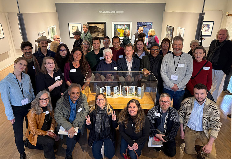
In addition to those physical difficulties, there are also photographic technical challenges. The relatively easy ones are exposure and shutter speed. The underwater part of the image is darker than the part over water. A one-shot solution, preferable because of wave motion, is to use a graduated neutral density filter (GND), which has to be of the screw-on type because there is no space in a housing for a square filter holder. However, it limits the placement of the waterline and precludes switching from a horizontal to a vertical composition. Although to handle the difference some photographers use a 4-stop GND, I found that the dynamic range of digital cameras makes a 2-stop GND generally sufficient at midday. I brought an underwater strobe to light up the reef in lower illumination conditions, but it adds another level of complexity. Because while making the images you are floating in moving water, a fast shutter speed, at least 1/100s, although 1/200 is safer, is necessary. However, when shooting through a dome you also need to stop down the lens for uniform sharpness and depth of field (as explained next), hence even at midday, the range of usable ISO starts at 400.

The more difficult challenge is the depth of field. Above water, the dome port has no special optical properties; it works like a clear window. When used in a housing, the lens has air in front of it and air in front of the port, so there is no difference in the medium. However, underwater, the dynamics change. With air in front of the lens but water in front of the port, the dome port functions like the rear element of a giant lens made of the sea. Therefore, what the camera captures underwater is a virtual diffracted image. That is why objects appear closer underwater than above water. Roughly speaking, the virtual image is located at a distance from the lens equal to twice the dome’s diameter. For my 8-inch dome, it means that objects at infinity underwater are imaged about 16 inches from the lens, with the focusing distance for closer objects even shorter. Most people focus on the underwater part of the image, relying on depth of field to take care of the above-water part. However, even stopping down to the maximum may not be enough. When I examined larger versions of single-frame split images, I noticed that in single captures, the above-water portions were always slightly soft. Therefore, like Floris van Breugel, I planned to rely on focus bracketing and stitch two pictures taken at different focus settings. However, because of the current, I could not make the two frames from the same spot.

As told in my travel story, I flooded my housing and ruined the DSLR camera, destroying the hard-earned and promising pictures. Fortunately, I had brought two backup compact underwater cameras. My best one was the Sony RX100 in a Meikon housing with the screw-on Inon UWL-H100 wet lens that converts 28mm, the widest focal length of the RX100, to a 16mm suited for photographing split shots. Only slightly bulkier than the Nikonos, the combination provides maybe the best digital underwater image quality possible in a package of this small size, even though the limits of the 1-inch sensor begin to show up at ISO 400 – will someone make an underwater housing for the Ricoh GR? However, its front element is a smallish 3 inches, making placement of the waterline difficult. By using the focus bracketing technique, the best composition including the iconic Sunuitao Peak I was able to make is the photograph below, where the waterline is lower than I wished. It is a composite of two almost identical images, except for the focus point.

Recognizing the improbability of composing a great split image with that rig, I also proceeded to photograph a series of images with a neat waterline low in the frame, and a series of underwater images from a few inches below the surface, to be used as material for a composite image. Although the reef had an amazing diversity of corals, the most striking features were huge coral heads almost the size of a small car. If I framed the underwater image horizontally, the composite would have a square aspect ratio, so I preferred to frame the underwater vertically, resulting in a vertical composite with an overall higher resolution. Unlike the previous photograph, which I have kept close to the original file, I color-corrected the underwater part to restore some of the vibrance lost when the white balance is set for the landscape. Since they are an assemblage of different compositions unlike the composite images from focus bracketing, I clearly caption them with the word “composite”, an extreme rarity in my archive.

Generative AI is not part of my practice, however, I like to keep up to date with current technologies out of curiosity. To generate a horizontal image, I tried Adobe Firefly AI Image Extender in the Photoshop Beta release 25.10. As you click and drag beyond the borders of your image, generative AI quickly fills the space with contents that blend with the existing image. Although it took many iterations to give the mountain a plausible look, Adobe Firefly easily provided plausible renditions of the reef. I picked one that including coral species I remembered seeing in Ofu. With a final aspect ratio of 2:3, more than 55% of the image is AI-generated. I was impressed enough by the result that I even published one of those images, the first (partly) AI-generated image in my archive. I marked it as such in the caption. The opening image is one of the variations, and of course, the central portion is unchanged.

Since those AI images were so realistic, maybe it was unnecessary to travel to Ofu if the goal was just pictures, as you could try to generate 100% of the image by AI. OpenAI’s DALL-E 2 made a big splash as the first mainstream AI image generator and has been superseded by the more advanced DALL-E 3 offered as part of a ChatGPT Plus subscription ($20 per month as of this writing). There is a simple way to use it for free: it is the model that powers the lesser-known Microsoft Designer’s Image Creator. The first series was obtained with a direct prompt and the second with a ChatGPT-generated prompt, a bit of an improvement. I am no “prompt engineer”, so I am curious if anybody can do better. Those examples would indicate that AI still has a long way to go to produce an image from scratch even vaguely resembling a specific place – or even any place, as they all look quite artificial to my eye. It could be that Ofu Island is as much a challenge to AI image generators as it is to travelers. The scarcity of images available for training compared to well-trodden destinations must have been a factor, but that is what makes a visit to Ofu particularly rewarding.

Since this is still new, I am interested in your attitude towards generative AI. Have you created any AI-generated images, and would you publish them? If you do not see the two questions in the poll below, click here.

Part 5 of 5: 1 | 2 | 3 | 4 | 5

American Samoa Cultural Vignettes

https://www.terragalleria.com/blog/american-samoa-cultural-vignettes/

While this series has largely focused on natural experiences, the National Park of American Samoa was also established to preserve and celebrate Samoan culture. Its mission includes safeguarding cultural traditions and ensuring they remain vibrant and relevant. In that spirit, this piece showcases various aspects of Samoan culture through a collection of photos taken on Tuitula Island.

Aiga Busses

Aiga buses are a colorful and iconic mode of transportation in American Samoa. These vibrant, locally-owned buses are converted trucks, often adorned with bright paint, island motifs, and lively decorations. The buses operate on flexible schedules, picking up and dropping off passengers anywhere along their routes, making them a convenient and accessible option for locals and visitors alike. Fares are low, and the atmosphere is friendly and communal, reflecting the Samoan spirit of aiga, or family. Adding to the lively experience is the bus’s sound system, often blasting cheerful island music, creating a festive atmosphere.

Samoans

In American Samoa, locals are remarkably warm and friendly. As I also experienced in Vietnam, young people often invite visitors to take their pictures. This welcoming attitude contrasts sharply with the negative reactions sometimes encountered in Western countries, where parents often strongly object to their children being photographed. While those Samoans see photography as a way to connect and share their vibrant community, in mainland America, caution and suspicion often prevail.

Church

The Christian religion, practiced by almost every Samoan, holds significant importance in Samoan life, deeply influencing the culture and daily routines of its people. Even the smallest villages feature a distinctive church, serving as the spiritual and social heart of the community. The Sunday Sabbath is rigorously respected, with most activities paused to honor the day of rest and worship. Samoans often wear white to church. The strict observance of the evening prayer time, known as Sa, is a daily ritual where families gather to practice their devout faith. Retired scuba diving tanks are often used as curfew bells. Villagers hit them with hammers at 6 in the evening to signal the start of prayer time.

U.S. Territory

Throughout the 19th century, Western powers attempted to divide the Samoan Islands. In 1899, the US claimed the eastern islands, while Germany took the western ones. Flag Day commemorates the first raising of the American flag over American Samoa on April 17, 1900. With its new status, American Samoa adopted the U.S. flag. On Flag Day in 1960, the American Samoan flag, featuring both US and Samoan influences, became official. The red, white, and blue colors reflect US symbols. Today, American Samoans are U.S. nationals but not citizens, with some fearing that citizenship could disrupt their traditions.

Siapo

Siapo is a Samoan art made traditionally made from the inner bark of the paper mulberry tree. The bark is processed, beaten, and decorated with intricate patterns depicting natural elements like shells, fish, and leaves. Used in clothing, gifts, and wall hangings, siapo is created through a meticulous, multi-stage process passed down through generations. In 2002, a young Samoan man gave me a siapo as a gift after I observed him drawing it on wood and I returned the favor by sending him a print. Twenty-two years later, I posed at the National Park of American Samoa Visitor Center in front of an eight-foot by eight-foot Siapo Mamanu, the largest of its kind since 2000, created in collaboration with the American Samoa Community College Art Department on the occasion of the National Park Service Centennial.

Feast

Tisa’s Barefoot Bar weekly serves a traditional Samoan feast, prepared using an earth oven known as an umu. The preparation is a time-honored process. Early in the day, a patch of earth is lined with a sheet of metal, superheated stones, and banana leaves so that the food doesn’t touch the rocks. The food, which typically includes a variety of meats, seafood, and root vegetables, is then placed in the umu, sealed with layers of banana leaves, and left to cook slowly for several hours. This method infuses the dishes with a smoky flavor and tender texture, offering an authentic taste of Samoan cuisine. As a vegetarian, I was at first wary that I would only be served papaya and taro with a coconut and leaf garnish, but the food turned out surprisingly tasty and filling. The feast at Tisa’s Barefoot Bar, eaten without utensils, is not just a meal but a cultural experience, bringing people together to celebrate Samoan traditions and hospitality.

Part 4 of 5: 1 | 2 | 3 | 4 | 5