Death at Midday
6 Comments
Beginners often shoot landscapes at all times of the day, and don’t realize why some come out better than others.
The standard operating procedure of the “serious” landscape photographer is to concentrate on the so-called golden hour, half an hour around sunrise and sunset time. Early morning and late afternoon are the second best. Midday, deemed “bad light” for photography, is spent scouting or resting.
The more flat and barren a landscape is, the more imperative this prescription becomes, especially if the day is sunny, and the subject a grand landscape. Is there any landscape more flat and barren than Death Valley anywhere ?
Besides the light, what’s great about golden hour photographs is that they capture a moment in time, a short instant of transition between day and night – capturing moments is part of the essence of photography. But that’s also what limits them. They don’t show what a place looks like most of the time.
I love the golden hour as much as anybody, and cherish it as I am aware that there are only so many sunrises and sunsets that I will be able to experience through my life. However, I prefer to keep looking for images all day, and I’ve arrived to a point where they can sometimes be reasonably successful.
In the three opening images of the Death Valley National section in my upcoming National Parks Book, I make a statement: each of those there images was shot at midday, within two hours of high noon.
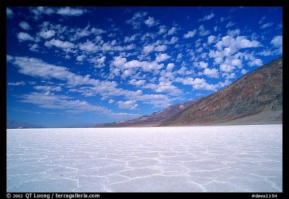
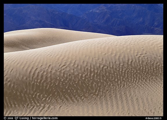
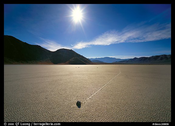
Do those images work for you ? If so, can you figure it out what makes them work ?
Answers will be in the book, but you don’t have to wait until this summer, as I’ll post them in a week 🙂


The nice flat horizon line on the top and especially the bottom photo probably allowed some great work with a gradient ND filter to manage the stark contrast.
as for the middle one I suspect the lack of sky was key to its success
Good try, but no GNDs were used! The third picture would have needed one if the tone of the playa wasn’t so light.
Nice photos. The deep blues suggest a polarizing filter.
Yes on the 1st image, not on 3rd, wouldn’t have worked with sun in frame.
All three work for me, though the second one is my favorite. The common elements I see are: strong color contrast. The strong blues allow the more muted yellow and white to pop. Interesting texture is another common element. And the symmetry of elements between the sky (and hills) and the foreground.
All around pleasing images.
I had texture and symmetry in mind indeed, but didn’t think in terms of color contrast, which is an excellent point!