Sequoias and stars, Kings Canyon NP
11 Comments
Although they are not as tall as the coastal redwoods, the giant sequoia trees still reach impressively into the sky. I found it difficult to convey the sense of cosmic height in daylight images. The usually blue sky isn’t visually that interesting, there are almost always harsh shadows or dappled light on a part of the trunks, and it is difficult to avoid visual clutter when trying to include the entire tree. I’ve come to prefer night photographs, because they do not suffer from those shortcomings. Do you agree ? Here are some variations on this theme, from two trips to Kings Canyon National Park last year. All images were photographed on Canon EOS 5D mk2 with 24/1.4 II lens, except last one.
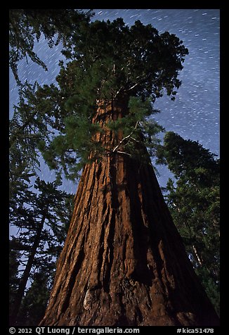
Image 1. Shot using only natural light from the moon, this required careful planning to find a well-lit tree, as a balanced exposure. ISO 800, f2.8 4min.
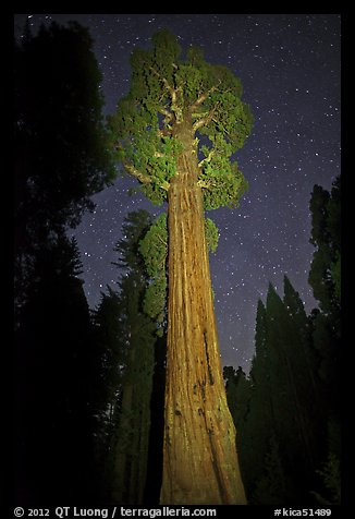
Image 2. Light painted with a flashlight. Thanks to the spot lighting, the tree (General Grant), which is depicted almost entirely, is better separated from the surrounding forest than in a daylight shot. Beyond ISO 1600 noise becomes objectionable to me on the 5Dmk2. Beyond 30s star streaking is more noticeable, so ISO 1600, f1.4 30s.
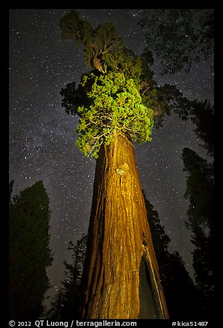
Image 3. This is a closer angle on the General Grant tree, pointing more upwards. I used less even lighting, shining the light on some areas more than others, and emphasized the leaves. ISO 1600, f1.4 30s.
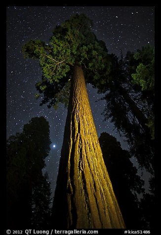
Image 4. This unnamed tree was lighted more laterally, providing more texture for the trunk. I lighted from the right so that the left side would be shaded in order to add contrast with the bright celestial body. ISO 1600, f1.4 30s.
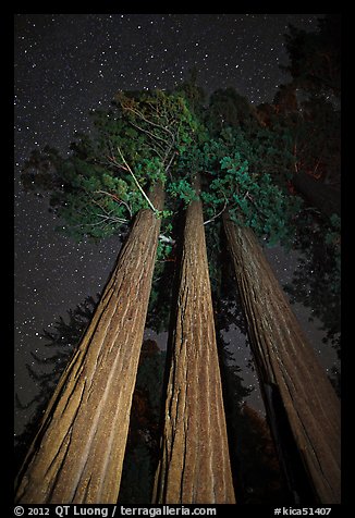
Image 5. Looking for a more complex subject, I included a group of three sequoia trees. More neutral filtration results here in colors closer to moonlight. ISO 1600, f1.4 30s.
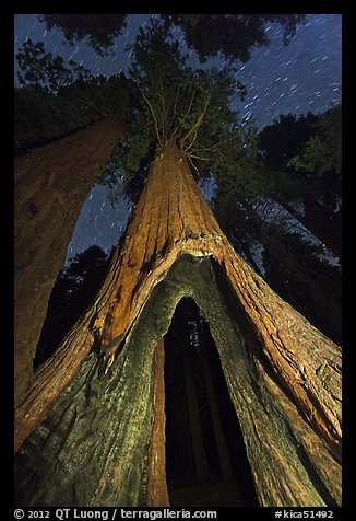
Image 6. I found a tree with an impressive opening (caused by fire) at the base. To make the opening more prominent, as well as including a sliver of sky in the opening, I had to get closer to the tree, therefore using a wider lens (zoom set at 19mm). Because the f1.4 aperture is not available on that lens, the exposure is much longer, resulting in short star streaks instead of point stars. ISO 1600. f4 4min.
(if you don’t see the poll question, please vote here for your favorite)
Do you find the light-painted images artificial, or is using lighting in nature photography fair game, like in most other areas of photography ?


Hi QT!
I enjoyed all the images very much but especially liked #1the most. Perhaps it is because it’s exposure is more balanced due to the moonlight, but I also enjoyed the star trails, with the little hint of Milky Way. I found this one to be more dramatic than the others.
In answer to whether I find light-painted images artificial, no I do not. Whether it is by moonlight or flashlight, I think lightpainting (done correctly) can only enhance a subject and the whole scene.
This is a great collection QT. #3 is my favorite with the more defined branches and deeper cluster of stars.
QT, These are tremendous. As a lover of giant sequoias I find most images of them kind of disappointing and have thought also that night photography would be an interesting way to try to capture their uniqueness. You really pulled it off well. To me it’s a toss up between 1 and 3. If I had to choose I’d say 1 simply for the extra effort and planning from working with moonlight only. For photo 5 you mention filters… did you experiment with different filters for the other shots? Chris
My flashlight uses LEDs which have a color which I find a bit too cool. I used CTO (Color Temperature Orange) gels (such as in here: http://strobist.blogspot.com/2006/03/lighting-101-using-gels-to-correct.html) to warm up the light, using a full CTO for 2,3,4,6 and a 1/2 strength CTO for 5.
Hola QT! I love the third picture the most(well, actually the fourth one is my favourite too). But I finally choose the third one because I love how the stars spread on the picture. The stars arrangement (not that you arrange them, hehehe) felt so rich..! =D
great concepts and excellent technique, here are my feelings. #1 far “outshines” the others as the light is the most natural feeling and the comp is compelling. the other shots have an unnatural warm tone of the flashlight whereby perhaps rendered in monochrome they would feel spectacular to me however as is the color temp is a bit of a put off in the flashlight shots. glad to give my 2 cents and contribute to a critique as not enough people open up to that kind of discourse. I enjoy following your work and will continue to do so, have a nice day sir- Nate Parker.
QT: Very unique approach. I like #1 best, as it has the most balanced lighting. The “star trails” definitely add interest to the sky.
I used your photographs of many years back of Vermont as inspiration to go find some of the places you shot. Thank you for all the photos you have posted over the years!
nice twist. I should have tried that when I visited in 2010. Should try it next time.
I ended up shooting in harsh lighting:
http://peter-chong.blogspot.com/2011/07/giant-sequioia-at-mariposa-grove.html
#4 followed by #1. I do appreciate light-painted images but thought it was a little too bright on some of these. I like the shadows in #4.
I am glad to see these images But my favorite was the Fotopedia cover image which, if one looks closely, reveals the misty “spiral nebula” that is the Andromeda Galaxy :0)
I like #3 the best because to me it represents what a tree-climbing animal with night vision eyes might see as it climbs up this huge trunk.